Categories
Macro

Current account equilibria in AEs

Have you ever wondered what a country’s current account balance should be? If you’re a macroeconomist or investor, then chances are that you have. While plenty has been written on how to measure “equilibrium” current account balances, to my knowledge there is precious little publicly-available information as to what these actually are. So I’ve drawn from the existing literature on the subject in an attempt to construct a model of where a country’s current account should stand over the medium-to-long term.

If you’re asking yourself why you should care about “normal” current account balances, first of all a quick refresher. The current account is the sum of a country’s goods and services trade balances (i.e. exports minus imports), its net primary income (e.g. wages and investment income from abroad), and net secondary income (i.e. grants from foreign donors and workers’ remittances from abroad). Adding consumption and investment to the current account is equal to gross national income, and some simple arithmetic shows that the CAB is also equivalent to savings minus investment:

CAB = PIB + SIB + X - M

GNI = PIB + SIB + X - M + C + I = CAB + C + I

CAB = GNI - C - I = S - I

From a savings minus investment perspective, the CAB is the sum of the public sector’s (i.e. government) S - I balance, which is closely related to the government’s budget, and the private sector’s S - I balance. Surplus current account flows lead to the accumulation of foreign currency reserves and/or net foreign assets acquisition, while a deficit must be financed by capital from abroad and/or the depletion of the central bank’s foreign currency reserves.

Exchange rates

Exchange rates obviously play a pivotal role in influencing a CAB, which is why “currency wars” periodically erupt, with nations accusing each other – sometimes with good reason – of artificially devaluing their currencies in order to boost their CABs. Currencies are also one of the main reasons to take an interest in CABs, because the latter help measure whether a currency is over- or undervalued.

Focusing on a country’s real effective exchange rate, i.e. its trade-weighted exchange rate incorporating relative price levels of its trading partners, there are multiple approaches to assessing REER fair value, one of which involves measuring cyclically-adjusted (i.e. “underlying”) current account deviations from the equilibrium current account:

REER deviation from FV ≈ CABunderlying - CABequilibrium

Undervalued currency: CABunderlying > CABequilibrium

Overvalued currency: CABunderlying < CABequilibrium

CAB modeling results

The first step in this analysis is to measure equilibria CABs that reflect a country’s non-cyclical characteristics over the medium-to-long run, hewing closely to past work on the subject, including by analyzing the same group of 21 advanced economies. I’ve developed two models in order to track these CABs: short-run estimates of observed CAB readings and a long-run framework to approximate equilibria CABs.

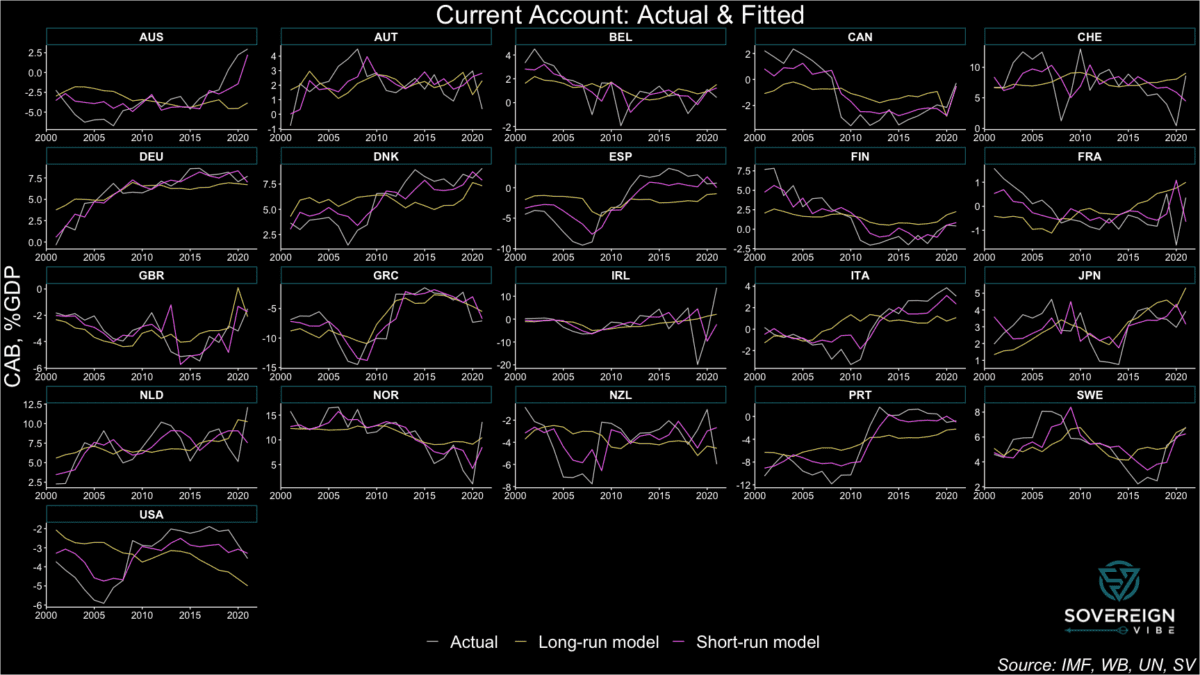
The results are presented in the chart below, featuring CAB observations, the long-run model, and short-run model. The latter tracks the actual CAB results relatively closely, in large part because the cyclical/short-term variables exhibit high degrees of statistical significance in the model. Moreover, the observed CAB values are obviously driven by cyclical factors in addition to long-term trends.

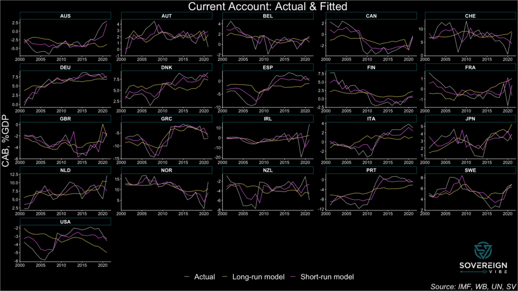
In contrast, the long-run model has much lower explanatory power compared to the short-run model with respect to minimizing residual deviations away from the observed CABs. But this is precisely the point. Medium- to long-run CAB equilibria should be relatively stable compared to the cyclical volatility exhibited by the actual CABs and their short-run fitted values.

Still, the long-run model estimates of CAB equilibria are subject to a high degree of uncertainty, given the the presence of statistical significance in only one of the three independent variables and low adjusted R2 (see regressions below).

Model & variable selection

The analysis uses panel data for 21 advanced economies from 2001 – 2021 and included various statistical tests for selecting appropriate models and controlling for heteroskedasticity, serial correlation, cross-sectional dependence, and stationarity. For both the short- and long-run approaches, fixed effects models were chosen over OLS or random effects. Only individual (i.e. country) fixed effects were included; time-fixed effects were unnecessary.

The current account balance as a percentage of nominal GDP served as the dependent variable for both the short- and long-run frameworks.

Short-run model variables
  • One-year lag of the dependent variable, i.e. the current account / GDP ratio. The high degree of inertia in CAB time series processes resulted in a large positive coefficient at a high degree of significance.
  • Deviation from the in-sample average of the general government cyclically-adjusted budget balance adjusted for nonstructural elements beyond the economic cycle, as a share of potential GDP. Countries with higher-than average government budget balances should be able to attract larger portions of global current account surpluses. This is confirmed by the positive coefficient at 1% significance.
  • Deviation from the in-sample average of GNI per capita on a PPP basis, adjusted for the country’s output gap to equate the observation to what it would be if the economy were running at potential. As expected, the coefficient is positive – reflecting the CAB-GNI conceptual overlap, greater availability of income and thus savings opportunities to wealthier countries, and the need for capital deepening in less developed countries. It is significant when standard errors are adjusted for heteroskedasticity and autocorrelation in this fixed effects model.
  • Domestic output gap: actual output minus potential output in current USD (logarithmic difference). Economies in the boom phase of an economic cycle can experience strong import growth, appreciated exchange rates, and stronger remittance and primary income outflows, putting the current account under pressure. As expected, the coefficient is negative, large, and significant.
  • One-year change in the terms of trade, i.e. the ratio of the price of exports to the price of imports. The coefficient is positive and significant, as expected.
  • One-year change in the REER. The coefficient is negative and significant, as expected, because high REERs can lead to imports becoming relatively cheap, thus increasing import volumes, and lead to exports becoming relatively expensive, thus decreasing export volumes.
Regression Results – 21 Advanced Economies
Dependent variable:
Current Account Balance, %GDP
panelcoefficient
lineartest
(1)(2)
fixed.shortrunfixed.hac.shortrun
cab.t_10.582***0.582***
(0.040)(0.125)
sur_dev0.221***0.221**
(0.052)(0.089)
ypcap_dev0.0260.026**
(0.018)(0.011)
ogap_usd.logdiff-6.593*-6.593*
(3.994)(3.620)
tot_1d0.091***0.091**
(0.021)(0.044)
reer_1d-0.050*-0.050**
(0.028)(0.024)
Observations441
R20.456
Adjusted R20.422
F Statistic57.907*** (df = 6; 414)
Note:*p<0.1; **p<0.05; ***p<0.01
Long-run model variables
  • Deviation from the in-sample average of the general government cyclically-adjusted budget balance adjusted for nonstructural elements beyond the economic cycle, as a share of potential GDP. Countries with higher-than average government budget balances should be able to attract larger portions of global current account surpluses. This is confirmed by the positive coefficient at 1% significance.
  • The deviation from the in-sample average of total dependency ratio of non-workers on the 20-64 year-old working-age population, i.e. people 19 and under & 65 and over. Faruqee and Isard contend that the dependency ratio should be negatively associated with current account equilibria, partly due to the income effect, and find it to be so in their 1970s – 1990s data. Here the sign is positive, somewhat unexpectedly, and is statistically insignificant.
  • The deviation from the in-sample average of the child-age dependency ratio on the 20-64 year-old working-age population, i.e. people 19 and under. I tested this variable on the intuition that the child dependency ratio could well be negative, not only due to the income effect as noted by Faruqee and Isard, but also due to the large amounts of consumption (which pushes down savings, increases imports etc) associated with children’s parents at the height of their income generation, family activities, and the associated demographic profile that such countries might have. Although this relationship showed up as negative in OLS, in this fixed effects model it is insignificant and unexpectedly positive.
  • The deviation from the in-sample average of the old-age dependency ratio on the 20-64 year-old working-age population, i.e. people 65 and over. My intuition with this variable is that it would be positive because of the high level of savings that elderly people have, despite doubts as to the degree to which the elderly can generate positive savings flows for themselves. The sign was positive, as expected, but small and insignificant.
  • Deviation from the in-sample average of GNI per capita on a PPP basis, adjusted for the country’s output gap to equate the observation to what it would be if the economy were running at potential. As expected, the coefficient is positive – reflecting the CAB-GNI conceptual overlap, greater availability of income and thus savings opportunities to wealthier countries, and the need for capital deepening in less developed countries. Yet this result is weak and insignificant in the long-run model.
Regression Results – 21 Advanced Economies
Dependent variable:
Current Account Balance, %GDPcab_ngdp
panelcoefficientpanelcoefficient
lineartestlineartest
(1)(2)(3)(4)
fixed.longrun.afixed.hac.longrun.afixed.longrun.bfixed.hac.longrun.b
sur_dev0.481***0.481***0.478***0.478***
(0.062)(0.125)(0.062)(0.129)
dem_tot_dev0.0860.086
(0.067)(0.134)
dem_chd_dev0.1730.173
(0.143)(0.361)
dem_old_dev0.0480.048
(0.087)(0.162)
ypcap_dev0.0140.0140.0120.012
(0.023)(0.035)(0.023)(0.038)
Observations441441
R20.1480.149
Adjusted R20.1010.100
F Statistic24.141*** (df = 3; 417)18.201*** (df = 4; 416)
Note:*p<0.1; **p<0.05; ***p<0.01
Categories
Macro

Mapping the world’s output gaps

Building on recent work on how to measure deviations of actual GDP from potential GDP, known as an output gap, I’m pleased to reveal a world map of results for 2023. Remember that an output gap is positive when actual GDP is above potential – or trend – and negative when it is below. In the map below, countries in blue have positive output gaps in 2023, while those in orange and red are negative.

While most countries are exhibiting above-trend GDP growth, there are some noteworthy pockets of below-trend output. Chief among these is a large negative output gap in Ukraine, clearly related to the ongoing war with Russia, and which also appears to have infected several of its neighbors in north-eastern and north-central Europe.

Other countries with active conflicts or security-related concerns also seem to be well below potential: Sudan, Myanmar, Haiti, and Iraq.

There are also some clusters of negative gaps in various regions: Latin America (Peru, Bolivia, Paraguay, and Chile), South/Southeast Asia (Pakistan, Nepal, Bhutan, Myanmar, Thailand, Laos), and West-Central Africa (Ghana, Burkina Faso, Gabon).

As for the positive output gaps around the world, these are mostly in the range of 0-2.5% of potential GDP. Much of southern Europe is above this level: Portugal, Spain, Italy, Croatia, Montenegro, Albania, Greece. Farther east, Georgia, Armenia, Iran, and Tajikistan have also recorded above-trend output beyond 2.5%. Brazil and some parts of Africa (Libya, Republic of Congo, Democratic Republic of Congo, Botswana, Benin, and Liberia).

The countries with the largest positive output gaps are in darkest blue: Guyana, Yemen, and Libya. The latter two have of course experienced significant conflicts over the past decade, suggesting that actual GDP is now well above trend as a result of those previous shocks. High positive output gaps can also be a symptom of economic overheating.

Note that data for 2023 is absent for some countries in the map because the IMF did not provide actual GDP estimates for this year in its October 2023 World Economic Outlook. These include Sri Lanka, Afghanistan, Syria, Venezuela, and Cuba. Given high economic uncertainty and/or the absence of reliable data from these countries, fair enough.

Trend GDP: a visual primer

So far in my writing about output gaps I haven’t made any visual presentations of what real and potential GDP look like. As explained previously, measuring potential GDP is complicated and data-intensive, so economists often use a shortcut: deriving a moving average of actual GDP readings as a proxy for potential GDP. The approach I have taken is known as Hodrick-Prescott filtering.

As a result of the previously-noted pitfalls of using moving averages to measure potential GDP, I refer to the term of “trend” rather than “potential” GDP. As for “actual” GDP, this is data in national currency units using constant prices, meaning that it is real – and not nominal – GDP.

The charts below provide examples actual and trend GDP. I’ve selected these countries because they are ongoing sovereign debt restructuring cases of interest, even if I only present them here for demonstrating how actual / real and trend / potential GDP relate to each other and output gaps:

Output Gap = (Real GDP - Potential GDP) / Potential GDP * 100

Sri Lanka is perhaps the most interesting case, even if the data is only through 2022: a sizable positive output gap – indicating potential overheating in the economy – preceded a sharp drop in GDP, leading to a negative output gap. Also currently in negative territory, Ghana’s GDP exhibits some of the same behavior, albeit with less volatility.

Zambia sustained a positive output gap throughout most of the 2010s, until an economic contraction in 2020 led it into negative territory, though the gap turned positive again in 2023. Once one of the world’s fastest growing economies, Ethiopia’s economic growth has also been remarkably stable, despite the recent Tigray conflict. This makes for a more “boring” chart but is a credit to the country’s economy, with the output gap in marginally positive territory.

Categories
Sovereign Debt

Sovereign debt stress heatmaps

Angola, Pakistan, Egypt, Jordan, Argentina, El Salvador, Ecuador, and Belize are among the market-access countries most at risk of sovereign stress, according to the model presented below. Unsurprisingly, several advanced economies appear least at risk, including Norway, Ireland, Denmark, Singapore, the Netherlands, Luxembourg, Hong Kong, and Switzerland.

Earlier this year I published the high-level initial results of a sovereign debt stress tracker, based on a model developed by the International Monetary Fund for countries that it classifies as having access to international markets. The IMF presented this model as part of its update to its Debt Sustainability Framework for Market-Access Countries in 2021, claiming at the time that it had performed significant robustness checks to ensure forecast salience. Time will tell how useful this tool is in predicting sovereign debt strains, and, in any case, it should only be used in conjunction with other analytical approaches.

Heatmaps

Using the latest available data for 2023, the heatmaps below rank order countries by the probability of experiencing sovereign stress, as represented by the column farthest to the right. Neither the probabilities for the dependent variable nor any of the raw data readings for any of the independent variables is shown below. Instead, readers can see the percentile rank compared to the maximum value in each variable column, which is beneficial for visually detecting relative heat for each indicator.

Lighter colors represent more risk, while darker colors represent less risk. Independent variables with negative coefficients, i.e. are negative predictors of sovereign stress, have been reversed in order to ensure color scheme coherence. These include institutional quality, the current account, and international reserves.

The first heatmap below suggests that Angola, Pakistan, Egypt, Jordan, Argentina, El Salvador, Ecuador, and Belize are most at risk of experiencing sovereign debt strains. Looking across the independent variables for this group of countries:

  • They generally suffer from high external public debt burdens and from relatively poor institutional quality, though Argentina and Jordan fare better on those measures, respectively.
  • El Salvador is penalized relatively less on stress history, though this assumes spread widening in recent years remained under the IMF’s stress definition threshold (see “Model” section below).
  • One-year changes in general government debt in Angola, Egypt, and Argentina point to potential risks.
  • El Salvador, Jordan, and, to a lesser extent, Pakistan, appear to need some replenishing of their international reserve buffers.
  • Angola and – to a lesser extent – Argentina are marked down for surging REERs.
  • Pakistan and Egypt display relatively concerning public debt/revenue ratios.
  • Jordan stands out for poor current account performance.
  • Egypt, Jordan, and Ecuador exhibit high credit-to-GDP gaps, though several other countries fare worse on this measure.

Each value is divided by the maximal value in that column, resulting in its own empirical percentile. Each value shown is the percent of observations with that value or below it. Sources: IMF, WGI, WB, Bruegel, BIS, author’s calculations.

The second heatmap uses foreign currency general government debt to replace the external PPG debt indicator featured in the first heatmap (see explanation in “Data” section below). Neither of these indicators is ideal, as in both cases coverage for many countries is either lacking or data points are equal to zero. This is obvious in both heatmaps from the absence of dark-colored cells in the relevant column, meaning that many countries are zero. Overall country coverage on this variable is better in the first heatmap, but the second one provides value for countries where data is missing in the first one (e.g. Israel, Korea, Sweden).

The eight countries most at risk of sovereign stress in this second heatmap are the same as in the first one, albeit in a slightly different order and except for Mexico replacing Belize. On this latter point, FX general government debt data – sourced from the BIS (see “Data” section below) – is missing for Belize, conferring on it an unfair advantage over Mexico and other countries where data are present for this indicator. In the first heatmap, external debt data is present for both Mexico and Belize, with the latter appearing more at risk than the former.

Each value is divided by the maximal value in that column, resulting in its own empirical percentile. Each value shown is the percent of observations with that value or below it. Sources: IMF, WGI, WB, Bruegel, BIS, author’s calculations.

Interpretation

Focusing on a country case helps illustrate ways to interpret the data in this model. Take Angola, as it appears most at-risk. Using heatmap (1), the brightest and thus most concerning data points are in the institutional quality, REER 3-year change, general government debt 1-year change, and external public and publicly-guaranteed debt columns. This suggests that the government and public sector more broadly are borrowing heavily, while prices and the exchange rate have also combined to rise quickly. Moreover, the institutions to set a good policy framework appear to be lacking. This is already a dangerous mix.

On the other hand, Angola scores well on its current account balance and international reserves variables. This is easily explained by the fact that the country is an oil exporter, thereby keeping its current account balance high and accumulating foreign reserves from the proceeds of these oil sales to buyers abroad.

While these oil exports provide Luanda with ample benefits, heavy reliance on a commodity-based export sector is also a double-edged sword. The result is often an appreciation of the exchange rate, making the economy less competitive for developing other industries: a classic case of Dutch Disease.

More concerning still is the presence of high inflation. The country’s surging REER variable already suggests that prices are probably rising, as the overall increase is unlikely to be due to nominal exchange rate dynamics alone. Increases in government debt suggest potential fiscal profligacy, which can lead to undesirably-high inflation, the presence of which is confirmed by a glance at recent Angolan statistics. The credit-to-GDP gap, which measures the deviation from trend of credit to the non-financial private sector as a share of GDP, is not particularly alarming in Angola, but may be high enough to also be contributing to the rising price level.

Angola also exhibits a high public debt-to-revenue ratio, which is worrying, given all the oil revenues that the country is seemingly raking in, suggesting that less borrowing and more fiscal discipline are likely needed. Recent sovereign stress is also a concern, indicating that, for all its natural resources, the government is unable or unwilling to pursue policies required to maintain macroeconomic stability.

Model

To recap, the model’s dependent variable is the probability of sovereign stress, which the IMF has detailed criteria for defining – running the gamut from outright default to a mere spread widening beyond a certain threshold. Regarding the independent variables:

  • The first two represent how recently a country has experienced sovereign stress, and its government effectiveness and regulatory quality.
  • Other explanatory variables are macroeconomic in nature, including current account balances, real effective exchange rates – which also capture price changes, credit gaps to the private sector, and international reserves.
  • More specifically fiscal indicators include those on general government debt, foreign currency public debt, and public debt-to-revenue ratios.
  • With the exception of REERs and debt-to-revenue, these macro-fiscal indicators are all expressed as a share of GDP.
  • A global variable also features in the model, the VIX Index, which measures stock market volatility in the US, but is not presented in the heatmaps above, given its constance across countries.

Data

In the first iteration of the tracker, 2023 data was captured for 43 market-access countries, including both emerging markets-developing economies and advanced economies. Thanks to more available data for this year and refinements in data capture, coverage has been expanded to 82 MACs in these heatmaps.

Two similar heatmaps are presented in this article, with a difference in one of the independent variables and, as a result, slight changes to the overall results in the dependent variable. One of the IMF’s indicators is foreign currency public debt. In the first instance, the World Bank indicator for external public and publicly-guaranteed debt is used as the best available proxy for the IMF’s variable. While using this data from the World Bank remains the best possible option at this stage, there are some glaring omissions in coverage. For instance, the World Bank source suggests that Israel’s external PPG debt is equal to zero, which is clearly incorrect.

As a remedy to the World Bank’s data deficiencies, a second heatmap applies data from the Bank of International Settlements on foreign currency general government debt, as a proxy for this indicator in the same overall model. The BIS data does fill in some of the World Bank gaps – e.g. Israel – but in fact covers fewer countries than the first source. As such, the first heatmap is still preferable.

It is also worth noting that both the World Bank and BIS indicators differ from the IMF variable of foreign currency public debt. In the former case, external public debt differs somewhat from foreign currency public debt, even if virtually all external debt is in foreign currency. In the latter case, foreign currency general government debt excludes some types of debt that is covered under foreign currency public debt.

Categories
International Financial Architecture

Multilateralism limps onward in Marrakech

The World Bank Group-International Monetary Fund Annual Meetings drew to a close in Marrakech this past weekend, the first time these events have been held in Africa since the 1973 edition in Nairobi. While the Bank-Fund leadership expressed their usual endorsement of international cooperation and optimism for the future, this year’s agenda also explicitly aimed to address geopolitical fragmentation and fully acknowledged heightened threats to the goals of eradicating poverty; bolstering sustainable, inclusive growth; and preserving macroeconomic stability.

The main problem at this year’s annuals wasn’t a new one and goes by many names: geopolitical competition, fragmentation, deglobalization, trade frictions, or decoupling. A whole host of challenges to multilateral financing efforts stem from the political obstacles to international cooperation that have emerged over the past decade, with the 2007-2009 Global Financial Crisis marking the end of America’s “unipolar moment” and ushering in a new, more competitive era. The prospects for a new capital increase for multilateral development banks, innovative hybrid financing solutions to boost World Bank lending, and sovereign debt restructuring processes are all suffering from the fractured backdrop.

IMF Global Policy Agenda

The IMF’s policy priorities are a response to the main macroeconomic challenges in today’s global economy:

  • tame inflation
  • ensure financial stability
  • restore fiscal room
  • boost medium-term growth

Indeed, inflation has not yet reverted to central bank targets in many countries, while the rapid rise in interest rates in the past few years have strained parts of the US banking system. At the same time, expansionary fiscal policies have pushed up yields on government debt in various countries, with the return of bond vigilantes evident in the US in 2023. The prospect of higher fiscal deficits can also sometimes undermine financial stability, as exemplified by the UK mini-budget straining pension schemes in September 2022. Tighter fiscal policy will be necessary in many countries to guard against future shocks, while appropriate reforms are also widely-needed to revive the dimmed outlook of medium-term growth.

In parallel with the macroeconomic policy priorities, the Fund is pursuing complementary objectives. The IMF launched, with the government of Morocco, the Marrakech Principles for Global Cooperation, which include reinvigorating inclusive and sustainable growth; building resilience; supporting transformational reforms; and strengthening and modernizing global cooperation. These principles are a welcome attempt to stem the tide of global divergences, even if they are unlikely to meet with much success in the short term. In a similar vein, the IMF has attracted more funding for the interest-free Poverty Reduction and Growth Trust and for the climate change-focused Resilience and Sustainability Trust.

Of note, the IMFC Chair committed to concluding the 16th General Review of quotas by December 2023, in light of agreement on a significant increase of quotas this year. Crucially, there seems to be support for quota realignment by June 2025 to reflect current economic realities, including through an updated quota formula. The IMFC has also called for the creation of a third chair on the IMF Executive Board for Sub-Saharan Africa, in order to improve the continent’s representation.

Yet the IMF has not been able to deliver more in the way of impactful policy successes. One potentially high-impact policy area would be finding a solution for re-allocating SDR usage from the wealthy countries that don’t need them to the poorer countries that do. A further work-stream with outsized effects would be to do more to strengthen the Global Financial Safety Net, which includes the IMF’s toolkit, bilateral swap arrangements, regional financial arrangements, and international reserves – a tall order in the current environment.

Global Sovereign Debt Roundtable

The official sector has achieved a modicum of progress on improving the sovereign debt restructuring architecture in recent months. Probably of most importance to private creditors is improved information-sharing during restructurings, with new possibilities for private lenders to access debt sustainability analyses and related elements at the same time as official creditors, under certain conditions. The Fund has highlighted the increasing speed from staff-level approval to Board approval, from 11 months in Chad in 2022, to 9 in Zambia, 6 in Sri Lanka, and 5 in Ghana most recently, while recognizing that this is still above the 2-3 month average in the past.

The IMF maintains that external public debt strains are not currently as high as they were in the 1990s, even considering the existence of larger local debt markets, which has led to some observers wondering if there is a sense of complacency about pending risks in low-income countries. The IMFC welcomed progress in Zambia, Sri Lanka, and Suriname but called for more results in Ghana, Ethiopia, and Malawi, while also calling for stronger creditor coordination for sovereign debt restructurings occurring outside the Common Framework.

One of the main pieces of news to come out of the meetings was that Zambia’s finance ministry and its official creditor committee signed a memorandum of understanding, thus formalizing the agreement reached in June, and paving the way for Zambia to seek comparable treatment from its commercial creditors. It was also revealed that Kenya may be seeking exceptional access to IMF support ahead of a $2 billion bond maturing in June 2024.

There are some other minor new features in the sovereign restructuring framework, regarding cutoff dates (no later than staff-level agreement), state-contingent debt instruments (which shouldn’t be the norm), and the appropriate approaches to domestic debt (case-by-case) and SOE debt. Other areas remain contentious among the various creditor categories, such as appropriate discount rates to be used for NPV calculations for comparability of treatment. There is also no consensus on the treatment of arrears and on debt service suspensions during negotiations.

Show me the money: capital increases for MDBs?

Despite the ongoing efforts of senior staff to convince donor countries to provide more resources for development, the World Bank Group’s ambitions will continue to lack requisite firepower. The cause is an absence of political will in most of the G7 countries to make sufficient financial commitments to development, as evidenced by a succession of broken Western promises. To be sure, some efforts are under way, such as Japan’s pledge to significantly raise its contribution to the IMF’s zero-interest loan tool, the Poverty Reduction and Growth Trust. For its part, the US may transfer $2 billion in additional funding to the World Bank Group this year, though this is a far cry from the scale that is needed.

Additional annual financing required to meet the United Nations’ Sustainable Development Goals stands at around $3 trillion. The G20’s Capital Adequacy Review framework suggests that a general capital increase for the multilateral bank system, including the IBRD, could unlock $200 billion in annual lending, with a further $80 billion annually from balance sheet optimization (e.g. callable and hybrid capital). The Center of Global Development suggests that the international development finance system should boost its annual financing by $500 billion by 2030, with multilateral development banks providing $260 billion and national development finance institutions delivering the remainder. Private capital ought to match that half-trillion increase, for a combined public-private total of $1 trillion.

Yet these figures still fall well short of the additional $3 trillion needed annually. By the CGD’s calculations, each dollar of new equity in MDBs can be leveraged for $15 of external sustainable investment financing, of which $7 in direct MDB lending and $8 in private capital. Assuming that private finance can be crowded in to such a degree is likely overly optimistic, as the CGD’s own figures indicate that MDBs currently mobilize only 60 cents for each dollar lent. Even so, public and private stakeholders will have to come up with financing solutions to achieve the SDGs, and this should be possible with enough political will: just look at the over $100 billion raised for Ukraine.

The World Bank’s Evolution Roadmap

The World Bank Group’s recently-appointed president, Ajay Banga, has laid out a roadmap to enhance the organization’s effectiveness. More efficient balance sheet management should unleash $157 billion in additional lending over 10 years, while preserving the Bank’s AAA rating. These measures include increasing the loan to equity ratio, launching a hybrid capital instrument, and creating a portfolio guarantee mechanism. Similarly, management is also exploring solutions using callable capital and SDRs. An elegant approach to channeling some of 2021’s SDR 650 billion windfall could be to have the Bank issue SDR bonds, to be purchased by national central banks.

A number of other changes are in the works under Banga. These include setting up a Global Public Goods Fund to grow concessional resources by attracting funding from governments and philanthropies, exploring maturities of up to 40 years for social and human capital investments, and exploring energy transition solutions. More importantly, efficiency gains are at the heart of the new strategy. There is an objective to slash project review and approval times by a third by simplifying procedures, while partnerships with other MDBs are already being pursued more actively so as to amplify impact. Similarly, Banga’s team plans on scaling knowledge-sharing in order to more easily share impactful solutions, and a private sector investment lab has already been set up to galvanize private financing.

Banga’s plans to streamline processes seem like a requisite pre-condition for convincing donor countries to increase the Bank’s share capital, though even if his team can deliver, any new equity is far from guaranteed. Early signs of the new president’s first few months in the role have demonstrated his dynamism and communication skills, and future success in reforming the institution’s bureaucracy, while likely challenging to achieve, could yield significant development benefits. However, his team is reportedly difficult to approach internally, which could potentially delay progress.

Categories
Sovereign Debt

Mind the credit gap

As part of tracking the probability of credit stress among 112 sovereign issuers, one of the variables of interest in the IMF’s model is the credit-to-GDP gap. This indicator matters not only because of its predictive power for sovereign credit events but for many other reasons as well, including monetary policy transmission and government borrowing. When analyzed in conjunction with other data, credit gaps are useful barometers for detecting the presence of credit bubbles, economic over- or under-heating, and policy distortions such as financial repression and fiscal dominance.

Credit gaps are derived from observations of credit extended to the private sector as a percentage of GDP, and then a statistical technique, usually Hodrick-Prescott filtering, is used to smooth out the data points in the time series as a way to measure an underlying trend. While there are some shortcomings to this approach, including the arbitrary nature of the smoothing parameters used to identify the trend, it helps ascertain whether the cyclical component of lending is above or below long-term expected processes.

A credit-to-GDP gap is thus an actual observation at time t minus the trend in the same time period. As such, a positive credit gap is one in which lending is above trend, whereas a negative one is below. The credit gap coefficient in the IMF model is positive, as is the case in other models in the financial crisis academic literature, meaning that higher values are associated with an increased likelihood of sovereign debt strains. Looking at quarterly data through end-202212023 data will be presented in future posts on credit gaps. from the Bank of International Settlements on 43 countries plus the Euro Area, this first set of charts presents the actual credit-to-GDP ratios in blue, the smoothed trend in yellow, and the credit-to-GDP gaps in green.

SLIDE DOWN: actual data vs trend; SLIDE UP: the cyclical gap between the two; XM = Euro Area

In the chart above, credit gaps in this mix of developed (DMs) and major emerging market economies (EMs) are currently mostly negative. This makes sense given the tighter monetary policy stances around the world to combat inflation, with EM central banks having begun their rate-raising cycles2Some EM central banks are so far ahead of DM that they have already begun cutting rates in 2023. before their DM peers. A spike in credit gaps can also be observed in 2020 as policymakers worldwide lowered interest rates and facilitated the extension of credit as part of emergency measures to mitigate economic scarring at the height of the pandemic.

The BIS credit gap data is extremely useful for this set of countries, which, after all, comprise the world’s largest economies, and all the more so because it is available on a quarterly basis. The BIS describes its credit-to-GDP ratio as capturing total borrowing from all domestic and foreign sources by the private non-financial sector.3https://www.bis.org/statistics/about_credit_stats.htm However, other sources are needed for measuring credit to the private sector in other countries, and, thankfully, the World Bank has a similar indicator: domestic credit to the private sector by banks.4 https://databank.worldbank.org/metadataglossary/jobs/series/FS.AST.PRVT.GD.ZS The World Bank data series has far broader country coverage than the BIS data, thus opening vast additional swathes of the world to analytical coverage.

In contrast to the BIS data with its inclusion of both domestic and foreign credit to the non-financial private sector, the World Bank indicator appears to only include domestic sources of financing. Moreover, the BIS data appears to include sources of non-bank financing, unlike the World Bank data. Taken together, these two differences likely explain much of the discrepancy between these two datasets. Further, the World Bank data appears to only be available at a yearly frequency, thus requiring the BIS quarterly data to be transformed to yearly averages for the purposes of comparison.

The charts below present BIS data in blue and World Bank data in yellow, in yearly form through end-2022 in both cases. As seen above, the BIS provides credit gap and trend data alongside its credit ratios and uses a one-sided Hodrick-Prescott filter with the smoothing parameter λ set to 400,000 for this quarterly data. The World Bank only provides its credit ratios on a standalone basis, meaning that the trend and credit gap need to be estimated independently. This is simple enough for one country, and thankfully panel statistical techniques enable scalability for quick estimation across a large number of countries and years. As such, trends and credit gaps are derived from the World Bank’s credit ratios using a two-sided HP filter with λ = 100, the recommended setting for annual data.

SLIDE DOWN: actual data; SLIDE UP: trend data, smoothed with HP filters

Consistent with the inclusion of foreign sources of credit, the BIS credit ratios are usually higher than those from the World Bank, especially in many European countries, e.g. Luxembourg and Belgium. Elsewhere, the figures track more closely, as is the case with Japan, Malaysia, and the UK. The US and China also fell into this category, but the datasets have diverged in recent decades for those countries. Surprisingly, there are also a few countries where the World Bank ratio exceeds the BIS reading, despite the former excluding foreign credit sources, with South Africa and the US standing out most prominently from this perspective.

The point of comparing the two datasets is to use the BIS as a benchmark to get a sense if the World Bank data is at least somewhat aligned with the former and it is any good for predictive purposes. Certainly, the similar characteristics of the actual and trend data above are a positive sign. As for the credit gaps themselves, the BIS and World Bank figures are presented below. While there are large differences in most countries, there are also similar processes at work in many countries, e.g. the United Kingdom, Malaysia. The BIS credit gaps appear to be more volatile than those of the World Bank, which could be explained by the former’s inclusion of foreign lending: capital flows of the portfolio variety, which includes debt, are prone to sudden stops and starts.

SLIDE DOWN: credit gaps; SLIDE UP: difference in credit gaps (WB – BIS)

To simplify further, the difference in the BIS and World Bank credit gaps, where the former is subtracted from the latter (difference = WB – BIS), features in the chart above. Ideally, the data readings would all be horizontal lines at zero or at least resemble a stationary process hovering above and below zero. While some countries do have these features – Sweden, the UK, the US, and Switzerland, among others, a large cohort exhibits some sort of bias. A statistical test of this difference in credit gaps across this panel of countries over these years would likely reject the notion that the difference is equal to zero. Nevertheless, the World Bank domestic credit to private sector by banks indicator seems fit for purpose, particularly given the large role that domestic banks play in credit provision in most economies.

Future posts will expand further on the importance of credit gaps and present broad country coverage of World Bank credit gap data.

  • 1
    2023 data will be presented in future posts on credit gaps.
  • 2
    Some EM central banks are so far ahead of DM that they have already begun cutting rates in 2023.
  • 3
    https://www.bis.org/statistics/about_credit_stats.htm
  • 4
    https://databank.worldbank.org/metadataglossary/jobs/series/FS.AST.PRVT.GD.ZS
Categories
Sovereign Debt

Tracking sovereign stress in 112 countries

Introducing a sovereign stress tracker covering 100+ countries, based on the IMF’s Debt Sustainability Framework for Market-Access Countries. The model used in this analysis suggests that sovereign debt strains are lower in 2023 than they were in either 2022 or 2020 for this group of countries. MACs comprise all economies that are lower-middle income and above, including many emerging economies and all advanced economies.

Market-Access Countries

In 2021, the IMF released its new Debt Sustainability Analysis framework for Market-Access Countries, in line with its differentiation between MACs and low-income countries. The reasons given for distinguishing between these two groups is that MACs generally have significant access to international capital markets, whereas LICs rely on concessional resources to fulfill their external financing needs.

As such, the Fund has a separate approach to debt sustainability analysis for LICs, which is beyond the scope of this tracker. The strict definition is that countries eligible for the IMF’s Poverty Reduction and Growth Trust, which is an interest-free concessional financing tool, are treated as LICs, whereas the rest are considered MACs.

Geographic coverage

Overall, 140+ countries and territories were included in this analysis, but results were only obtained for 112,1Angola, Albania, United Arab Emirates, Argentina, Armenia, Antigua & Barbuda, Australia, Austria, Azerbaijan, Belgium, Bulgaria, Bahrain, Bahamas, Bosnia & Herzegovina, Belarus, Belize, Bolivia, Brazil, Barbados, Brunei, Botswana, Canada, Switzerland, Chile, China, Colombia, Costa Rica,  Cyprus, Czechia, Germany, Denmark, Dominican Republic, Algeria, Ecuador, Egypt, Spain, Estonia, Finland, Fiji, France, Gabon, United Kingdom, Georgia, Equatorial Guinea, Greece, Guatemala, Hong Kong SAR, China, Croatia, Hungary, Indonesia, India, Ireland, Iran, Iraq, Iceland, Israel, Italy, Jamaica, Jordan, Japan, Kazakhstan, St. Kitts & Nevis, South Korea, Kuwait, Lebanon, Sri Lanka, Lithuania, Luxembourg, Latvia, Morocco, Mexico, North Macedonia, Malta, Mongolia, Mauritius, Malaysia, Namibia, Nigeria, Netherlands, Norway, New Zealand, Oman, Pakistan, Panama, Peru, Philippines, Poland, Portugal, Paraguay, Qatar, Romania, Russia, Saudi Arabia, Singapore, El Salvador, Suriname, Slovakia, Slovenia, Sweden, Eswatini, Seychelles, Syria, Thailand, Trinidad & Tobago, Tunisia, Turkey, Ukraine, Uruguay, United States, Venezuela, Vietnam, South Africa given insufficient data availability in around 30 cases. The analysis is based on a multivariate model, meaning that a missing data point for a single variable across all years makes it impossible to derive a final measurement for the country in question, resulting in exclusion.

The calculated probabilities of sovereign stress for the 112 countries do not cover all years, unfortunately. For instance, there are only results for 43 countries in 2023, given less availability of annual data and/or forecasts for the current year. Data coverage will be improved in future iterations of the tracker.

All countries included are either high, upper middle, or lower middle income countries, with few exceptions, such as Syria, which the World Bank reclassified as a LIC in 2018. There is also some debate as to whether Venezuela constitutes an UMIC or a LMIC, though it is treated as a LMIC here.

Model

The IMF claims that extensive testing demonstrates that its new MAC DSF is much better at accurately predicting sovereign debt distress. Predictive analysis is based on a multivariate logit model developed by Fund staff. Passing the required data into the model provides a probability that a sovereign borrower experiences debt stress:

Multivariate logit model specification

RegressorCoefficient
Institutional quality-1.073 ***
Stress History0.514 ***
Current account balance/GDP-0.024 **
REER (3-year change)0.013 **
Credit/GDP gap (t -1)0.086 ***
Δ Public debt/GDP0.052 ***
Public debt/revenue0.002 ***
FX public debt/GDP0.024 ***
International reserves/GDP-0.034 ***
ΔVIX0.015 ***
*** / ** indicate statistical significance at the 1 percent / 5 percent levels

Results

In addition to the dotplot chart above, a further way to view the broad results from this analysis of 112 countries is as a boxplot, presented below. I fully acknowledge that this data is unbalanced, given the limited number of data points in 2023 and also in the early 2000s – as can be seen in the first chart above – compared to better country representation in the middle years of the sample. More charts are presented in the next section below in order to address this issue.

As can be seen in the data, in 2023 there appears to be less systemic sovereign stress among MACs as compared to previous years, particularly 2022 and 2020. Future posts will provide granular details and heatmaps at the country level.


  • 1
    Angola, Albania, United Arab Emirates, Argentina, Armenia, Antigua & Barbuda, Australia, Austria, Azerbaijan, Belgium, Bulgaria, Bahrain, Bahamas, Bosnia & Herzegovina, Belarus, Belize, Bolivia, Brazil, Barbados, Brunei, Botswana, Canada, Switzerland, Chile, China, Colombia, Costa Rica,  Cyprus, Czechia, Germany, Denmark, Dominican Republic, Algeria, Ecuador, Egypt, Spain, Estonia, Finland, Fiji, France, Gabon, United Kingdom, Georgia, Equatorial Guinea, Greece, Guatemala, Hong Kong SAR, China, Croatia, Hungary, Indonesia, India, Ireland, Iran, Iraq, Iceland, Israel, Italy, Jamaica, Jordan, Japan, Kazakhstan, St. Kitts & Nevis, South Korea, Kuwait, Lebanon, Sri Lanka, Lithuania, Luxembourg, Latvia, Morocco, Mexico, North Macedonia, Malta, Mongolia, Mauritius, Malaysia, Namibia, Nigeria, Netherlands, Norway, New Zealand, Oman, Pakistan, Panama, Peru, Philippines, Poland, Portugal, Paraguay, Qatar, Romania, Russia, Saudi Arabia, Singapore, El Salvador, Suriname, Slovakia, Slovenia, Sweden, Eswatini, Seychelles, Syria, Thailand, Trinidad & Tobago, Tunisia, Turkey, Ukraine, Uruguay, United States, Venezuela, Vietnam, South Africa