Angola, Pakistan, Egypt, Jordan, Argentina, El Salvador, Ecuador, and Belize are among the market-access countries most at risk of sovereign stress, according to the model presented below. Unsurprisingly, several advanced economies appear least at risk, including Norway, Ireland, Denmark, Singapore, the Netherlands, Luxembourg, Hong Kong, and Switzerland.
Earlier this year I published the high-level initial results of a sovereign debt stress tracker, based on a model developed by the International Monetary Fund for countries that it classifies as having access to international markets. The IMF presented this model as part of its update to its Debt Sustainability Framework for Market-Access Countries in 2021, claiming at the time that it had performed significant robustness checks to ensure forecast salience. Time will tell how useful this tool is in predicting sovereign debt strains, and, in any case, it should only be used in conjunction with other analytical approaches.
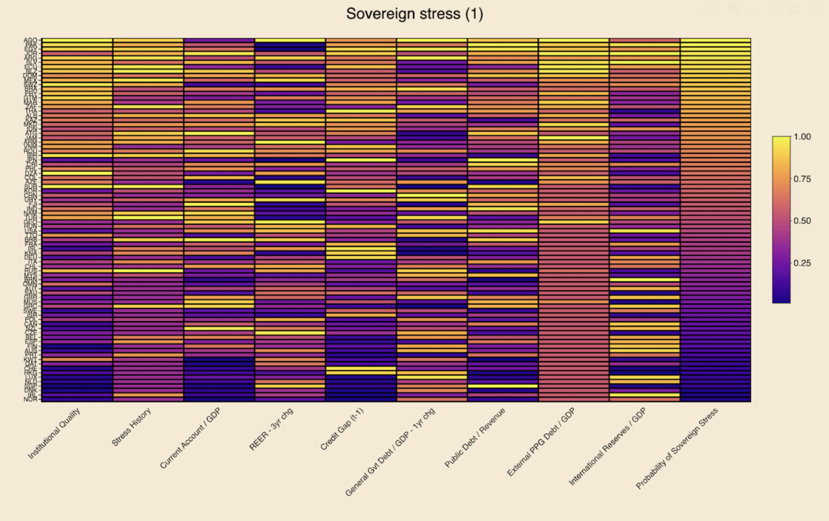
Heatmaps
Using the latest available data for 2023, the heatmaps below rank order countries by the probability of experiencing sovereign stress, as represented by the column farthest to the right. Neither the probabilities for the dependent variable nor any of the raw data readings for any of the independent variables is shown below. Instead, readers can see the percentile rank compared to the maximum value in each variable column, which is beneficial for visually detecting relative heat for each indicator.
Lighter colors represent more risk, while darker colors represent less risk. Independent variables with negative coefficients, i.e. are negative predictors of sovereign stress, have been reversed in order to ensure color scheme coherence. These include institutional quality, the current account, and international reserves.
The first heatmap below suggests that Angola, Pakistan, Egypt, Jordan, Argentina, El Salvador, Ecuador, and Belize are most at risk of experiencing sovereign debt strains. Looking across the independent variables for this group of countries:
- They generally suffer from high external public debt burdens and from relatively poor institutional quality, though Argentina and Jordan fare better on those measures, respectively.
- El Salvador is penalized relatively less on stress history, though this assumes spread widening in recent years remained under the IMF’s stress definition threshold (see “Model” section below).
- One-year changes in general government debt in Angola, Egypt, and Argentina point to potential risks.
- El Salvador, Jordan, and, to a lesser extent, Pakistan, appear to need some replenishing of their international reserve buffers.
- Angola and – to a lesser extent – Argentina are marked down for surging REERs.
- Pakistan and Egypt display relatively concerning public debt/revenue ratios.
- Jordan stands out for poor current account performance.
- Egypt, Jordan, and Ecuador exhibit high credit-to-GDP gaps, though several other countries fare worse on this measure.
Each value is divided by the maximal value in that column, resulting in its own empirical percentile. Each value shown is the percent of observations with that value or below it. Sources: IMF, WGI, WB, Bruegel, BIS, author’s calculations.
The second heatmap uses foreign currency general government debt to replace the external PPG debt indicator featured in the first heatmap (see explanation in “Data” section below). Neither of these indicators is ideal, as in both cases coverage for many countries is either lacking or data points are equal to zero. This is obvious in both heatmaps from the absence of dark-colored cells in the relevant column, meaning that many countries are zero. Overall country coverage on this variable is better in the first heatmap, but the second one provides value for countries where data is missing in the first one (e.g. Israel, Korea, Sweden).
The eight countries most at risk of sovereign stress in this second heatmap are the same as in the first one, albeit in a slightly different order and except for Mexico replacing Belize. On this latter point, FX general government debt data – sourced from the BIS (see “Data” section below) – is missing for Belize, conferring on it an unfair advantage over Mexico and other countries where data are present for this indicator. In the first heatmap, external debt data is present for both Mexico and Belize, with the latter appearing more at risk than the former.
Each value is divided by the maximal value in that column, resulting in its own empirical percentile. Each value shown is the percent of observations with that value or below it. Sources: IMF, WGI, WB, Bruegel, BIS, author’s calculations.
Interpretation
Focusing on a country case helps illustrate ways to interpret the data in this model. Take Angola, as it appears most at-risk. Using heatmap (1), the brightest and thus most concerning data points are in the institutional quality, REER 3-year change, general government debt 1-year change, and external public and publicly-guaranteed debt columns. This suggests that the government and public sector more broadly are borrowing heavily, while prices and the exchange rate have also combined to rise quickly. Moreover, the institutions to set a good policy framework appear to be lacking. This is already a dangerous mix.
On the other hand, Angola scores well on its current account balance and international reserves variables. This is easily explained by the fact that the country is an oil exporter, thereby keeping its current account balance high and accumulating foreign reserves from the proceeds of these oil sales to buyers abroad.
While these oil exports provide Luanda with ample benefits, heavy reliance on a commodity-based export sector is also a double-edged sword. The result is often an appreciation of the exchange rate, making the economy less competitive for developing other industries: a classic case of Dutch Disease.
More concerning still is the presence of high inflation. The country’s surging REER variable already suggests that prices are probably rising, as the overall increase is unlikely to be due to nominal exchange rate dynamics alone. Increases in government debt suggest potential fiscal profligacy, which can lead to undesirably-high inflation, the presence of which is confirmed by a glance at recent Angolan statistics. The credit-to-GDP gap, which measures the deviation from trend of credit to the non-financial private sector as a share of GDP, is not particularly alarming in Angola, but may be high enough to also be contributing to the rising price level.
Angola also exhibits a high public debt-to-revenue ratio, which is worrying, given all the oil revenues that the country is seemingly raking in, suggesting that less borrowing and more fiscal discipline are likely needed. Recent sovereign stress is also a concern, indicating that, for all its natural resources, the government is unable or unwilling to pursue policies required to maintain macroeconomic stability.
Model
To recap, the model’s dependent variable is the probability of sovereign stress, which the IMF has detailed criteria for defining – running the gamut from outright default to a mere spread widening beyond a certain threshold. Regarding the independent variables:
- The first two represent how recently a country has experienced sovereign stress, and its government effectiveness and regulatory quality.
- Other explanatory variables are macroeconomic in nature, including current account balances, real effective exchange rates – which also capture price changes, credit gaps to the private sector, and international reserves.
- More specifically fiscal indicators include those on general government debt, foreign currency public debt, and public debt-to-revenue ratios.
- With the exception of REERs and debt-to-revenue, these macro-fiscal indicators are all expressed as a share of GDP.
- A global variable also features in the model, the VIX Index, which measures stock market volatility in the US, but is not presented in the heatmaps above, given its constance across countries.
Data
In the first iteration of the tracker, 2023 data was captured for 43 market-access countries, including both emerging markets-developing economies and advanced economies. Thanks to more available data for this year and refinements in data capture, coverage has been expanded to 82 MACs in these heatmaps.
Two similar heatmaps are presented in this article, with a difference in one of the independent variables and, as a result, slight changes to the overall results in the dependent variable. One of the IMF’s indicators is foreign currency public debt. In the first instance, the World Bank indicator for external public and publicly-guaranteed debt is used as the best available proxy for the IMF’s variable. While using this data from the World Bank remains the best possible option at this stage, there are some glaring omissions in coverage. For instance, the World Bank source suggests that Israel’s external PPG debt is equal to zero, which is clearly incorrect.
As a remedy to the World Bank’s data deficiencies, a second heatmap applies data from the Bank of International Settlements on foreign currency general government debt, as a proxy for this indicator in the same overall model. The BIS data does fill in some of the World Bank gaps – e.g. Israel – but in fact covers fewer countries than the first source. As such, the first heatmap is still preferable.
It is also worth noting that both the World Bank and BIS indicators differ from the IMF variable of foreign currency public debt. In the former case, external public debt differs somewhat from foreign currency public debt, even if virtually all external debt is in foreign currency. In the latter case, foreign currency general government debt excludes some types of debt that is covered under foreign currency public debt.
One reply on “Sovereign debt stress heatmaps”
[…] the release of sovereign debt stress heatmaps for 82 market-access countries, the underlying data for nine indicators for near-term risks is now […]