
One of the holy grails in the economics profession is to accurately measure an economy’s output gap, which is the difference between its actual GDP and potential GDP. Having an accurate representation of an output gap is useful for all sorts of economic modeling purposes, given statistical relationships with inflation, exchange rates, and a host of other variables of interest to economists, investors, and policymakers. Simply put, a positive (negative) output gap means that actual GDP is above (below) potential GDP.
Yet the IMF in its flagship World Economic Outlook database provides output gaps for fewer than 30 advanced economies, to say nothing of emerging and developing economies. The Fund does of course in many cases provide such estimates elsewhere, such as in country and program monitoring reports, but, unfortunately, leaves these out of the WEO.
Measuring output gaps is notoriously riddled with uncertainty because, unlike actual GDP, potential GDP isn’t directly observed through spending or income. Rather, it needs to be estimated in some other way, which I have done for the broadest possible group of advanced and emerging-developing economies.
The optimal approach for calculating potential GDP likely focuses on supply side inputs including total factor productivity, labor, and capital à la Y = ALαK1−α, an example of which is the Production Function Methodology. Yet such methodologies can be data-intensive, especially when looking at emerging and developing economies, for which data is often scarcer.
An alternative is to use a moving averages approach – one of which is known as Hodrick-Prescott filtering – that separates actual GDP readings into trend and cyclical components, representing potential output and the output gap, respectively. One of the downsides of this approach is that it may misestimate potential output by ignoring the individual supply-side constituents used in bottom-up methodologies. An advantage of HP filtering is that potential GDP and output gaps can be quickly estimated for a broad group of countries from real GDP data.
The problem is of course whether the HP-estimated output gaps that I have prepared are actually any good. To assess this, I compare the HP results with the countries – all of which are advanced economies – for which the IMF provides output gap estimates in its World Economic Outlook database. Using the October 2023 WEO, I derive the HP output gaps for many countries with annual real GDP readings and λ = 100. I rely on data in national currency, which has the benefit of minimizing exchange rate effects that are present in USD data. I then plot the HP-derived output gaps against the IMF’s own output gap estimates, hoping to see something resembling a positive, one-to-one relationship, which the data bear out fairly well:
Behind the scenes I’ve looked at slopes by individual countries (remember m = Δy/Δx), and these all seem to be m < 1, indicating that there is more variance in the HP-derived output gaps. In any case, these data seem to track pretty closely, meaning that the HP gaps probably have some analytical value.
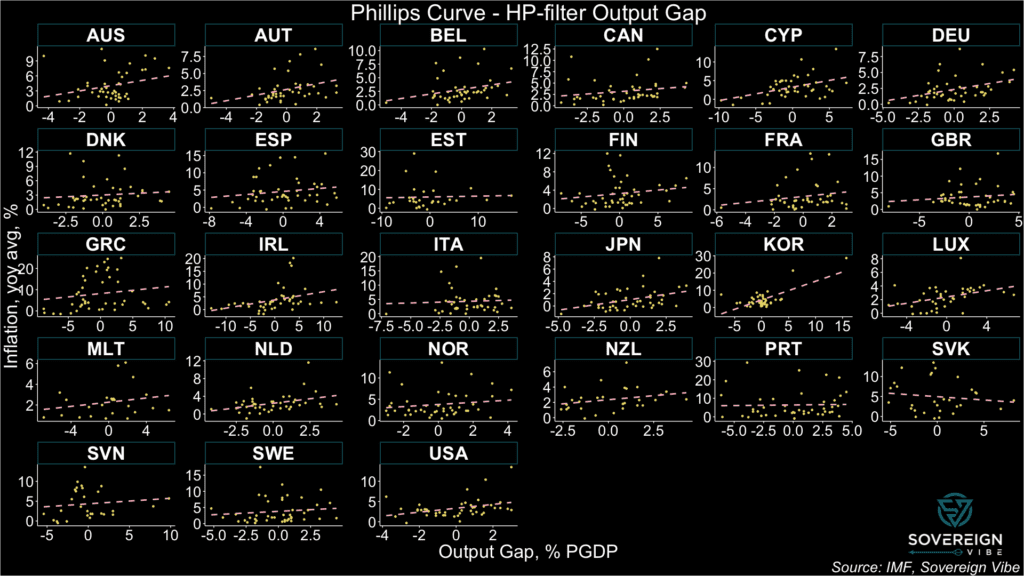
Next, I put the WEO and HP output gaps to the test separately against inflation readings, expecting the relationship to be positive. The theoretical underpinning is that when an economy is running hot – i.e. its output gap is positive – prices tend to rise more. Known as the Phillips Curve, this relationship is also often shown as the negative link between inflation and unemployment.
The two faceted charts below show Phillips Curves for the selected countries where IMF output gap estimates are available in the WEO. The first one uses the IMF’s output gap estimates in the x-axis, while the second one uses the HP-derived ones. Consistently positive relationships likely point to better output gap measurement.
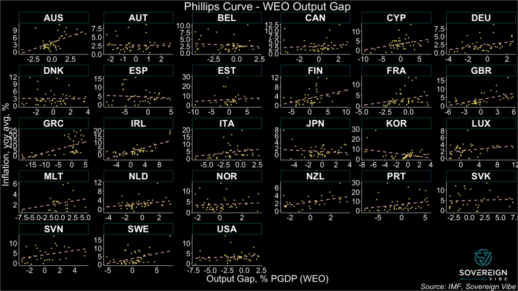
In the first chart, the WEO’s output gap estimates point to a positive relationship with inflation in most countries, as per the fitted linear regression lines. There are, however, some exceptions. Austria, Belgium, Spain, Japan, Korea, and possibly Denmark all exhibit negative relationships. Others such as Slovakia, Estonia, and Norway appear quite flat. This calls into question the IMF’s output gap estimates in these countries, according to the Fund’s own data.
On the other hand, the second chart exhibits more consistently-positive relationships with inflation in this sample of countries, suggesting that the HP-derived output gaps may actually be more accurate than those provided by the IMF. Slovakia appears to be the only country with a negatively-sloped line, although admittedly Estonia, Italy, and Portugal are nearly flat.
One reply on “On a quest for output gaps”
[…] on recent work on how to measure deviations of actual GDP from real GDP, known as an output gap, I’m pleased to reveal a world […]