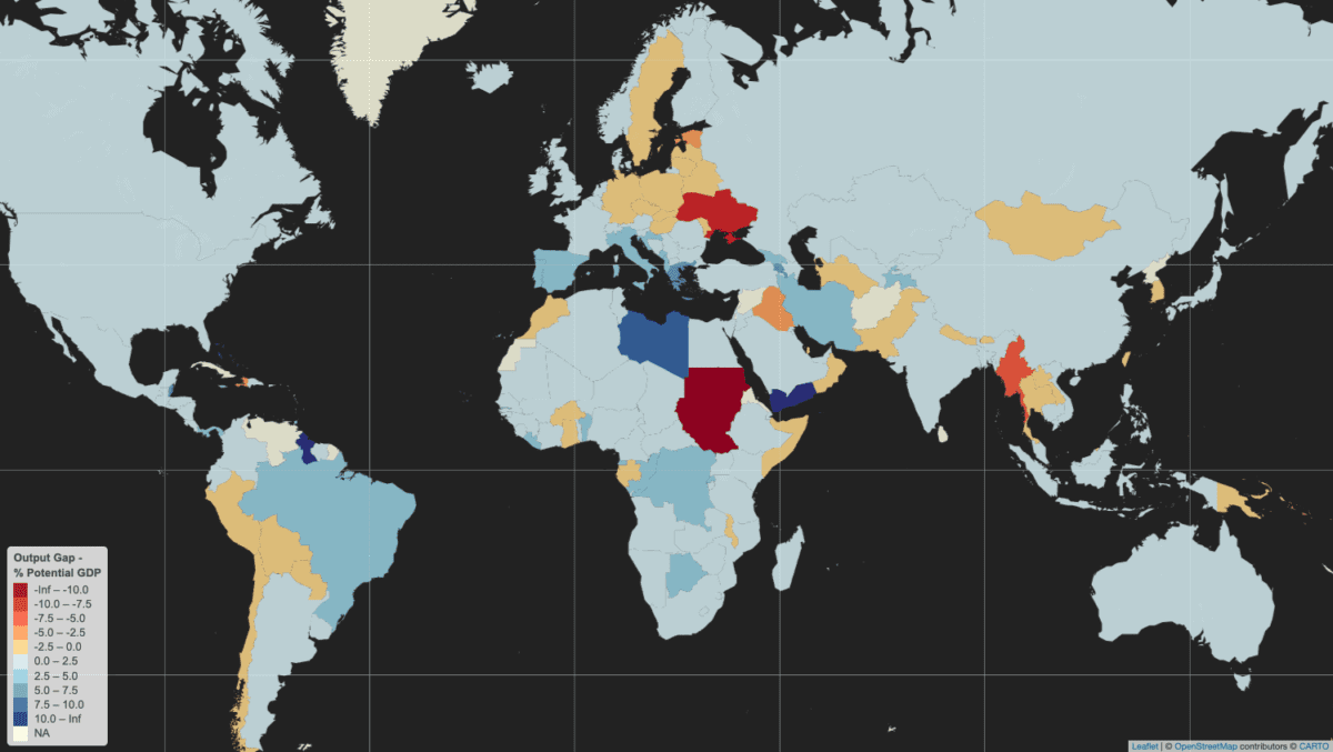
Building on recent work on how to measure deviations of actual GDP from potential GDP, known as an output gap, I’m pleased to reveal a world map of results for 2023. Remember that an output gap is positive when actual GDP is above potential – or trend – and negative when it is below. In the map below, countries in blue have positive output gaps in 2023, while those in orange and red are negative.
While most countries are exhibiting above-trend GDP growth, there are some noteworthy pockets of below-trend output. Chief among these is a large negative output gap in Ukraine, clearly related to the ongoing war with Russia, and which also appears to have infected several of its neighbors in north-eastern and north-central Europe.
Other countries with active conflicts or security-related concerns also seem to be well below potential: Sudan, Myanmar, Haiti, and Iraq.
There are also some clusters of negative gaps in various regions: Latin America (Peru, Bolivia, Paraguay, and Chile), South/Southeast Asia (Pakistan, Nepal, Bhutan, Myanmar, Thailand, Laos), and West-Central Africa (Ghana, Burkina Faso, Gabon).
As for the positive output gaps around the world, these are mostly in the range of 0-2.5% of potential GDP. Much of southern Europe is above this level: Portugal, Spain, Italy, Croatia, Montenegro, Albania, Greece. Farther east, Georgia, Armenia, Iran, and Tajikistan have also recorded above-trend output beyond 2.5%. Brazil and some parts of Africa (Libya, Republic of Congo, Democratic Republic of Congo, Botswana, Benin, and Liberia).
The countries with the largest positive output gaps are in darkest blue: Guyana, Yemen, and Libya. The latter two have of course experienced significant conflicts over the past decade, suggesting that actual GDP is now well above trend as a result of those previous shocks. High positive output gaps can also be a symptom of economic overheating.
Note that data for 2023 is absent for some countries in the map because the IMF did not provide actual GDP estimates for this year in its October 2023 World Economic Outlook. These include Sri Lanka, Afghanistan, Syria, Venezuela, and Cuba. Given high economic uncertainty and/or the absence of reliable data from these countries, fair enough.
Trend GDP: a visual primer
So far in my writing about output gaps I haven’t made any visual presentations of what real and potential GDP look like. As explained previously, measuring potential GDP is complicated and data-intensive, so economists often use a shortcut: deriving a moving average of actual GDP readings as a proxy for potential GDP. The approach I have taken is known as Hodrick-Prescott filtering.
As a result of the previously-noted pitfalls of using moving averages to measure potential GDP, I refer to the term of “trend” rather than “potential” GDP. As for “actual” GDP, this is data in national currency units using constant prices, meaning that it is real – and not nominal – GDP.
The charts below provide examples actual and trend GDP. I’ve selected these countries because they are ongoing sovereign debt restructuring cases of interest, even if I only present them here for demonstrating how actual / real and trend / potential GDP relate to each other and output gaps:
Output Gap = (Real GDP - Potential GDP) / Potential GDP * 100


Sri Lanka is perhaps the most interesting case, even if the data is only through 2022: a sizable positive output gap – indicating potential overheating in the economy – preceded a sharp drop in GDP, leading to a negative output gap. Also currently in negative territory, Ghana’s GDP exhibits some of the same behavior, albeit with less volatility.
Zambia sustained a positive output gap throughout most of the 2010s, until an economic contraction in 2020 led it into negative territory, though the gap turned positive again in 2023. Once one of the world’s fastest growing economies, Ethiopia’s economic growth has also been remarkably stable, despite the recent Tigray conflict. This makes for a more “boring” chart but is a credit to the country’s economy, with the output gap in marginally positive territory.
2 replies on “Mapping the world’s output gaps”
[…] Domestic output gap: actual output minus potential output in current USD (logarithmic difference). Economies in the boom phase of an economic cycle can experience strong import growth, appreciated exchange rates, and stronger remittance and primary income outflows, putting the current account under pressure. Unexpectedly, the coefficient is positive, and is also large and significant. Theoretically, exports could be a common driver of output gaps and CABs in EMs, as they are positively associated with both. […]
[…] output gap: actual output minus potential output in current USD (logarithmic difference). Economies in the […]