Categories
Sovereign Debt

Mind the credit gap

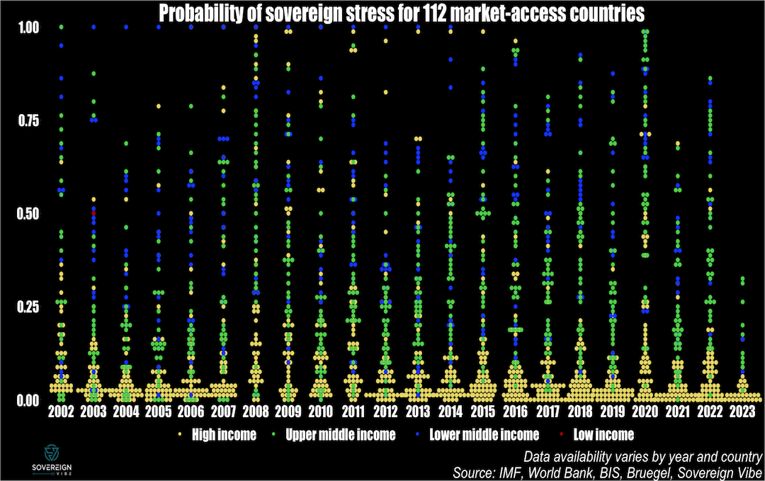
As part of tracking the probability of credit stress among 112 sovereign issuers, one of the variables of interest in the IMF’s model is the credit-to-GDP gap. This indicator matters not only because of its predictive power for sovereign credit events but for many other reasons as well, including monetary policy transmission and government borrowing. When analyzed in conjunction with other data, credit gaps are useful barometers for detecting the presence of credit bubbles, economic over- or under-heating, and policy distortions such as financial repression and fiscal dominance.

Credit gaps are derived from observations of credit extended to the private sector as a percentage of GDP, and then a statistical technique, usually Hodrick-Prescott filtering, is used to smooth out the data points in the time series as a way to measure an underlying trend. While there are some shortcomings to this approach, including the arbitrary nature of the smoothing parameters used to identify the trend, it helps ascertain whether the cyclical component of lending is above or below long-term expected processes.

A credit-to-GDP gap is thus an actual observation at time t minus the trend in the same time period. As such, a positive credit gap is one in which lending is above trend, whereas a negative one is below. The credit gap coefficient in the IMF model is positive, as is the case in other models in the financial crisis academic literature, meaning that higher values are associated with an increased likelihood of sovereign debt strains. Looking at quarterly data through end-202212023 data will be presented in future posts on credit gaps. from the Bank of International Settlements on 43 countries plus the Euro Area, this first set of charts presents the actual credit-to-GDP ratios in blue, the smoothed trend in yellow, and the credit-to-GDP gaps in green.

SLIDE DOWN: actual data vs trend; SLIDE UP: the cyclical gap between the two; XM = Euro Area

In the chart above, credit gaps in this mix of developed (DMs) and major emerging market economies (EMs) are currently mostly negative. This makes sense given the tighter monetary policy stances around the world to combat inflation, with EM central banks having begun their rate-raising cycles2Some EM central banks are so far ahead of DM that they have already begun cutting rates in 2023. before their DM peers. A spike in credit gaps can also be observed in 2020 as policymakers worldwide lowered interest rates and facilitated the extension of credit as part of emergency measures to mitigate economic scarring at the height of the pandemic.

The BIS credit gap data is extremely useful for this set of countries, which, after all, comprise the world’s largest economies, and all the more so because it is available on a quarterly basis. The BIS describes its credit-to-GDP ratio as capturing total borrowing from all domestic and foreign sources by the private non-financial sector.3https://www.bis.org/statistics/about_credit_stats.htm However, other sources are needed for measuring credit to the private sector in other countries, and, thankfully, the World Bank has a similar indicator: domestic credit to the private sector by banks.4 https://databank.worldbank.org/metadataglossary/jobs/series/FS.AST.PRVT.GD.ZS The World Bank data series has far broader country coverage than the BIS data, thus opening vast additional swathes of the world to analytical coverage.

In contrast to the BIS data with its inclusion of both domestic and foreign credit to the non-financial private sector, the World Bank indicator appears to only include domestic sources of financing. Moreover, the BIS data appears to include sources of non-bank financing, unlike the World Bank data. Taken together, these two differences likely explain much of the discrepancy between these two datasets. Further, the World Bank data appears to only be available at a yearly frequency, thus requiring the BIS quarterly data to be transformed to yearly averages for the purposes of comparison.

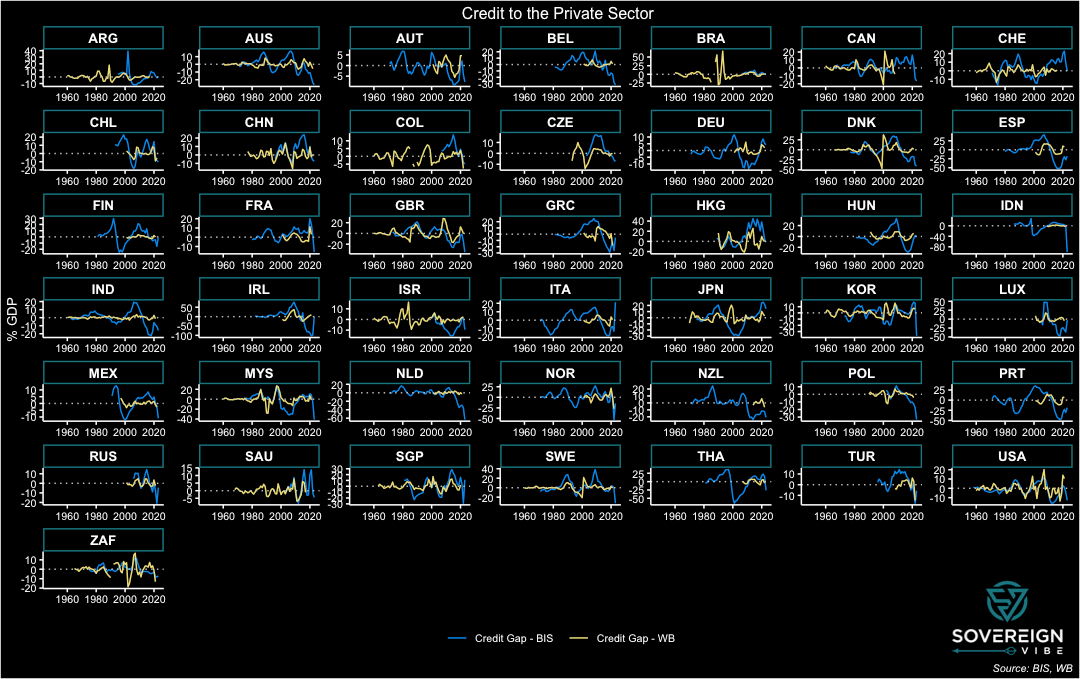
The charts below present BIS data in blue and World Bank data in yellow, in yearly form through end-2022 in both cases. As seen above, the BIS provides credit gap and trend data alongside its credit ratios and uses a one-sided Hodrick-Prescott filter with the smoothing parameter λ set to 400,000 for this quarterly data. The World Bank only provides its credit ratios on a standalone basis, meaning that the trend and credit gap need to be estimated independently. This is simple enough for one country, and thankfully panel statistical techniques enable scalability for quick estimation across a large number of countries and years. As such, trends and credit gaps are derived from the World Bank’s credit ratios using a two-sided HP filter with λ = 100, the recommended setting for annual data.

SLIDE DOWN: actual data; SLIDE UP: trend data, smoothed with HP filters

Consistent with the inclusion of foreign sources of credit, the BIS credit ratios are usually higher than those from the World Bank, especially in many European countries, e.g. Luxembourg and Belgium. Elsewhere, the figures track more closely, as is the case with Japan, Malaysia, and the UK. The US and China also fell into this category, but the datasets have diverged in recent decades for those countries. Surprisingly, there are also a few countries where the World Bank ratio exceeds the BIS reading, despite the former excluding foreign credit sources, with South Africa and the US standing out most prominently from this perspective.

The point of comparing the two datasets is to use the BIS as a benchmark to get a sense if the World Bank data is at least somewhat aligned with the former and it is any good for predictive purposes. Certainly, the similar characteristics of the actual and trend data above are a positive sign. As for the credit gaps themselves, the BIS and World Bank figures are presented below. While there are large differences in most countries, there are also similar processes at work in many countries, e.g. the United Kingdom, Malaysia. The BIS credit gaps appear to be more volatile than those of the World Bank, which could be explained by the former’s inclusion of foreign lending: capital flows of the portfolio variety, which includes debt, are prone to sudden stops and starts.

SLIDE DOWN: credit gaps; SLIDE UP: difference in credit gaps (WB – BIS)

To simplify further, the difference in the BIS and World Bank credit gaps, where the former is subtracted from the latter (difference = WB – BIS), features in the chart above. Ideally, the data readings would all be horizontal lines at zero or at least resemble a stationary process hovering above and below zero. While some countries do have these features – Sweden, the UK, the US, and Switzerland, among others, a large cohort exhibits some sort of bias. A statistical test of this difference in credit gaps across this panel of countries over these years would likely reject the notion that the difference is equal to zero. Nevertheless, the World Bank domestic credit to private sector by banks indicator seems fit for purpose, particularly given the large role that domestic banks play in credit provision in most economies.

Future posts will expand further on the importance of credit gaps and present broad country coverage of World Bank credit gap data.

  • 1
    2023 data will be presented in future posts on credit gaps.
  • 2
    Some EM central banks are so far ahead of DM that they have already begun cutting rates in 2023.
  • 3
    https://www.bis.org/statistics/about_credit_stats.htm
  • 4
    https://databank.worldbank.org/metadataglossary/jobs/series/FS.AST.PRVT.GD.ZS
Categories
Sovereign Debt

Tracking sovereign stress in 112 countries

Introducing a sovereign stress tracker covering 100+ countries, based on the IMF’s Debt Sustainability Framework for Market-Access Countries. The model used in this analysis suggests that sovereign debt strains are lower in 2023 than they were in either 2022 or 2020 for this group of countries. MACs comprise all economies that are lower-middle income and above, including many emerging economies and all advanced economies.

Market-Access Countries

In 2021, the IMF released its new Debt Sustainability Analysis framework for Market-Access Countries, in line with its differentiation between MACs and low-income countries. The reasons given for distinguishing between these two groups is that MACs generally have significant access to international capital markets, whereas LICs rely on concessional resources to fulfill their external financing needs.

As such, the Fund has a separate approach to debt sustainability analysis for LICs, which is beyond the scope of this tracker. The strict definition is that countries eligible for the IMF’s Poverty Reduction and Growth Trust, which is an interest-free concessional financing tool, are treated as LICs, whereas the rest are considered MACs.

Geographic coverage

Overall, 140+ countries and territories were included in this analysis, but results were only obtained for 112,1Angola, Albania, United Arab Emirates, Argentina, Armenia, Antigua & Barbuda, Australia, Austria, Azerbaijan, Belgium, Bulgaria, Bahrain, Bahamas, Bosnia & Herzegovina, Belarus, Belize, Bolivia, Brazil, Barbados, Brunei, Botswana, Canada, Switzerland, Chile, China, Colombia, Costa Rica,  Cyprus, Czechia, Germany, Denmark, Dominican Republic, Algeria, Ecuador, Egypt, Spain, Estonia, Finland, Fiji, France, Gabon, United Kingdom, Georgia, Equatorial Guinea, Greece, Guatemala, Hong Kong SAR, China, Croatia, Hungary, Indonesia, India, Ireland, Iran, Iraq, Iceland, Israel, Italy, Jamaica, Jordan, Japan, Kazakhstan, St. Kitts & Nevis, South Korea, Kuwait, Lebanon, Sri Lanka, Lithuania, Luxembourg, Latvia, Morocco, Mexico, North Macedonia, Malta, Mongolia, Mauritius, Malaysia, Namibia, Nigeria, Netherlands, Norway, New Zealand, Oman, Pakistan, Panama, Peru, Philippines, Poland, Portugal, Paraguay, Qatar, Romania, Russia, Saudi Arabia, Singapore, El Salvador, Suriname, Slovakia, Slovenia, Sweden, Eswatini, Seychelles, Syria, Thailand, Trinidad & Tobago, Tunisia, Turkey, Ukraine, Uruguay, United States, Venezuela, Vietnam, South Africa given insufficient data availability in around 30 cases. The analysis is based on a multivariate model, meaning that a missing data point for a single variable across all years makes it impossible to derive a final measurement for the country in question, resulting in exclusion.

The calculated probabilities of sovereign stress for the 112 countries do not cover all years, unfortunately. For instance, there are only results for 43 countries in 2023, given less availability of annual data and/or forecasts for the current year. Data coverage will be improved in future iterations of the tracker.

All countries included are either high, upper middle, or lower middle income countries, with few exceptions, such as Syria, which the World Bank reclassified as a LIC in 2018. There is also some debate as to whether Venezuela constitutes an UMIC or a LMIC, though it is treated as a LMIC here.

Model

The IMF claims that extensive testing demonstrates that its new MAC DSF is much better at accurately predicting sovereign debt distress. Predictive analysis is based on a multivariate logit model developed by Fund staff. Passing the required data into the model provides a probability that a sovereign borrower experiences debt stress:

Multivariate logit model specification

RegressorCoefficient
Institutional quality-1.073 ***
Stress History0.514 ***
Current account balance/GDP-0.024 **
REER (3-year change)0.013 **
Credit/GDP gap (t -1)0.086 ***
Δ Public debt/GDP0.052 ***
Public debt/revenue0.002 ***
FX public debt/GDP0.024 ***
International reserves/GDP-0.034 ***
ΔVIX0.015 ***
*** / ** indicate statistical significance at the 1 percent / 5 percent levels

Results

In addition to the dotplot chart above, a further way to view the broad results from this analysis of 112 countries is as a boxplot, presented below. I fully acknowledge that this data is unbalanced, given the limited number of data points in 2023 and also in the early 2000s – as can be seen in the first chart above – compared to better country representation in the middle years of the sample. More charts are presented in the next section below in order to address this issue.

As can be seen in the data, in 2023 there appears to be less systemic sovereign stress among MACs as compared to previous years, particularly 2022 and 2020. Future posts will provide granular details and heatmaps at the country level.


  • 1
    Angola, Albania, United Arab Emirates, Argentina, Armenia, Antigua & Barbuda, Australia, Austria, Azerbaijan, Belgium, Bulgaria, Bahrain, Bahamas, Bosnia & Herzegovina, Belarus, Belize, Bolivia, Brazil, Barbados, Brunei, Botswana, Canada, Switzerland, Chile, China, Colombia, Costa Rica,  Cyprus, Czechia, Germany, Denmark, Dominican Republic, Algeria, Ecuador, Egypt, Spain, Estonia, Finland, Fiji, France, Gabon, United Kingdom, Georgia, Equatorial Guinea, Greece, Guatemala, Hong Kong SAR, China, Croatia, Hungary, Indonesia, India, Ireland, Iran, Iraq, Iceland, Israel, Italy, Jamaica, Jordan, Japan, Kazakhstan, St. Kitts & Nevis, South Korea, Kuwait, Lebanon, Sri Lanka, Lithuania, Luxembourg, Latvia, Morocco, Mexico, North Macedonia, Malta, Mongolia, Mauritius, Malaysia, Namibia, Nigeria, Netherlands, Norway, New Zealand, Oman, Pakistan, Panama, Peru, Philippines, Poland, Portugal, Paraguay, Qatar, Romania, Russia, Saudi Arabia, Singapore, El Salvador, Suriname, Slovakia, Slovenia, Sweden, Eswatini, Seychelles, Syria, Thailand, Trinidad & Tobago, Tunisia, Turkey, Ukraine, Uruguay, United States, Venezuela, Vietnam, South Africa
Categories
Sovereign Debt

Update: Debt Dashboard for Low-Income Countries

The first web application as part of Sovereign Vibe’s DataHub disaggregates the World Bank’s International Debt Statistics’ outstanding debt stock data for 68 low-income countries by creditors type: multilateral, bilateral, and private. Further decompositions are provided for the concessional and non-concessional components of multilateral and bilateral lending, and also for private credit by bondholders, banks, and other private lenders.

This first update to the “External Sovereign Debt: DSSI Countries” dashboard adds some helpful new features for users seeking to quickly view and analyze external public and publicly-guaranteed debt stock data. To begin with, the updated app now covers data extending back to 1970, the earliest year available in the WB database. The pilot version only extended coverage back to 2000, given the heavier data burden and the uncertainties around this initial attempt.

Secondly, this new version of the dashboard allows users to view the IDS debt stock data in US dollars, as previously, but now also includes an option to view the readings as a percentage of GDP.

Third, a new category has been created to aggregate all borrowing countries. When opening the application, the “Sovereign borrower(s)” category defaults to “All DSSI,” while the “Creditor(s)” menu defaults to “World” so that users can get a high-level view of all lending (i.e. from the entire world) for all these countries (i.e. all DSSI) at once. This view is presented in the previous post, “Cure worse than the disease,” but was previously unavailable through the dashboard.

Finally, the update enables users to select multiple creditors when viewing a country’s external debt stock. Over two hundred creditor locations and types are specified in the creditor menu, so, for example, a user could choose to look at how much China, France, bondholders, and the World Bank-IBRD have lent to Zambia up until the latest data reading.

Further updates to this dashboard could include allowing users to select multiple borrowers at once. While in practice providing this is currently possible for viewing the debt stock data in US dollars, some back-end work is needed to make aggregating borrowers usable in percentage of GDP. Next steps will include:

  • Enabling users to select multiple borrowers at once
  • Expanding coverage to the broader emerging markets universe
  • Moving beyond external debt stocks and towards associated external sovereign debt flows
  • Progressing from descriptive data towards analytical outputs

What are your thoughts on this basic dashboard? How do you think it could be improved, and what features would you like to see? Feel free to submit comments in the section below or via the website’s Contact page.

All suggestions for avenues of further research are welcome as Sovereign Vibe progresses from its current pilot phase towards deeper analysis of challenges facing the sovereign debt landscape and the emerging markets complex.

Categories
Sovereign Debt

Cure worse than the disease

A high-level snapshot of the structure of outstanding external sovereign debt burdens for low-income countries and reflections on the G20’s pandemic-era DSSI policy and its successor, the Common Framework for Debt Treatments beyond the DSSI.

LIC debt burdens

During last month’s IMF-World Bank Spring Meetings, I listened to a discussion on debt crisis resolution between civil society activists and IMF staff. The vastly different frames of reference, language, and motivations on low-income country (LIC) debt playing out were captivating. It is precisely this clash of worlds that the sovereign debt space needs more of as stakeholders search for the best policies to foster inclusive growth and eradicate poverty.

Civil society organizations (CSOs) have a long-standing and well-known position on LIC external sovereign debt: in a nutshell, just cancel it. Indeed, rising external debt burdens in LICs in recent years have fueled more calls for debt forgiveness. Looking at the DSSI-eligible LICs, the rapid increase in external sovereign debt in the 2010s does give pause for concern. While the overall external public and publicly-guaranteed (PPG) debt load hovered around $200 billion throughout the 1990s and 2000s, it surpassed the $600 billion mark in 2021.

Contrast the CSO perspective with IMF staff assertions that external sovereign debt strains in LICs are less severe today than in the past. Needless to say, the CSO representatives were essentially unanimous in taking issue with this position, labeling it as provocative. IMF staff presented a chart resembling the one below, highlighting how external public debt-to-GDP was much heavier previously. In fact, the most acute strains occurred in the mid-1990s. These declined until the late 2000s, partly thanks to the Heavily-Indebted Poor Countries initiative (HIPC) from 1996 and the Multilateral Debt Relief Initiative (MDRI) from 2005.

While today’s external PPG debt ratios are less alarming, the growth of domestic capital markets in many LICs suggests that overall (i.e. domestic plus external) sovereign debt-to-GDP could be too high. Moreover, LIC sovereigns have borrowed more on non-concessional terms over the past decade, pointing to greater interest payment pressures.

The new data above will augment the DSSI dashboard in the Sovereign Vibe DataHub, where users can filter data by borrower and creditor.

Categories
Sovereign Debt

Welcome!

Introducing the Sovereign Vibe project in this first blog post, for your reading pleasure.

What is Sovereign Vibe?

Sovereign Vibe is a data-focused blog designed to provide actionable insights on emerging markets sovereign debt, global macroeconomics, and capital markets. And by “emerging markets” and “global macroeconomics,” what I really mean is that this blog will cover emerging, frontier, and developing economies, or at least to the extent my one-person bandwidth permits.

My preferred catch-all term for this is one that the International Monetary Fund also uses: emerging and developing economies (EMDEs). Since EMDEs are greatly affected by what happens in advanced economies (AEs), I’ll also be exploring some relevant developments in the US and other wealthy countries whenever I deem useful.

This is a project that I have wanted to do for a long time, for at least two reasons. The first is that what should be easily-accessible sovereign debt data often requires some wrangling before useful information can be extracted from it. The second is that narratives on EMDEs are too often siloed, with limited cross-referencing among the commentariat comprising development experts, policymakers, investors, bankers, lawyers, journalists, activists, and geopolitical strategists. Generating fresh insights from data and bringing diffuse analysis together should provide some big-picture value to the reader. If you agree, please consider subscribing below for free newsletter email updates.

What do you mean by data?

Well, here’s an example. The chart below shows the outstanding external public and publicly-guaranteed debt stock of 68 Low-Income Countries (LICs), a subset of the EMDEs. This data comes from the World Bank’s well-known International Debt Statistics database and covers the countries eligible for the G20’s Debt Service Suspension Initiative (DSSI), which made it possible for these countries to delay servicing some of their external public debt during the pandemic in 2020 and 2021. In fact, 73 countries were eligible, but data is unavailable for five of them. I’ll cover the DSSI and its successor policy, the so-called Common Framework in more detail in future posts.

For now, as you can see, these poor countries amassed a lot of external sovereign debt in the 2010s, with the greatest increases coming in the form of private credit and non-concessional official lending. This latter type is of both the multilateral and bilateral variety, with “bilateral non-concessional” overlapping to a large extent with Chinese loans. Private and non-concessional is a pretty expensive mix for these borrowers, given the interest rates on those types of debt…but more on that some other time.

To get a clear breakdown of this data, check out the Sovereign Vibe DataHub, which features as its inaugural dashboard the decomposition of DSSI-eligible countries’ external public debt stock by borrowing country, creditor country, and creditor type.