With global public debt at $100 trillion, many countries need more IMF-World Bank help.
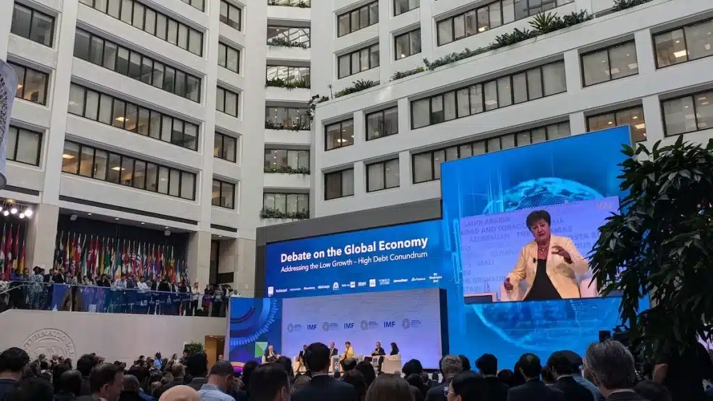
Now that the dust has settled over last week’s IMF-World Bank Annual Meetings here in Washington, D.C., I can’t help but feel underwhelmed.
The meetings have achieved only incremental progress at a time when bold measures are needed to foster growth, eradicate poverty, and achieve the United Nations’ Sustainable Development Goals.
IMF Managing Director Kristalina Georgieva speaking at IMF HQ1 on October 24th, 2024 in Washington, D.C. Credit: Paul Della Guardia
Outcomes
Some of the Meetings’ chief outcomes include:
The IMF Executive Board has reformed the charges, surcharges, and commitment fees that will lower the cost of borrowing for member countries by some $1.2 billion annually.
The G20 finance ministers and central bank governors have committed to a roadmap for building larger multilateral development banks.
The IMF has introduced a new “debt-at-risk” framework that assesses how changing economic, financial, and political conditions can alter the distribution of debt-to-GDP ratios in the future.
The prospects of providing the International Development Association with a record $100 billion replenishment later this year remain uncertain, amid competing policy visions and domestic fiscal pressures for donors.
Heavy debt burdens
I am far from the only participant who has been left nonplussed by the world’s premier global economic event.
None other than the U.S. Treasury is now pressuring the World Bank, IMF, and other international financial institutions to do more to help poor countries manage heavy debt burdens and handle punishing debt repayments over the next few years.
Global public debt now stands at around $100 trillion, with debt ratios having grown significantly in developing economies.
In 2013, only 6 African countries had debt-to-GDP ratios above 60%, whereas that figure has now risen to 27.
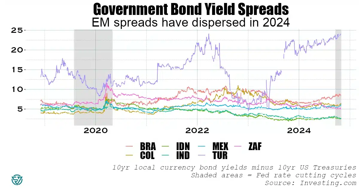
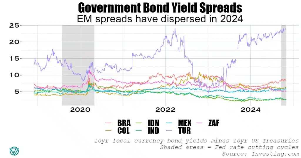
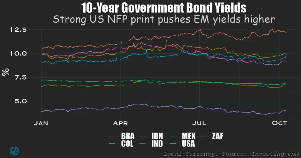
EM local currency sovereign spreads
The payment pressures that EM government borrowers face are real, both for low- and middle-income countries, though relief may come through the recently-begun Fed interest rate-cutting cycle.
Local currency bond spreads over U.S. Treasuries underscore the divergences in borrowing costs in the EM universe, while also reflecting domestic capital market development.
Spreads on Indian and Indonesian 10-year local currency bonds have declined significantly in recent years, to only 250 basis points, on the back of robust growth and sound economic policy.
Turkey has been grappling with inflation above 50%, hence the large nominal borrowing costs in lira.
Similarly, spreads on Brazilian 10-year sovereign bonds are also elevated this year amid perceptions of fiscal risks.
The same has been true in 2024 for Mexico, albeit to a lesser degree, as investors worry over the new Sheinbaum administration’s left-wing spending plans.
South African spreads have declined following the June election that brought the ruling African National Congress into a coalition with the center-right, market-friendly Democratic Alliance party.
The Fed’s data-dependence is clouding EM’s mostly-benign cutting cycle outlook.
Investor expectations of Fed policy and the resulting impact on US Treasury yields is increasingly affecting emerging market debt, as markets lurch from one narrative to another in response to data releases.
Volatility in the US Treasury market has surged since last Friday’s blockbuster US non-farm payrolls report, with investors expecting the Fed to slow the rate-cutting cycle.
The strong print dashed hopes of a second large cut at the Fed’s meeting in November, which had risen in the wake of the landmark 50 basis point decrease on September 18th.
This reversal sent US 10-year Treasuries above the 4% mark, while also placing upward pressure on EM local currency yields so far in October.
This month, ten-year yields are trending higher in India, Indonesia, South Africa (despite a recent rate cut), Mexico, and Colombia. Only Brazil has seen its long-term borrowing costs decline, although these remain elevated.
Mixed picture: today’s US macro data release
Today’s US data release of headline CPI declining to 2.4% in September could place upward pressure on US Treasury yields, as it was above the consensus forecast of 2.3%.
Moreover, core inflation also came in above economists’ expectations, at 3.3%.
On the other hand, US unemployment insurance filings beat the forecast number by 30,000, having risen to 258,000. This is the largest weekly increase this year, supporting the case for monetary policy easing.
In early trading, the two-year Treasury yield has remained stable, at slightly above 4%.
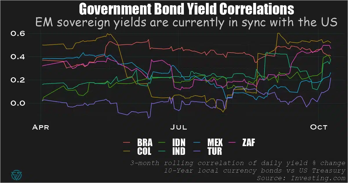
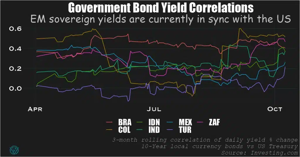
EM and Treasury yields are tightly correlated
Since August, EM sovereign yield correlations to US Treasuries have increased.
Looking at this relationship over a three-month rolling window, this tighter link has benefited EM government issuers.
Indeed, their borrowing costs were declining until end-September, except in the case of Brazil (see first chart above).
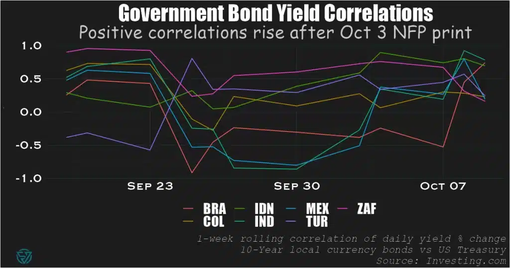
And since October 3’s large NFP figure, all seven in-sample EMs have seen their weekly yield correlations to US Treasuries turn positive.
Moreover, 10-year local currency government bonds in Brazil, India, and Indonesia have recorded positive weekly correlations with 10-year Treasuries of 0.75 or above.
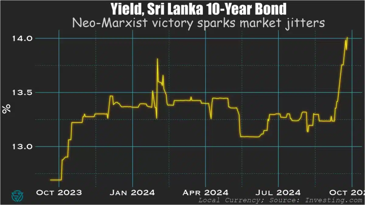
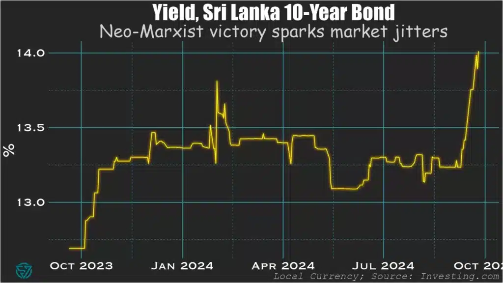
Markets cautious on newly-elected President Dissanayake, renegotiations.
In one of Sri Lanka’s greatest political shake-ups in decades, this weekend’s presidential election saw the victory of neo-Marxist Anura Kumara Dissanayake ahead of the country’s two main, established parties.
With the political establishment now swept away, Dissanayake now faces the arduous task of consolidating the economic recovery and setting public finances on a sustainable, growth-inducing trajectory.
Political Thunderbolt
Markets have had a mixed reaction to Anura Dissanayake’s victory in Sri Lanka’s presidential election over the weekend.
The bond market reaction has been fairly predictable for the election of a neo-Marxist, with Sri Lankan government yields sent soaring.
There are concerns that Dissanayake’s neo-Marxist leanings will lead to renegotiations of provisional debt restructuring deals and may even call some IMF conditionality into question.
Yields are also up over market uncertainty around how the new president and his party will govern, and whether that will threaten reform momentum.
The situation is fluid, with Dissanayake having dissolved parliament yesterday, where his party only holds three seats.
An End to Corrupt Rule?
There are some reasons to be hopeful. Local equities have been rising this week.
This could be related to the potential end to corrupt rule in the country and, with any luck, a pivot towards more transparent, inclusive governance and the stability that brings.
President Anura Kumara Dissanayake; Eranga Jayawardena/Associated Press
It’s easy to forget that what matters for governance is inclusivity, rather than focusing excessively on the left-right political spectrum.
The deeply-corrupt Rajapaksa dynasty was more market-friendly than Dissanayake on the surface.
But it was the endemic clientelism under their rule that led the country over the brink of default.
More than anything, this electoral result has been the repudiation of long-standing patronage networks.
As such, it should give investors hope for improved macroeconomic stability and public financial management.
If Dissanayake and his team manage to avoid measures that are excessively punitive for investors and businesses, including SMEs, brighter days may well be ahead for Sri Lanka and its stakeholders.
A Silver Lining to Renegotiations?
Moreover, there could be a silver lining to revising provisional debt restructuring agreements.
The bondholder deal is problematic as it is, as the macro-linked bonds will increase Sri Lanka’s future coupon payments if nominal dollar GDP rises beyond a certain threshold.
The macro-linked instruments are supposed to reflect strong growth.
But merely a strong currency appreciation that pushes GDP in nominal USD above the threshold, rather than rising output, could trigger the step-up.
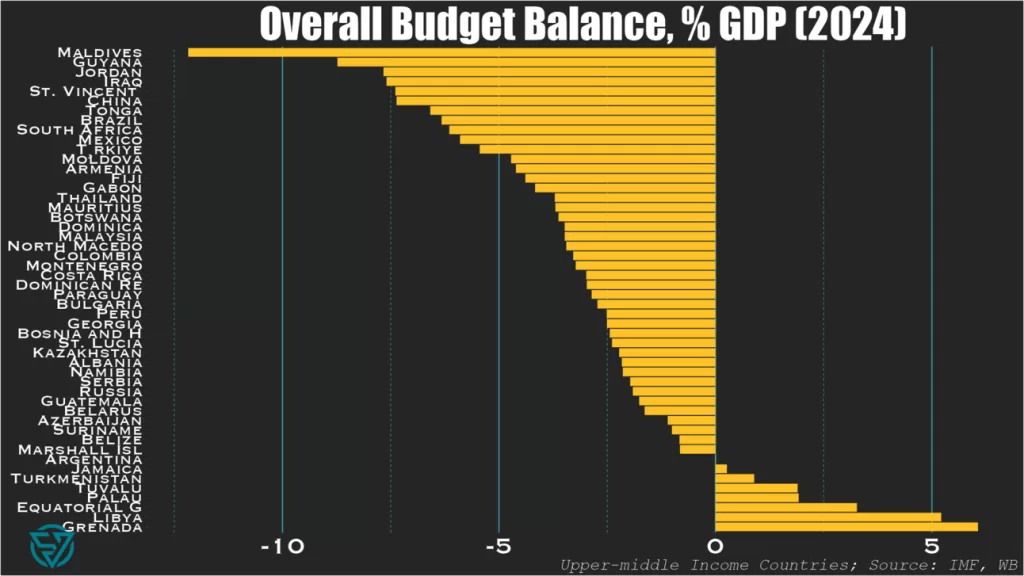
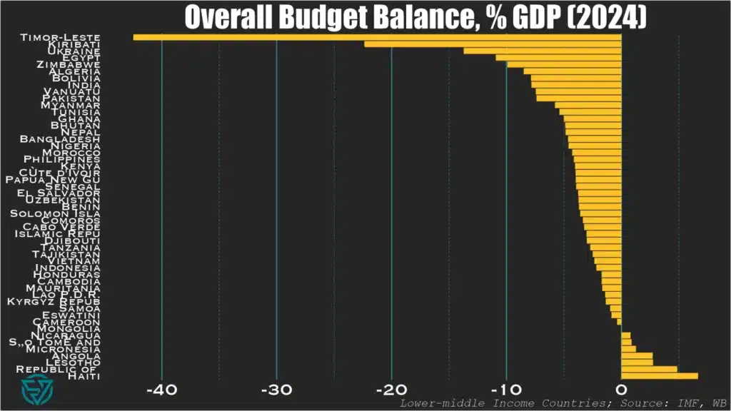
Small island states and large emerging markets have the biggest budget deficits in 2024.
So this week I wanted to take a quick look at how our beloved emerging and frontier markets compare fiscally .
In today’s newsletter I’m only showing you overall budget balances as a starting point. This is part of a larger deep-dive cross-country fiscal comparison that I’m working on.
As I’ve done previously, I segment the countries by income level, into upper-middle and lower-income groups. Here I rely on the IMF’s World Economic Outlook April 2024 database, using the forecasts for the current year.
Small Island States & “Big EM”
The first thing that stands out when comparing the upper-middle (first chart) and lower-income (second chart) country groups is that “only” one UMIC – the Maldives – has a budget deficit at or below -10%/GDP.
In contrast, five LMICs – Timor-Leste, Kiribati, Ukraine, Egypt, Zimbabwe – are at or below this threshold.
No wonder the Maldives is currently on the hunt for a bailout to avoid the first-ever sovereign default on an Islamic bond.
And taken together, these charts both underscore the frailties of small-island states. In addition to the ones mentioned above: St. Vincent, Tonga, Fiji, and Vanuatu also have yawning budget deficits.
The Washington Consensus
These lists are also noteworthy for the presence of large deficits in large emerging markets keen to use their borrowing power. Chief among them is China at -7.4%/GDP, followed by Brazil, South Africa, Mexico, and Turkey.
Though by now it’s fair to say that the Washington Consensus principle of fiscal discipline is effectively dead, with the US on track to run a -7%/GDP fiscal shortfall this year.
Among large emerging markets, only China is more profligate. Unlike the US, however, it is trying to spend its way out of an economic slump.
So for any countries out there in need of an IMF program, the message is “do as I say, not as I do” when told to rein in their government spending.
A Positive Note?
Not really, unless Jamaica or a chainsaw counts. The countries that run fiscal surpluses have one or more of the following characteristics:
Mineral wealth: Equatorial Guinea, Libya, Turkmenistan, Republic of Congo, Angola, Turkmenistan, Mongolia
Small islands with no borrowing power: Haiti, Lesotho, Tuvalu, Palau, Grenada, Micronesia, São Tomé and Príncipe
Behold the dashboard for low- and middle-income country external sovereign debt!
After peaking at $188 billion in 2021, for the first time in two decades the stock of low- and middle-income country sovereign debt that China holds declined in 2022. At just under $181 billion, this is still more than the US, France, the UK, Germany, Italy, and Canada combined. Nevertheless, this reversal confirms China’s pullback from its Belt and Road Initiative-driven lending that began in the early 2010s. It is also part of a broader global trend that saw LMICs’ external debt stock dip by $43 billion, from $3.490 trillion in 2021 to $3.447 trillion in 2022. Higher global interest rates are certainly part of the story.
China’s exposure to LMICs is $181 billion.
G7 ex-Japan exposure to LMICs is $161 billion.
There has been no shortage of coverage in recent years on Chinese lenders holding off on new loans to emerging and developing economies. Indeed, Beijing has been reconsidering its Belt and Road Initiative even as its sovereign lenders grapple with the consequences of having such large exposures to EMDEs for the first time. Chief among these of course have been the debt restructurings of recent years, which have underscored how the preferences of Chinese creditors diverge from those of other lenders.
The sharpest drops in percentage terms came in other private lending, which includes trade finance, and in the bilateral concessional category. While we shouldn’t read too deeply into this, I can’t help but muse that decreasing export credits is consistent with worsening frictions between China and its trading partners. Similarly, the drop in concessional overseas lending shouldn’t come as too much of a surprise in the context of domestic financial strains, as China’s property crisis roils onward.
bn USD
2022
2021
% Δ
$ Δ
Bilateral: Concessional
6.6
7.1
-7.8
-0.6
Bilateral: Non-Concessional
142.3
147.7
-3.6
-5.4
Private: Commercial Banks
29.1
30.1
-3.2
-1.0
Private: Other (incl. ECAs)
2.8
3.1
-10.3
-0.3
Total
180.8
188.0
-3.8
-7.2
Chinese lending to lower and middle income sovereign borrowers
Among LMICs, low-income countries are already feeling quite the pinch at China’s relative withdrawal. Chinese exposure to LICs has dropped by a full percentage point of GDP in just the space of a couple years. This is equivalent to a roughly 25% decline relative to output, as Chinese-held LIC debt has decreased from ~4% to ~3% of GDP since 2020.
Geographically, the outgoing Chinese tide is also affecting Africa. In 2022, China held less than $80 billion of African external debt, the lowest reading since 2018. While Sub-Saharan external debt actually increased in 2022, the pace has slowed compared to previous years. This reflects the lower exposure and significant weight of Chinese creditors, as they account for 1/6th of the $480 billion in global holdings of African external debt.
The World Bank’s International Debt Statistics are one of the top resources in the sovereign debt space. The data is released with about a year’s lag, meaning that full year data is currently only available through the end of 2022. But, as you can see, it’s such fertile analytical ground. So feel free to use this dashboard for your own purposes. Also available here.
EMDE sovereign borrowers walk a tightrope in the fragmented creditor landscape.
One of the main themes permeating the 7th edition of the Sovereign Debt Research and Management Conference – aka “DebtCon” – held in Paris on 29-31 May was the increasingly challenging environment that sovereign borrowers face in accessing international capital and managing their balance sheets. These challenges are numerous and complex, with some of the best-known ones being the more diverse creditor landscape, implementation problems of key policies such as the G20’s Common Framework of Debt Treatments beyond the DSSI, and geopolitical fragmentation.
The Chinese impact
DebtCon is a particularly useful forum for finding solutions to the day’s most pressing sovereign debt policy issues. Not only does it bring together stakeholders from across much of the sovereign space, including borrowers, creditors, academics, and practitioners, but the conference is also focused and small enough for participants to exchange ideas more efficiently than at larger, sprawling events.
One of the most impactful discussions was the closing panel, which addressed the geopolitics of sovereign debt and best encapsulated the myriad challenges in the space. Take, for instance, increased creditor diversity: one of the key newer features – alongside the emergence of bondholders – is that China has established itself as the world’s largest bilateral creditor to lower- and middle-income countries over the past decade plus. Resolving debt crises has become harder as a result, with more debt exposure to China making it less likely for a sovereign borrower to complete a Paris Club restructuring. Similarly, debt to China is associated with longer negotiating times for IMF programs.
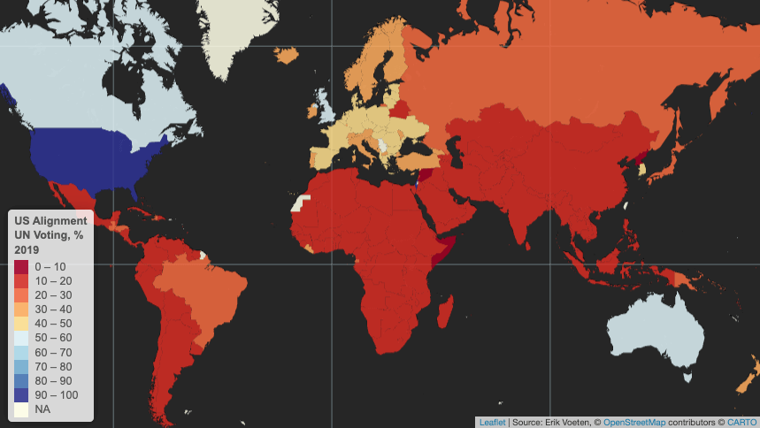
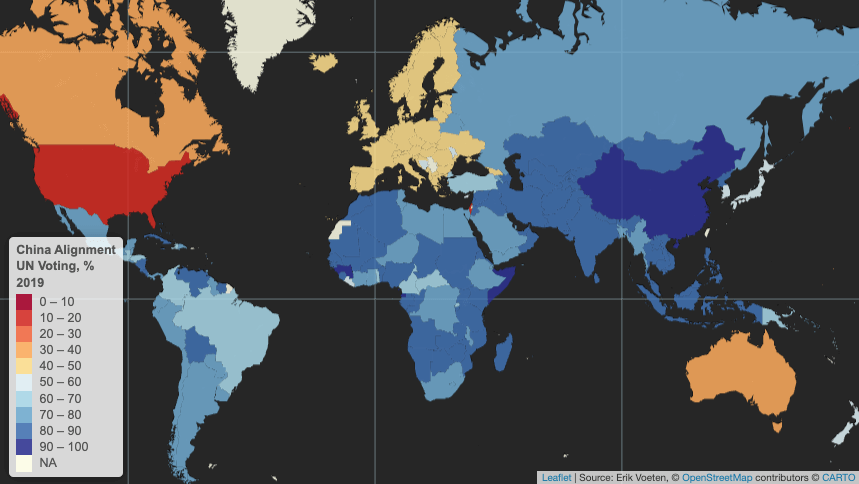
United Nations voting patterns
Yet emerging and developing economies as a whole are much more geopolitically-aligned with China than they are with the US. Using the latest available data on countries’ voting patterns in the United Nations’ General Assembly, in 2019 only a few EMDEs voted in alignment with the US more than 20% of the time. None did so in more than 50% of votes.
Only a handful of US allies tend to vote with the US in UN General Assembly votes more than half the time: Israel, Canada, the UK, Australia.
In contrast, EMDEs tend to vote in lockstep with China, which, after all is still considered somewhat of an emerging market itself. Virtually no EMDE votes outside of Europe were misaligned with China in the UN more than 50% of the time in 2019. Geopolitics is of course more complex than suggested by UN voting, and the world is not reverting to Cold War-era bipolarity, with multipolarity seemingly emerging on the horizon instead.
Sovereign borrowers in the “Global South” are aligned with China more often than not in UN voting.
Walking a tightrope
Nevertheless, the above data suggests that sovereign borrowers are navigating a complex environment in which they have to walk a tightrope between managing relationships with Chinese creditors and maintaining access to IMF support and lending from the Paris Club and private creditors. As such, some EMDE governments may not see that it is in their best interests to ask their largest creditors, which are often Chinese, to take steep haircuts during debt resolutions as has often been the case with past Paris Club restructurings and the Common Framework.
Instead, countries in debt distress may prefer to ask China for maturity extensions and for maintaining exposure while they implement structural reforms to set debt on a more sustainable path. This approach has the potential drawback of conflicting with or delaying IMF program negotiations, which typically require financing assurances from key creditors. Even so, some sovereign borrowers – especially those that are among Beijing’s strategic partners – may judge that their relationship with China is more important in terms of resources than IMF program sizes.
Still others may prefer to rely more on the G20’s Common Framework and the IMF and World Bank. This is especially true considering that Chinese lending to EMDEs has slowed to a trickle over the past five years as Beijing reconsiders its Belt and Road Initiative ambitions.
A poorly-functioning global trading system
Yet the drawback of relying on G7 countries and the Anglosphere for sovereign lending is that, ultimately, among these only Germany and Japan run meaningful current account surpluses. And while bilateral aid from the G7 is non-negligible, external deficits in the US, UK, Canada, and (historically) Australia mean that global capital flows towards these countries rather than from them to the world, as is the case with China.
One way to increase capital flows from rich to poor countries would be for more rich countries to begin running current account surpluses, which would effectively overhaul the global trading system. This is a highly unlikely outcome over the short- and medium-terms, for many reasons but partly because doing so would affect the US dollar’s reserve currency status, the ability to weaponize the dollar via sanctions, and undermine the power of US banks. In these murky waters, it is a small wonder then that many EMDE sovereign borrowers will continue to prefer to hedge their bets by viewing China as at least as important as the IMF and other creditors combined.
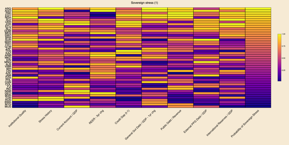
Today’s charts are an update of the Sovereign Vibe sovereign debt stress tracker initially released in 2023. This tool is based directly on the IMF’s Debt Sustainability Framework for Market-Access Countries, released in 2021, and is relevant only for countries that “principally receive financing through market-based instruments and on non-concessional terms.” Through extensive testing, the IMF developed a model that measures the probability of a borrowing country experiencing sovereign debt strains in the near-term based on changes in nine macroeconomic and governance variables.
Results
Among middle- and lower-income countries with market access with full data availability across all indicators, Argentina, Angola, and Pakistan are most at risk of sovereign debt stress. In the heatmap below, brighter colors indicate more risk, while darker colors indicate less risk. I use percentile scoring for each variable, including the probability of sovereign stress outcome.
Argentina defaulted on local currency debt in 2023, which penalized the country via the “stress history” indicator and propelled it into the “top” spot. The sovereign defaults that I tallied based on S&P for 2023 are El Salvador, Cameroon, and Ethiopia on foreign currency debt and Argentina, Ghana, El Salvador, Mozambique, and Sri Lanka on local currency. Let me know if I am missing any!
Caveats
Regarding the other 2023 sovereign defaults, El Salvador registered as sixth-most at risk of sovereign stress. I would expect Sri Lanka to rank fairly high on the sovereign stress heat-map above. But data for Sri Lanka has been patchy since its 2022 default, preventing me from making a full calculation on the same footing as other countries.
The IMF does not consider Cameroon, Ethiopia, Ghana, and Mozambique to currently be MACs. Other countries are borderline. For instance, Angola has been a market-access country for several years, but it seems like the IMF is in the process of declassifying it due to current vulnerabilities. So I may remove Angola from the next update. On the other hand, Nigeria still seems to be within the IMF’s MAC perimeter.
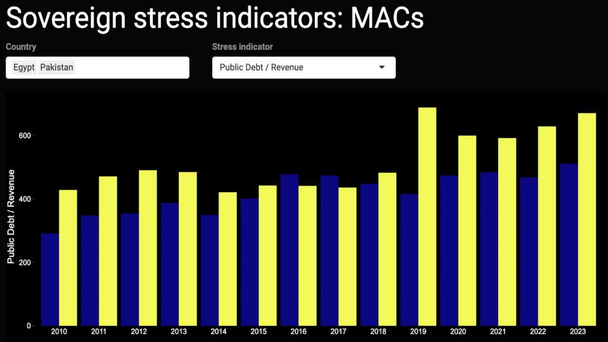
Also, this tracker shouldn’t be taken as gospel as to the likelihood of sovereign stress, as it only reflects macroeconomic-related indicators and which are mostly backward-looking. It fails to capture the qualitative aspects of a government’s commitment to reforms. Case in point: I wrote of Egypt’s brightening prospects last week.
Changes since October 2023
The table below outlines changes in the ten MACs most at-risk of experiencing sovereign debt strains. Argentina, Nigeria, and Ukraine have deteriorated by climbing up the ranking. Angola, Pakistan, Egypt, Jordan, Ecuador, Belize, and Mexico have seen their rankings improve. El Salvador continues to occupy the sixth spot.
Rank
May 2024
October 2023
🥇
🇦🇷 Argentina ⬆️
🇦🇴 Angola
🥈
🇦🇴 Angola ⬇️
🇵🇰 Pakistan
🥉
🇵🇰 Pakistan ⬇️
🇪🇬 Egypt
4
🇪🇬 Egypt ⬇️
🇯🇴 Jordan
5
🇳🇬 Nigeria ⬆️
🇦🇷 Argentina
6
🇸🇻 El Salvador
🇸🇻 El Salvador
7
🇺🇦 Ukraine ⬆️
🇪🇨 Ecuador
8
🇯🇴 Jordan ⬇️
🇧🇿 Belize
9
🇪🇨 Ecuador ⬇️
🇩🇴 Dominican Republic
10
🇧🇿 Belize ⬇️
🇲🇽 Mexico
I was surprised to see Mexico in October’s top ten, which points to some of this tool’s analytical limits. I and many others have generally perceived Mexico as a positive EM story in recent years, with an economy benefiting from supply chain reconfigurations and near-shoring, and an appreciating peso. Nevertheless, this IMF model can help challenge consensus narratives: in fact, Mexico is penalized precisely because of the strong appreciation of its real effective exchange rate over the past three years.
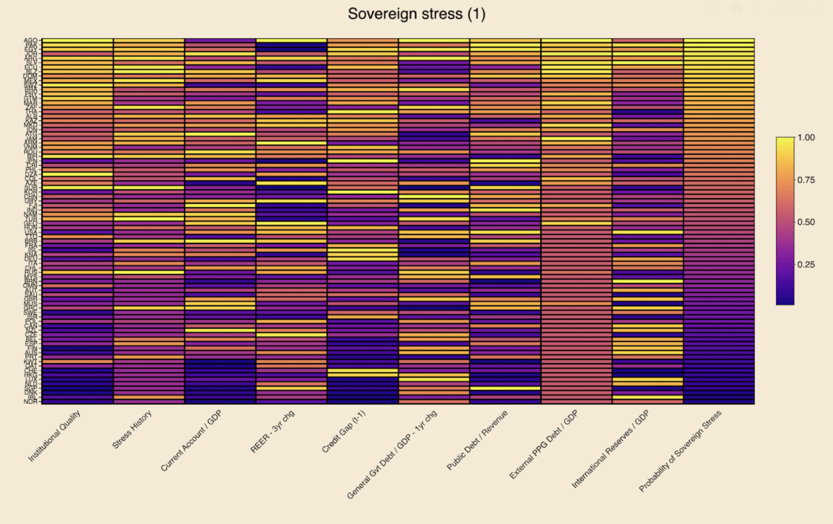
Following the release of sovereign debt stress heatmaps for 82 market-access countries, the underlying data for nine indicators for near-term risks is now available in the dashboard below. This first iteration facilitates visualization of each variable since 2010, with the possibility of viewing multiple countries simultaneously for comparative purposes. This tool is based directly on the IMF’s model for detecting the probability of sovereign debt strains 1-2 years ahead, as described in its 2021 Debt Sustainability Framework for Market-Access Countries. In addition to the IMF’s own documentation, past posts on this site describe the model and its indicators in more detail:
Institutional quality
Stress history
Current account / GDP
Real effective exchange rate: 3-year change
Credit gap to the non-financial private sector / GDP (t – 1)
General government debt / GDP: 1-year change
Public debt / Revenue
External public and publicly-guaranteed debt / GDP
International reserves / GDP
Future iterations
For the time being, this dashboard allows for users to view only one indicator at a time, and excludes one of the IMF’s ten independent variables – the one-year change in the VIX index.
A further improvement for future versions concerns the change-based variables, as it would be helpful for readers to also – or only – view the level of REERs and general government debt (and of the VIX, if included).
Moreover, an augmented dashboard for broad monitoring of sovereign debt strains would have to include interest payments, amortization schedules, gross financing needs, central bank interest rates, and more information on exchange rate dynamics, inter alia.
Missing data
Lastly, working with this data from a range of official, reputable sources highlights severe deficiencies in coverage. In some cases, the data is missing outright:
For instance, World Bank data would have us believe that Israel has no external PPG debt or that Jordan has no international reserves, which is untrue in both cases.
Similarly, BIS data on credit gaps is only available for around 40 countries, though these are easily estimated for a much larger set of countries using World Bank data.
Despite these oversights from multilateral data sources, it is still useful to have broad overviews of the sovereign debt landscape for those needing to view which parts of the system are coming under strain. Of course, paid data sources can help plug these data holes.
But, given efforts at the IMF, World Bank, and elsewhere to advocate for sovereign debt transparency, surely some of the lowest-hanging fruit must be for the multilateral institutions themselves to improve their own data collection and dissemination practices to make relevant data more widely-available.
Angola, Pakistan, Egypt, Jordan, Argentina, El Salvador, Ecuador, and Belize are among the market-access countries most at risk of sovereign stress, according to the model presented below.Unsurprisingly, several advanced economies appear least at risk, including Norway, Ireland, Denmark, Singapore, the Netherlands, Luxembourg, Hong Kong, and Switzerland.
Earlier this year I published the high-level initial results of a sovereign debt stress tracker, based on a model developed by the International Monetary Fund for countries that it classifies as having access to international markets. The IMF presented this model as part of its update to its Debt Sustainability Framework for Market-Access Countries in 2021, claiming at the time that it had performed significant robustness checks to ensure forecast salience. Time will tell how useful this tool is in predicting sovereign debt strains, and, in any case, it should only be used in conjunction with other analytical approaches.
Heatmaps
Using the latest available data for 2023, the heatmaps below rank order countries by the probability of experiencing sovereign stress, as represented by the column farthest to the right. Neither the probabilities for the dependent variable nor any of the raw data readings for any of the independent variables is shown below. Instead, readers can see the percentile rank compared to the maximum value in each variable column, which is beneficial for visually detecting relative heat for each indicator.
Lighter colors represent more risk, while darker colors represent less risk. Independent variables with negative coefficients, i.e. are negative predictors of sovereign stress, have been reversed in order to ensure color scheme coherence. These include institutional quality, the current account, and international reserves.
The first heatmap below suggests that Angola, Pakistan, Egypt, Jordan, Argentina, El Salvador, Ecuador, and Belize are most at risk of experiencing sovereign debt strains. Looking across the independent variables for this group of countries:
They generally suffer from high external public debt burdens and from relatively poor institutional quality, though Argentina and Jordan fare better on those measures, respectively.
El Salvador is penalized relatively less on stress history, though this assumes spread widening in recent years remained under the IMF’s stress definition threshold (see “Model” section below).
One-year changes in general government debt in Angola, Egypt, and Argentina point to potential risks.
El Salvador, Jordan, and, to a lesser extent, Pakistan, appear to need some replenishing of their international reserve buffers.
Angola and – to a lesser extent – Argentina are marked down for surging REERs.
Pakistan and Egypt display relatively concerning public debt/revenue ratios.
Jordan stands out for poor current account performance.
Egypt, Jordan, and Ecuador exhibit high credit-to-GDP gaps, though several other countries fare worse on this measure.
Each value is divided by the maximal value in that column, resulting in its own empirical percentile. Each value shown is the percent of observations with that value or below it. Sources: IMF, WGI, WB, Bruegel, BIS, author’s calculations.
The second heatmap uses foreign currency general government debt to replace the external PPG debt indicator featured in the first heatmap (see explanation in “Data” section below). Neither of these indicators is ideal, as in both cases coverage for many countries is either lacking or data points are equal to zero. This is obvious in both heatmaps from the absence of dark-colored cells in the relevant column, meaning that many countries are zero. Overall country coverage on this variable is better in the first heatmap, but the second one provides value for countries where data is missing in the first one (e.g. Israel, Korea, Sweden).
The eight countries most at risk of sovereign stress in this second heatmap are the same as in the first one, albeit in a slightly different order and except for Mexico replacing Belize. On this latter point, FX general government debt data – sourced from the BIS (see “Data” section below) – is missing for Belize, conferring on it an unfair advantage over Mexico and other countries where data are present for this indicator. In the first heatmap, external debt data is present for both Mexico and Belize, with the latter appearing more at risk than the former.
Each value is divided by the maximal value in that column, resulting in its own empirical percentile. Each value shown is the percent of observations with that value or below it. Sources: IMF, WGI, WB, Bruegel, BIS, author’s calculations.
Interpretation
Focusing on a country case helps illustrate ways to interpret the data in this model. Take Angola, as it appears most at-risk. Using heatmap (1), the brightest and thus most concerning data points are in the institutional quality, REER 3-year change, general government debt 1-year change, and external public and publicly-guaranteed debt columns. This suggests that the government and public sector more broadly are borrowing heavily, while prices and the exchange rate have also combined to rise quickly. Moreover, the institutions to set a good policy framework appear to be lacking. This is already a dangerous mix.
On the other hand, Angola scores well on its current account balance and international reserves variables. This is easily explained by the fact that the country is an oil exporter, thereby keeping its current account balance high and accumulating foreign reserves from the proceeds of these oil sales to buyers abroad.
While these oil exports provide Luanda with ample benefits, heavy reliance on a commodity-based export sector is also a double-edged sword. The result is often an appreciation of the exchange rate, making the economy less competitive for developing other industries: a classic case of Dutch Disease.
More concerning still is the presence of high inflation. The country’s surging REER variable already suggests that prices are probably rising, as the overall increase is unlikely to be due to nominal exchange rate dynamics alone. Increases in government debt suggest potential fiscal profligacy, which can lead to undesirably-high inflation, the presence of which is confirmed by a glance at recent Angolan statistics. The credit-to-GDP gap, which measures the deviation from trend of credit to the non-financial private sector as a share of GDP, is not particularly alarming in Angola, but may be high enough to also be contributing to the rising price level.
Angola also exhibits a high public debt-to-revenue ratio, which is worrying, given all the oil revenues that the country is seemingly raking in, suggesting that less borrowing and more fiscal discipline are likely needed. Recent sovereign stress is also a concern, indicating that, for all its natural resources, the government is unable or unwilling to pursue policies required to maintain macroeconomic stability.
Model
To recap, the model’s dependent variable is the probability of sovereign stress, which the IMF has detailed criteria for defining – running the gamut from outright default to a mere spread widening beyond a certain threshold. Regarding the independent variables:
The first two represent how recently a country has experienced sovereign stress, and its government effectiveness and regulatory quality.
Other explanatory variables are macroeconomic in nature, including current account balances, real effective exchange rates – which also capture price changes, credit gaps to the private sector, and international reserves.
More specifically fiscal indicators include those on general government debt, foreign currency public debt, and public debt-to-revenue ratios.
With the exception of REERs and debt-to-revenue, these macro-fiscal indicators are all expressed as a share of GDP.
A global variable also features in the model, the VIX Index, which measures stock market volatility in the US, but is not presented in the heatmaps above, given its constance across countries.
Data
In the first iteration of the tracker, 2023 data was captured for 43 market-access countries, including both emerging markets-developing economies and advanced economies. Thanks to more available data for this year and refinements in data capture, coverage has been expanded to 82 MACs in these heatmaps.
Two similar heatmaps are presented in this article, with a difference in one of the independent variables and, as a result, slight changes to the overall results in the dependent variable. One of the IMF’s indicators is foreign currency public debt. In the first instance, the World Bank indicator for external public and publicly-guaranteed debt is used as the best available proxy for the IMF’s variable. While using this data from the World Bank remains the best possible option at this stage, there are some glaring omissions in coverage. For instance, the World Bank source suggests that Israel’s external PPG debt is equal to zero, which is clearly incorrect.
As a remedy to the World Bank’s data deficiencies, a second heatmap applies data from the Bank of International Settlements on foreign currency general government debt, as a proxy for this indicator in the same overall model. The BIS data does fill in some of the World Bank gaps – e.g. Israel – but in fact covers fewer countries than the first source. As such, the first heatmap is still preferable.
It is also worth noting that both the World Bank and BIS indicators differ from the IMF variable of foreign currency public debt. In the former case, external public debt differs somewhat from foreign currency public debt, even if virtually all external debt is in foreign currency. In the latter case, foreign currency general government debt excludes some types of debt that is covered under foreign currency public debt.
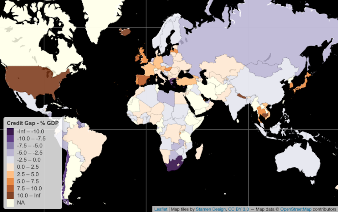
This post follows on from previous credit gap analysis on this blog and how this indicator helps estimate the probability of sovereign debt strains, for which Bank of International Settlements data is of great use. However, the BIS data covers “only” 43 countries and the Euro Area, which roughly corresponds to the G20 – including the 27 European Union members. As a result of this limitation, I use World Bank data, which has much broader country coverage, to derive credit gaps for a larger number of countries. As the Bank’s dataset is released on an annual frequency, I use annualized BIS data for comparative purposes, though the latter has the advantage of being published on a quarterly basis and is thus already available for a part of 2023.1As a reminder, in the IMF’s MAC DSA model published in 2021, the coefficient for credit gaps as an independent variable is positive with respect to the dependent variable, which is the probability of a sovereign stress event.
The first map below presents the BIS data on credit gaps in 2022, revealing how most of these 43 countries,2Argentina, Australia, Brazil, Canada, China, Chile, Colombia, Denmark, Ireland, Austria, Czechia, Finland, France, Germany, Greece, Hungary, India, Israel, Italy, Japan, South Korea, Mexico, Malaysia, Belgium, Hong Kong SAR, China, Luxembourg, Netherlands, Norway, New Zealand, Poland, Portugal, Russia, Saudi Arabia, South Africa, Singapore, Spain, Sweden, Switzerland, Thailand, Turkey, United Kingdom, United States, Indonesia are in negative territory, meaning that credit extended to the private sector is below trend. This makes sense given the wave of central bank tightening from circa 2021 in many countries, leading to tighter financial conditions globally. Notable exceptions remained in 2022, including Japan, Switzerland, Germany, and France in the DM space and Korea, Thailand, Indonesia, Brazil, and Hungary among EMs.
The second map shows BIS credit gap data for 2021, when there was clearly more heat in the system. Several countries exhibited positive gaps that ended up turning negative in 2022: Canada, the US, Mexico, Colombia, Argentina, Saudi Arabia, Norway, Sweden, and Austria among them. Virtually all countries cooled down from 2021 to 2022, according to this data.
The credit gaps derived from World Bank data feature in the two maps below, the first of which is for 2022. Sadly, this first World Bank map appears underwhelming given missing 2022 data for a number of large countries, including the US, Canada, Russia, and India. However, the data here covers 101 countries3Antigua & Barbuda, Algeria, Azerbaijan, Albania, Armenia, Angola, Australia, Barbados, Bangladesh, Belize, Bosnia & Herzegovina, Benin, Solomon Islands, Brazil, Brunei, Cambodia, Burundi, China, Chile, Colombia, Costa Rica, Cape Verde, Djibouti, Dominica, Dominican Republic, Ecuador, Egypt, El Salvador, Fiji, Georgia, Ghana, Grenada, Germany, Guatemala, Haiti, Honduras, Iceland, Israel, Côte d’Ivoire, Japan, Jamaica, Jordan, Kyrgyzstan, South Korea, Kuwait, Kazakhstan, Libya, Madagascar, North Macedonia, Mali, Morocco, Mauritius, Oman, Maldives, Mexico, Mozambique, Malawi, Niger, Hong Kong SAR, China Macao SAR, China, Palestinian Territories, Montenegro, Vanuatu, Norway, Nepal, Suriname, Nicaragua, New Zealand, Paraguay, Pakistan, Papua New Guinea, Guinea-Bissau, Qatar, Romania, Moldova, Philippines, Rwanda, St. Kitts & Nevis, Lesotho, Senegal, Sierra Leone, St. Lucia, Sudan, Trinidad & Tobago, Thailand, Tajikistan, Tonga, Togo, Turkey, United Kingdom, Burkina Faso, Uruguay, Uzbekistan, St. Vincent & Grenadines, Vietnam, Namibia, Samoa, Eswatini, Zimbabwe, Indonesia, Serbia – more than twice the number of BIS coverage. The last map is World Bank 2021 data with readings for 154 countries, which is closer to reasonable levels of coverage for those seeking a global view.
One of the glaring divergences between the World Bank and BIS datasets is China’s trajectory. The World Bank data suggests that China has gone from a negative gap in 2021 to a positive one in 2022, which is consistent with the PBOC easing while the rest of the world’s central banks were tightening. In contrast, the BIS data suggest that China’s gap became more negative in 2022 compared to 2021. As described previously, the World Bank data appears to include only domestic sources of credit, whereas the BIS includes domestic and foreign credit. Thus the data is essentially saying that, in 2022, domestic credit in China rose while foreign credit evaporated.
1
As a reminder, in the IMF’s MAC DSA model published in 2021, the coefficient for credit gaps as an independent variable is positive with respect to the dependent variable, which is the probability of a sovereign stress event.
2
Argentina, Australia, Brazil, Canada, China, Chile, Colombia, Denmark, Ireland, Austria, Czechia, Finland, France, Germany, Greece, Hungary, India, Israel, Italy, Japan, South Korea, Mexico, Malaysia, Belgium, Hong Kong SAR, China, Luxembourg, Netherlands, Norway, New Zealand, Poland, Portugal, Russia, Saudi Arabia, South Africa, Singapore, Spain, Sweden, Switzerland, Thailand, Turkey, United Kingdom, United States, Indonesia
3
Antigua & Barbuda, Algeria, Azerbaijan, Albania, Armenia, Angola, Australia, Barbados, Bangladesh, Belize, Bosnia & Herzegovina, Benin, Solomon Islands, Brazil, Brunei, Cambodia, Burundi, China, Chile, Colombia, Costa Rica, Cape Verde, Djibouti, Dominica, Dominican Republic, Ecuador, Egypt, El Salvador, Fiji, Georgia, Ghana, Grenada, Germany, Guatemala, Haiti, Honduras, Iceland, Israel, Côte d’Ivoire, Japan, Jamaica, Jordan, Kyrgyzstan, South Korea, Kuwait, Kazakhstan, Libya, Madagascar, North Macedonia, Mali, Morocco, Mauritius, Oman, Maldives, Mexico, Mozambique, Malawi, Niger, Hong Kong SAR, China Macao SAR, China, Palestinian Territories, Montenegro, Vanuatu, Norway, Nepal, Suriname, Nicaragua, New Zealand, Paraguay, Pakistan, Papua New Guinea, Guinea-Bissau, Qatar, Romania, Moldova, Philippines, Rwanda, St. Kitts & Nevis, Lesotho, Senegal, Sierra Leone, St. Lucia, Sudan, Trinidad & Tobago, Thailand, Tajikistan, Tonga, Togo, Turkey, United Kingdom, Burkina Faso, Uruguay, Uzbekistan, St. Vincent & Grenadines, Vietnam, Namibia, Samoa, Eswatini, Zimbabwe, Indonesia, Serbia