Categories
Macro

Supply constraints are driving US inflation

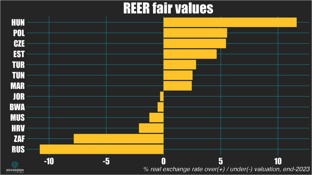
Higher for (a bit) longer, but don’t buy into inflationista hype.

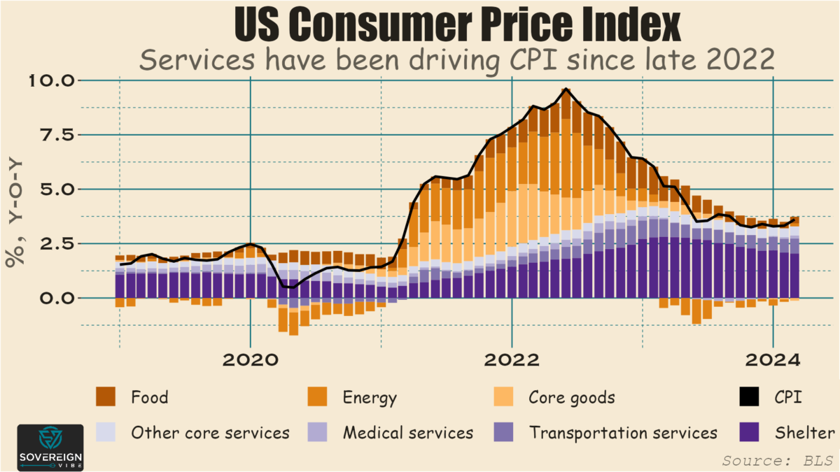
I wrote recently that emerging market sovereigns considering new issuance should be ready for Federal Reserve rate cuts in 2024, despite the hot Q1 inflation prints. The point is that core goods inflation has all but disappeared from the consumer price index and that core services inflation is concentrated in the transportation services segment, particularly motor vehicle insurance. The rise in car insurance costs in the US is a structural change, and the base effect will be locked in before long.

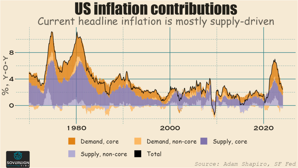
This inflation stickiness in transportation services is a lingering effect of Covid supply chain disruptions. Although these have lasted longer than most expected, they won’t last forever and will be resolved eventually. Juxtapose that point with data out of the San Francisco Fed that measures volume dynamics to gauge whether price rises are supply- or demand-driven. Supply is currently driving inflation, which confirms the CPI narrative around motor vehicle services.

This week of course Jerome Powell signaled that rates would be staying higher for longer. This makes good sense given higher Q1 inflation following his (overly) dovish remarks in December that markets interpreted (too) exuberantly.

One-to-two rate cuts are still priced in for this year, and any talk of new rate hikes are overblown. Powell himself said this week that a rate increase would be “unlikely.” Moreover, the Fed is slowing down its quantitative tightening program, lowering the monthly cap on US Treasuries it rolls off its balance sheet from $60bn to $25bn. So rates may be higher for longer than expected amid all the December-January euphoria, but the wind is still blowing in an “easing” rather than in a “tightening” direction.

There are other reasons that declining inflation and lower rates are likely in store later this year. Monetary policy has a lag time, so the restrictive stance that has been in place for the past few years will continue to work through the economy. There is also a post-Covid negative potential GDP trajectory gap, a point that my former colleague Robin Brooks makes. In fact, I’m hardly alone on this: see Claudia Sahm on the Covid hangover and Brian Levitt of Invesco on transportation services.

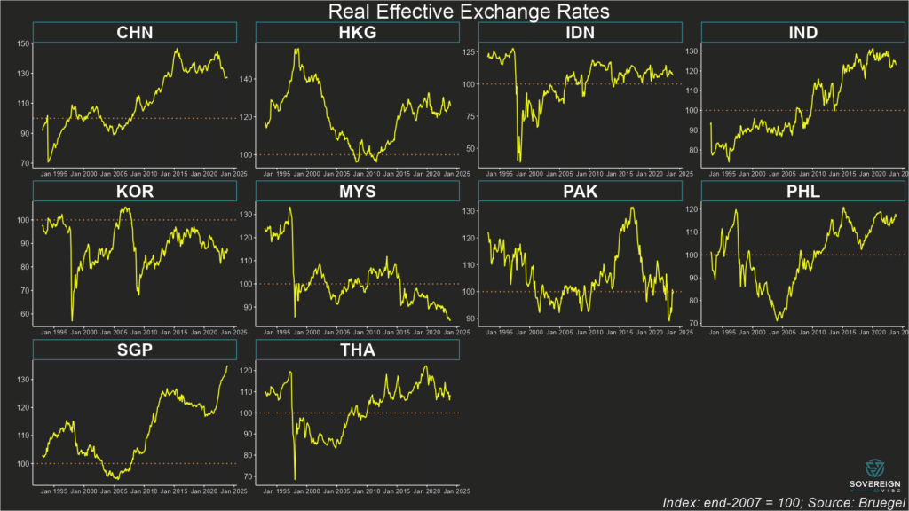
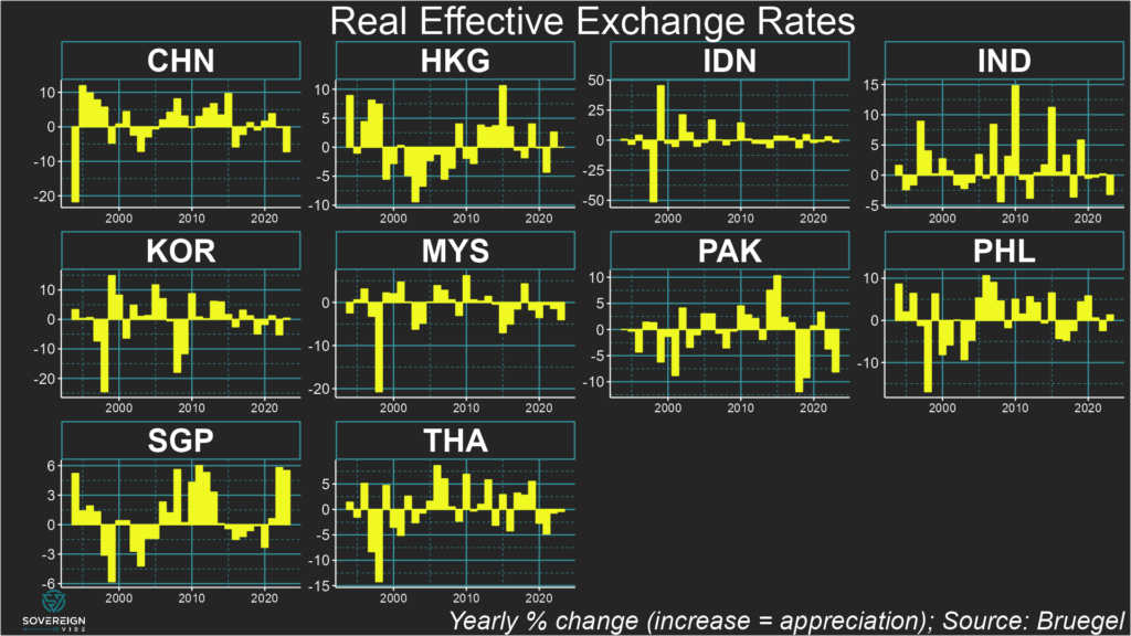
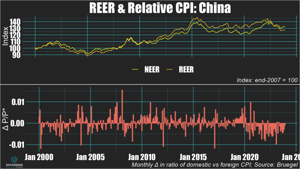
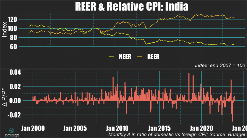
I’ll get back to more of a direct focus on emerging markets next week, but it’s important for EM watchers to keep an eye on the elephant in the room as well. Those developed market policy rates tend to have statistically significant negative relationships with capital flows to and from EM. Besides, Sovereign Vibe is also about global macro!

Categories
Macro

What does US inflation mean for EM sovereigns?

Debt management offices in emerging market finance ministries should be prepared for Fed rate cuts.

Emerging market sovereign debt issuance started 2024 off strongly with record-breaking issuance in January at ~$47bn and another ~$16bn in February, marking the highest January-February result since before the pandemic. Sub-Saharan African sovereigns even returned to the Eurobond market, with Côte d’Ivoire leading the way and Benin placing a debut issuance. Larger players including Saudi Arabia, Mexico, Indonesia, Hungary, and Romania made placements as well.

With borrowing costs having immediately fallen in the wake of Federal Reserve Chair Jerome Powell’s dovish comments on US inflation in December, the start-of-the-year timing for issuance was savvy given renewed concerns since March around higher-for-longer interest rates. With the 10-year US Treasury yield having climbed nearly 600bps since early March and the dollar also strengthening, debt management offices have likely become more circumspect regarding US inflation and the Fed.

The fading prospects of US rate cuts before H2 haven’t put a halt to activity this April out of Abu Dhabi and, more absurdly, El Salvador. And other debt management offices, including Tanzania, are also considering Eurobond issuance. Apparently EM sovereigns have issued about $93bn so far this year, which means about $30bn for March-April. These are still big numbers, but nothing close to that fast start in January.

Friday’s US inflation print came in hotter than expected, fueling ongoing concerns that rates will have to stay high for a while yet. The Fed’s preferred metric is core personal consumption expenditures (i.e. ex-food and energy), which rose 2.8% year-over-year in March – a third high monthly reading in a row. But digging through US data shows that the Fed may yet bring inflation lower soon. Looking at the consumer price index provides more granularity than is easily available through PCE, though it measures slightly different things.

In any case, it’s clear that almost all price pressures are emanating from services, with core (i.e. ex-food and energy) goods inflation having even turned negative. Within services, the largest component is shelter, which is often the case historically as well, but shelter inflation has moderated significantly over the past several months.

The main inflationary challenge is actually in the transportation services segment, which accounts for the lion’s share of services ex-shelter inflation. Within this category, motor vehicle insurance prices have been surging, e.g. 22% y-o-y in March, due to lingering Covid-era supply chain effects, changing car technology, higher car prices, and higher repair costs. It is likely that these factors are now locked in and will not rise much further, if at all. With the high base effect is now baked in, transportation services inflation will almost certainly fade over the coming months.

The upshot is that emerging market DMOs should expect US inflation to moderate over the coming months and for the Fed to cut rates at some point this year – and perhaps sooner rather than later. So I wouldn’t be surprised to see a pick-up in EM issuance again this year, though investor demand may be more for EM IG than for EM HY. Whether it’s wiser to place a Eurobond or a local currency bond, and whether offices should hedge their currency exposure in the former case is another matter. In the meantime, let the roadshows begin?

Categories
Macro

Central banks to weigh on 2024 markets

As global markets grapple with the prospect of higher rates for longer, it’s important to keep an eye on another important potential headwind: the direction of worldwide central bank asset purchases.

Without delving too deeply into the history of unconventional monetary policy, post-Global Financial Crisis the world’s major central banks implemented quantitative easing programs. This meant buying government bonds as a way to further support recovery by injecting cash into the economy. As a result, central bank balance sheets expanded significantly.

All the extra liquidity swilling around as a result of these purchases clearly has an impact on markets. When central bank buying decreases, this often seems to coincide with challenging periods for the S&P500, the MSCI All-World Index, and others. For example, 2018 and 2022 saw poor market returns, just as central bank asset purchasing was dipping in to negative territory, as presented in the chart below.

Looking at the balance sheets of major central banks, purchases of total assets are simply any changes from one period to the next. I’ve chosen a 12-month rolling window to show you annual purchases each month here.

Central bank buying was positive throughout much of the 2010s, hovering around $2.5tn year-on-year over 2016-2018, before turning negative in late 2018 and most of 2019. Annual purchases then skyrocketed to nearly $10tn during the pandemic, amid market ebullition from H2 2020 until the Omicron Covid variant dampened sentiment in November 2021 .

Since Q2 2022, annual central bank asset accumulation has been negative, reaching a nadir of some -$3tn in H2 of that year, which was a rough one for most asset classes. From late 2022 and through most of 2023, net buying headed back towards positive territory, with last year witnessing strong, broad-based returns.

In 2024, purchasing is starting to decrease again, which would be a negative signal for markets if the trend is confirmed. This tighter stance aligns with the likelihood that the Fed will keep rates at current levels for much of the year and the Bank of Japan allowing short term rates to increase when it abandoned yield curve control last October.

However, there may be a silver lining for markets. Weak growth and low inflation prints in the Eurozone are likely to lead the ECB to cut rates in 2024. While the ECB may not abandon the quantitative tightening program launched in March 2023, it is unlikely to ramp it up at a time when it needs to loosen policy. This is especially true since it has managed to reduce its balance sheet from €8.8tn in 2022 to around €6.6tn today, as visualized in dollar terms below.

Categories
Macro

Fair value exchange rates in EM Asia

  • FX fair value estimates for eight EM Asia economies point to more over- rather than under-valuation across the region…
  • …so the real depreciations registered by most of the region’s currencies last year has pushed many (but not all) towards fair value.
  • Inflation differentials are now playing a larger role in determining REERs compared to the pre-pandemic era.

Currencies in emerging markets Asia mostly declined in real terms in 2023. Pakistan registered the sharpest real exchange rate depreciation, though China also weakened significantly on the back of much less inflationary pressure in the country relative to its trading partners.

REER trends in EM Asia

Of the eight EM Asia countries covered below, only the Philippine peso and Korean won strengthened in real terms in 2023, though the Singaporean and (possibly) Hong Kong dollars were also in positive territory for the year.

For each country, I provide a chart that breaks down the contributions of to the real exchange rate:

  • The nominal effective exchange rate: Remember that “effective” implies a trade-weighted calculation against all trading partner currencies.
  • Inflation differentials: This indicator looks at the month-on-month changes of the ratio of the domestic country’s consumer price index versus the trade-weighted CPIs of its trading partners. A positive (negative) differential means that the domestic country is experiencing higher (lower) inflation than its trading partners are.

As for fair values, those are covered in the next section of this post.

🇨🇳 China: The yuan depreciated by around 7.5% in real terms in 2023, on the back of two years of mild appreciation. Despite some nominal weakening, it is mostly inflation differentials driving the real depreciation, as deflationary pressures in the Middle Kingdom stand in marked contrast to the rising prices experienced by its trading partners in recent years.

🇮🇳 India: The rupee experienced a real depreciation of about 3% in 2023 against its trading partners. Comparatively low inflation and some nominal currency weakening in H2 were both at play.

🇵🇰 Pakistan: The rupee declined by around 8% in real terms in 2023, following a smaller drop the previous year. The decrease in nominal effective terms was even larger, as inflation in Pakistan was higher than that of its trading partners for the entire year.

🇮🇩 Indonesia: The rupiah’s real exchange rate was fairly stable in 2023, registering a very modest decline in real and nominal terms alike. Inflation differentials were small and alternated between positive and negative over the course of the year, so had a negligible effect.

🇲🇾 Malaysia: The ringgit depreciated by nearly 5% in real terms over the course of 2023, with both nominal weakening and negative inflation differentials contributing.

🇵🇭 Philippines: The peso is one of the few currencies in this selection of EM Asian countries to have experienced a real appreciation in 2023, alongside the Korean won and Singaporean dollar. This modest real appreciation was driven by nominal strengthening and a positive inflation differential.

🇹🇭 Thailand: The baht weakened very modestly in real terms in 2023, mostly as a result of a negative inflation differential, while trading flat in nominal terms.

🇰🇷 South Korea: The won’s real exchange rate strengthened slightly in 2023, mirroring the nominal dynamic, with any inflation differential with trading partners close to zero.

Fair Value REERs

In EM Asia, Singapore, the Philippines, Korea, and Thailand appear most overvalued.

China, Hong Kong, and Malaysia are also in positive territory. However, China’s current account is likely much larger than reported, suggesting that the yuan is almost certainly undervalued.

In contrast, the Indian rupee appears to be about 5% below fair value.

The sample of countries will be expanded in further updates of this analysis.

Underlying & Equilibrium CABs

The chart below shows actual, underlying, and equilibrium current account balances. When the underlying CAB is below the modeled equilibrium, the currency is overvalued in real terms. The percentage amount of over- or under-valuation of the currency is the percentage of real depreciation or appreciation needed to move the underlying CAB to equilibrium. For example:

  • The Philippines’ underlying CAB is well beneath equilibrium, suggesting overvaluation. The peso would need to depreciate by about 5% in real terms for the underlying CAB to rise to equilibrium level.
  • India’s underlying CAB is above the estimated equilibrium implied by the model, pointing towards undervaluation. The rupee would need to undergo real appreciation of around 5% to decrease the underlying CAB to equilibrium.

Readers should note that countries with high ratios of imports and exports as a share of GDP have CABs that are more sensitive to REER misalignment.

In other words, seeing where and underlying CAB stands in relation to equilibrium reveals where a currency is over- or under-valued, but not the magnitude of the divergence from fair value.

Categories
Macro

Fair value exchange rates in LatAm

  • FX fair value estimates for 13 economies across LatAm at end-2023 underscore the idiosyncrasies of recent current account dynamics in the region…
  • …while also highlighting V- and L-shape nominal performance against USD since the pandemic in several countries,…
  • …even as the inflationary spike in ~2022 continues to abate across the main economies covered below.

As in other parts of the world, several Latin American economies saw their real exchange rates weaken during the pandemic only to rebound sharply amid the global inflationary shock. This v-shape trajectory of LatAm REERs is most evident in Peru and Costa Rica but is also visible to varying extents in Brazil, Colombia, the Dominican Republic, Mexico, and Panama.

REER trends in LatAm

In nominal terms against the dollar, the main currencies in the region weakened during 2020 before strengthening to varying degrees in the years since. Inflation was generally around the 2% mark in these economies in 2020 before peaking in 2022:

  • 🇲🇽 Mexican peso: after dropping sharply during the early pandemic, the peso had mostly recovered by early 2021 and traded flat until October 2022. Since then, it has strengthened significantly, despite some wobbles circa October 2023. Inflation rose from 2% in 2020 to ~8.5% in 2022 before declining to the 4-5% range in 2023/Q1 2024.
  • 🇧🇷 Brazilian real: weakened significantly in H1 2020 and has traded between flat and very moderate strengthening since. Inflation rose from 2% in 2020 to 12% by early 2022, and has remained mostly in the 4-6% range since late 2022.
  • 🇨🇴 Colombian peso: a sharp drop in March 2020 before almost recovering by the end of the year. Then steady weakening until June 2022, when it dropped sharply, followed by a strong recovery throughout 2023. In early 2020, inflation stood at 4% but declined to sub-2% that year, before beginning to rise in H1 2021, culminating in a peak above 13% in late 2022/early 2023 and since declined to the 8-10% range.
  • 🇨🇱 Chilean peso: came under pressure in March 2020 but only after having experienced a sharper drop in late 2019, so its decline during the pandemic coincided with a pre-existing weakening trend. By May 2021 it had more than recovered the early-pandemic weakness, then steadily weakened to October 2022. Subsequently, it bounced back in mid-2023 before declining again. Inflation hovered in the 2-4% range in 2020 before beginning a long steady rise from 2021 onwards, peaking at 14% in 2022 and declining to circa 4% by end-2023.
  • 🇵🇪 Peruvian sol: a steady, significant decline from early 2019 to September 2021, followed by flat-to-moderate strengthening. Inflation stayed around 2% throughout much of 2020 before rising to around 8.5% in H1 2022, and then beginning to moderate in H1 2023, dropping to below 4% by the end of the year.

Regarding fair values, the broad REER trends described above don’t really shed that much light, as valuations depend on where underlying current account balances stand in relation to equilibrium.

Fair Value REERs

In LatAm, Chile, Mexico, Costa Rica, Argentina, and Colombia appear most overvalued, while Guatemala, Panama, Brazil, and Ecuador seem most undervalued.

In this sample, the Dominican Republic and El Salvador are closest to fair value. Peru’s overvaluation is also relatively small.

Underlying & Equilibrium CABs

The chart below shows actual, underlying, and equilibrium CABs. When the underlying CAB is below equilibrium, the currency is overvalued in real terms. For example:

  • Chile’s underlying CAB exhibits a significant drop-off, with the headline CAB also being below equilibrium.
  • Mexico’s underlying CA deficit is even deeper in the red at around -6% of GDP, well below equilibrium.

Conversely, when underlying CABs are above estimated equilibria, the currency is undervalued in real terms. For example:

  • Guatemala exhibits a CA surplus of around 2.5% of GDP, about 5 percentage points above its estimated equilibrium.
  • Panama’s CA deficit is above its estimated normal level, which is quite low at around -7% of GDP and explained by some of the unique characteristics of the country’s economy.
  • Brazil has registered some large swings in its underlying CAB in recent years, meaning that the real has alternated between over- and under-valuation.

Readers should note that countries with high ratios of imports and exports as a share of GDP have CABs that are more sensitive to REER misalignment.

In other words, seeing where and underlying CAB stands in relation to equilibrium reveals where a currency is over- or under-valued, but not the magnitude of the divergence from fair value.

Stay tuned for more currency fair values in Asia and beyond.

Categories
Macro

Fair value exchange rates in CEEMEA

  • FX fair value estimates for 13 economies across CEEMEA at end-2023 underscore the impact of the war in Ukraine.
  • Real effective exchange rates spiked in various countries following the successive pandemic-Ukraine shocks…
  • …although Morocco and Croatia appear to be bastions of REER stability in an otherwise volatile group.

One way to value a currency is to assess the link between current account balances and real effective exchange rates, which merge the nominal exchange rate with the ratio of domestic to trade-weighted foreign prices. The IMF uses a fair value model that compares “equilibrium” to “underlying” CABs, with any difference a result of REER misalignment. FX fair values are presented below.

REER trends in CEEMEA

Several economies in Central & Eastern Europe, the Middle East, and Africa have experienced real exchange rate appreciation in the past few years. The dual pandemic-Ukraine inflationary shock since 2021-2022 is in large part responsible for this: annualized inflation remained in double digits in the Czech Republic, Hungary, Poland, Estonia, and Croatia until early- to mid-2023.

Moreover, the Czech koruna, Hungarian forint, and Polish złoty all weakened significantly in nominal terms in 2022, but inflation was so strong that these REERs still rose that year. In 2023, REERs in these countries continued to climb while the koruna traded flat and the forint and złoty registered modest nominal gains.

Russia saw yearly inflation fall from ~11% at the beginning of 2023 to the 2-3% range in Q2 before rising to ~7% by year end, while the ruble weakened significantly, resulting in REER weakening.

South Africa experienced declining inflation and a minor depreciation of the rand in 2023, albeit on the back of significant currency weakening since mid-2021, causing the REER to slide.

Turkey remains an inflationary basket-case, having spent almost all of 2023 near or above 50% in annualized terms, resulting in the lira’s ongoing decline. The net effect has been for its REER to move sideways – but after many years of secular decline.

Turning now to fair values, a number of REERs in CEEMEA exhibit significant over- or under-valuation.

Fair Value REERs

In CEEMEA, Hungary, Poland, and the Czech Republic appear most overvalued, while Russia and South Africa seem most undervalued.

It should come as no surprise that Hungary’s REER is overvalued, on the back of high inflation and (very modest) forint strengthening last year. But the real driver is that Hungary is running a massive underlying current account deficit at -15% GDP (see chart below).

Similarly, it also makes sense for Russia to be undervalued given the weaker ruble and moderating inflation. Its underlying CAB being above its equilibrium CAB confirms this is the case.

The same reasoning applies to South Africa: depreciated rand, lower inflation, and underlying above equilibrium.

Underlying & Equilibrium CABs

When the underlying and equilibrium current account balances are equal, the real effective exchange rate is at fair value.

If the equilibrium CAB is above (below) the underlying CAB, then the REER is over- (under-) valued.

In the chart below, the fitted estimates of current account equilibria are labeled as “model” and are shown alongside actual and underlying CAB readings.

Countries with high ratios of imports and exports as a share of GDP have CABs that are more sensitive to REER misalignment. Turkey and Tunisia provide an example of different sensitivities. In the chart, in 2023 both look overvalued, as equilibrium is above the underlying CABs.

The gap between Turkey’s equilibrium and underlying CAB is smaller than that of Tunisia, yet Turkey’s REER is more overvalued than Tunisia’s, as depicted in the fair values chart above. This is because Turkey’s economy is more open than Tunisia’s, hence REER misalignment has a greater impact on its CAB.

Categories
Macro

Current account equilibria in EMs

Following on from my estimates of current account equilibria in advanced economies, here I turn to emerging markets, which is after all the focus of this blog. I initially focused on AEs in an attempt to replicate as closely as possible an IMF empirical investigation of current account balances in this set of countries, as doing so is more methodologically prudent before expanding the analysis to EMs.

The goal of this work is to understand what a country’s current account balance should be (see my previous post for a breakdown of what CABs are), based on relevant characteristics as identified by the IMF in its model. These include the cyclically-adjusted government budget balances, demographic dependency ratios, and income level, which are all variables that tend to change only gradually over time. As such, they can be thought of as “long-term” variables, especially the latter two, which can be useful in trying to conceptualize where a country’s CAB ought to be.

In contrast, cyclical variables that are more volatile from year to year, such as real exchange rates, terms of trade, and domestic output gaps, as well as fiscal policy, theoretically should do a better job of predicting observed CAB readings. These can be thought of “short-term” variables, although I use the same fiscal variable in both the long- and short-run models.

The “long-run” model fitted values in these charts are the closest approximation I have now for current account equilibria in these EMs. But my confidence in these results is low and will require additional work, for the reasons described below.

Regretfully, I am far from satisfied with the results of this work so far, but have chosen to publish these interim conclusions in the interest of maintaining regular engagement with my audience. Worse still is that I had to exclude important EMs such as Indonesia from the analysis to maintain a balanced panel dataset, as data availability for some indicators didn’t go far back enough in time.

The good news is that both models have overall statistical significance and that each of the regressors in the short-run model is statistically significant.

Short-run model results

I’d still like to tweak the short-run model by adding a trade-weighted foreign output gaps as an independent variable and replacing the cyclically-adjusted budget indicator with a non-cyclically-adjusted budget variable. But, overall, I’m fairly content with the short-run model, as the fiscal, terms of trade, and real exchange rate regressors all behave as expected in relation to the CAB.

For methodological reasons, I dropped the lagged dependent variable that featured in the short-run AE model, which has decreased the R2 readings in this short-run EM model, though I don’t see this as much of a problem.

Surprisingly, the domestic output gap is not negatively-related to the CAB but exhibits a positive, strong, and significant association. A positive output gap, meaning that economic growth is above-trend, often results in increased imports, thus placing downward pressure on the CAB. And this is indeed what I found in the short-run model for AEs: a negative, strong, and significant relationship.

Perhaps the reason behind the positive output gap-CAB relationship in EMs is to be found in exports as a common driver: strong exports could lead to a higher output gap and a higher CAB. Many EMs rely heavily on exports for economic growth, whether of manufactured goods, commodities, or services.

Short-run model variables
  • Deviation from the in-sample average of the general government cyclically-adjusted budget balance adjusted for nonstructural elements beyond the economic cycle, as a share of potential GDP. Countries with higher-than average government budget balances should be able to attract larger portions of global current account surpluses. This is confirmed by the positive coefficient at 1% significance.
  • Domestic output gap: actual output minus potential output in current USD (logarithmic difference). Economies in the boom phase of an economic cycle can experience strong import growth, appreciated exchange rates, and stronger remittance and primary income outflows, putting the current account under pressure. Unexpectedly, the coefficient is positive, and is also large and significant. Theoretically, exports could be a common driver of output gaps and CABs in EMs, as they are positively associated with both.
  • One-year change in the terms of trade, i.e. the ratio of the price of exports to the price of imports. The coefficient is positive and significant, as expected.
  • One-year change in the REER. The coefficient is negative and significant, as expected, because high REERs can lead to imports becoming relatively cheap, thus increasing import volumes, and lead to exports becoming relatively expensive, thus decreasing export volumes.
Regression Results – 41 Emerging Economies
Dependent variable:
Current Account Balance, %GDP
panelcoefficient
lineartest
(1)(2)
random.shortrunrandom.pcse.shortrun
sur_dev0.439***0.439***
(0.056)(0.065)
ogap_usd.logdiff15.920***15.920**
(3.543)(8.019)
tot_1d0.061***0.061***
(0.022)(0.022)
reer_1d-0.072***-0.072***
(0.021)(0.018)
Constant-1.054-1.054
(0.735)(1.022)
Observations861
R20.097
Adjusted R20.093
F Statistic92.337***
Note:*p<0.1; **p<0.05; ***p<0.01
Long-run model results

As for the long-run model, alas only two of its four independent variables are statistically significant after controlling for heteroskedasticity and autocorrelation: the budget surplus indicator and the old-age dependency ratio.

The child-age dependency ratio and income level were both statistically insignificant, as was the case in the advanced economy model. As such, in further work on this I will be discarding these two regressors and replacing them with something related to private savings. Doing so would complement the public savings approach already captured by the budget variable.

Moreover, the adjusted-R2 is laughably low in this model. While achieving a high R2 isn’t the most important consideration in constructing a good model with unbiased, efficient estimators, I’d still like to see something higher.

One other area of improvement for this long-run CAB model would be to run the independent variables against underlying CABs – which have the cyclical impact of output gaps stripped out and real exchange rate effects worked in – rather than against observed, actual CABs.

Long-run model variables
  • Deviation from the in-sample average of the general government cyclically-adjusted budget balance adjusted for nonstructural elements beyond the economic cycle, as a share of potential GDP. Countries with higher-than average government budget balances should be able to attract larger portions of global current account surpluses. This is confirmed by the positive coefficient at 1% significance.
  • The deviation from the in-sample average of the child-age dependency ratio on the 20-64 year-old working-age population, i.e. people 19 and under. I tested this variable on the intuition that the child dependency ratio could well be negative, not only due to the income effect as noted by Faruqee and Isard, but also due to the large amounts of consumption (which pushes down savings, increases imports etc) associated with children’s parents at the height of their income generation, family activities, and the associated demographic profile that such countries might have. In this two-ways fixed effects model it is insignificant when standard errors are controlled for heteroskedasticity and autocorrelation. It is also unexpectedly positive.
  • The deviation from the in-sample average of the old-age dependency ratio on the 20-64 year-old working-age population, i.e. people 65 and over. My intuition with this variable is that it would be positive because of the high level of savings that elderly people have, despite doubts as to the degree to which the elderly can generate positive savings flows for themselves. The sign was positive, as expected, a statistically significant.
  • Deviation from the in-sample average of GNI per capita on a PPP basis, adjusted for the country’s output gap to equate the observation to what it would be if the economy were running at potential. Unexpectedly, the coefficient is negative: theoretically, greater availability of income and thus savings opportunities in wealthier countries should lead to a higher CAB. Yet this result is insignificant in the long-run model.
Regression Results – 41 Emerging Economies
Dependent variable:
Current Account Balance, %GDP
panelcoefficient
lineartest
(1)(2)
fixed.twoways.longrun.bfixed.twoways.hac.longrun.b
sur_dev0.371***0.371***
(0.060)(0.090)
dem_chd_dev0.157***0.157
(0.051)(0.119)
dem_old_dev0.433***0.433*
(0.147)(0.227)
ypcap_dev-0.056-0.056
(0.039)(0.114)
Observations861
R20.106
Adjusted R20.035
F Statistic23.716*** (df = 4; 796)
Note:*p<0.1; **p<0.05; ***p<0.01
Categories
Macro

Current account equilibria in AEs

Have you ever wondered what a country’s current account balance should be? If you’re a macroeconomist or investor, then chances are that you have. While plenty has been written on how to measure “equilibrium” current account balances, to my knowledge there is precious little publicly-available information as to what these actually are. So I’ve drawn from the existing literature on the subject in an attempt to construct a model of where a country’s current account should stand over the medium-to-long term.

If you’re asking yourself why you should care about “normal” current account balances, first of all a quick refresher. The current account is the sum of a country’s goods and services trade balances (i.e. exports minus imports), its net primary income (e.g. wages and investment income from abroad), and net secondary income (i.e. grants from foreign donors and workers’ remittances from abroad). Adding consumption and investment to the current account is equal to gross national income, and some simple arithmetic shows that the CAB is also equivalent to savings minus investment:

CAB = PIB + SIB + X - M

GNI = PIB + SIB + X - M + C + I = CAB + C + I

CAB = GNI - C - I = S - I

From a savings minus investment perspective, the CAB is the sum of the public sector’s (i.e. government) S - I balance, which is closely related to the government’s budget, and the private sector’s S - I balance. Surplus current account flows lead to the accumulation of foreign currency reserves and/or net foreign assets acquisition, while a deficit must be financed by capital from abroad and/or the depletion of the central bank’s foreign currency reserves.

Exchange rates

Exchange rates obviously play a pivotal role in influencing a CAB, which is why “currency wars” periodically erupt, with nations accusing each other – sometimes with good reason – of artificially devaluing their currencies in order to boost their CABs. Currencies are also one of the main reasons to take an interest in CABs, because the latter help measure whether a currency is over- or undervalued.

Focusing on a country’s real effective exchange rate, i.e. its trade-weighted exchange rate incorporating relative price levels of its trading partners, there are multiple approaches to assessing REER fair value, one of which involves measuring cyclically-adjusted (i.e. “underlying”) current account deviations from the equilibrium current account:

REER deviation from FV ≈ CABunderlying - CABequilibrium

Undervalued currency: CABunderlying > CABequilibrium

Overvalued currency: CABunderlying < CABequilibrium

CAB modeling results

The first step in this analysis is to measure equilibria CABs that reflect a country’s non-cyclical characteristics over the medium-to-long run, hewing closely to past work on the subject, including by analyzing the same group of 21 advanced economies. I’ve developed two models in order to track these CABs: short-run estimates of observed CAB readings and a long-run framework to approximate equilibria CABs.

The results are presented in the chart below, featuring CAB observations, the long-run model, and short-run model. The latter tracks the actual CAB results relatively closely, in large part because the cyclical/short-term variables exhibit high degrees of statistical significance in the model. Moreover, the observed CAB values are obviously driven by cyclical factors in addition to long-term trends.

In contrast, the long-run model has much lower explanatory power compared to the short-run model with respect to minimizing residual deviations away from the observed CABs. But this is precisely the point. Medium- to long-run CAB equilibria should be relatively stable compared to the cyclical volatility exhibited by the actual CABs and their short-run fitted values.

Still, the long-run model estimates of CAB equilibria are subject to a high degree of uncertainty, given the the presence of statistical significance in only one of the three independent variables and low adjusted R2 (see regressions below).

Model & variable selection

The analysis uses panel data for 21 advanced economies from 2001 – 2021 and included various statistical tests for selecting appropriate models and controlling for heteroskedasticity, serial correlation, cross-sectional dependence, and stationarity. For both the short- and long-run approaches, fixed effects models were chosen over OLS or random effects. Only individual (i.e. country) fixed effects were included; time-fixed effects were unnecessary.

The current account balance as a percentage of nominal GDP served as the dependent variable for both the short- and long-run frameworks.

Short-run model variables
  • One-year lag of the dependent variable, i.e. the current account / GDP ratio. The high degree of inertia in CAB time series processes resulted in a large positive coefficient at a high degree of significance.
  • Deviation from the in-sample average of the general government cyclically-adjusted budget balance adjusted for nonstructural elements beyond the economic cycle, as a share of potential GDP. Countries with higher-than average government budget balances should be able to attract larger portions of global current account surpluses. This is confirmed by the positive coefficient at 1% significance.
  • Deviation from the in-sample average of GNI per capita on a PPP basis, adjusted for the country’s output gap to equate the observation to what it would be if the economy were running at potential. As expected, the coefficient is positive – reflecting the CAB-GNI conceptual overlap, greater availability of income and thus savings opportunities to wealthier countries, and the need for capital deepening in less developed countries. It is significant when standard errors are adjusted for heteroskedasticity and autocorrelation in this fixed effects model.
  • Domestic output gap: actual output minus potential output in current USD (logarithmic difference). Economies in the boom phase of an economic cycle can experience strong import growth, appreciated exchange rates, and stronger remittance and primary income outflows, putting the current account under pressure. As expected, the coefficient is negative, large, and significant.
  • One-year change in the terms of trade, i.e. the ratio of the price of exports to the price of imports. The coefficient is positive and significant, as expected.
  • One-year change in the REER. The coefficient is negative and significant, as expected, because high REERs can lead to imports becoming relatively cheap, thus increasing import volumes, and lead to exports becoming relatively expensive, thus decreasing export volumes.
Regression Results – 21 Advanced Economies
Dependent variable:
Current Account Balance, %GDP
panelcoefficient
lineartest
(1)(2)
fixed.shortrunfixed.hac.shortrun
cab.t_10.582***0.582***
(0.040)(0.125)
sur_dev0.221***0.221**
(0.052)(0.089)
ypcap_dev0.0260.026**
(0.018)(0.011)
ogap_usd.logdiff-6.593*-6.593*
(3.994)(3.620)
tot_1d0.091***0.091**
(0.021)(0.044)
reer_1d-0.050*-0.050**
(0.028)(0.024)
Observations441
R20.456
Adjusted R20.422
F Statistic57.907*** (df = 6; 414)
Note:*p<0.1; **p<0.05; ***p<0.01
Long-run model variables
  • Deviation from the in-sample average of the general government cyclically-adjusted budget balance adjusted for nonstructural elements beyond the economic cycle, as a share of potential GDP. Countries with higher-than average government budget balances should be able to attract larger portions of global current account surpluses. This is confirmed by the positive coefficient at 1% significance.
  • The deviation from the in-sample average of total dependency ratio of non-workers on the 20-64 year-old working-age population, i.e. people 19 and under & 65 and over. Faruqee and Isard contend that the dependency ratio should be negatively associated with current account equilibria, partly due to the income effect, and find it to be so in their 1970s – 1990s data. Here the sign is positive, somewhat unexpectedly, and is statistically insignificant.
  • The deviation from the in-sample average of the child-age dependency ratio on the 20-64 year-old working-age population, i.e. people 19 and under. I tested this variable on the intuition that the child dependency ratio could well be negative, not only due to the income effect as noted by Faruqee and Isard, but also due to the large amounts of consumption (which pushes down savings, increases imports etc) associated with children’s parents at the height of their income generation, family activities, and the associated demographic profile that such countries might have. Although this relationship showed up as negative in OLS, in this fixed effects model it is insignificant and unexpectedly positive.
  • The deviation from the in-sample average of the old-age dependency ratio on the 20-64 year-old working-age population, i.e. people 65 and over. My intuition with this variable is that it would be positive because of the high level of savings that elderly people have, despite doubts as to the degree to which the elderly can generate positive savings flows for themselves. The sign was positive, as expected, but small and insignificant.
  • Deviation from the in-sample average of GNI per capita on a PPP basis, adjusted for the country’s output gap to equate the observation to what it would be if the economy were running at potential. As expected, the coefficient is positive – reflecting the CAB-GNI conceptual overlap, greater availability of income and thus savings opportunities to wealthier countries, and the need for capital deepening in less developed countries. Yet this result is weak and insignificant in the long-run model.
Regression Results – 21 Advanced Economies
Dependent variable:
Current Account Balance, %GDPcab_ngdp
panelcoefficientpanelcoefficient
lineartestlineartest
(1)(2)(3)(4)
fixed.longrun.afixed.hac.longrun.afixed.longrun.bfixed.hac.longrun.b
sur_dev0.481***0.481***0.478***0.478***
(0.062)(0.125)(0.062)(0.129)
dem_tot_dev0.0860.086
(0.067)(0.134)
dem_chd_dev0.1730.173
(0.143)(0.361)
dem_old_dev0.0480.048
(0.087)(0.162)
ypcap_dev0.0140.0140.0120.012
(0.023)(0.035)(0.023)(0.038)
Observations441441
R20.1480.149
Adjusted R20.1010.100
F Statistic24.141*** (df = 3; 417)18.201*** (df = 4; 416)
Note:*p<0.1; **p<0.05; ***p<0.01
Categories
Macro

Mapping the world’s output gaps

Building on recent work on how to measure deviations of actual GDP from potential GDP, known as an output gap, I’m pleased to reveal a world map of results for 2023. Remember that an output gap is positive when actual GDP is above potential – or trend – and negative when it is below. In the map below, countries in blue have positive output gaps in 2023, while those in orange and red are negative.

While most countries are exhibiting above-trend GDP growth, there are some noteworthy pockets of below-trend output. Chief among these is a large negative output gap in Ukraine, clearly related to the ongoing war with Russia, and which also appears to have infected several of its neighbors in north-eastern and north-central Europe.

Other countries with active conflicts or security-related concerns also seem to be well below potential: Sudan, Myanmar, Haiti, and Iraq.

There are also some clusters of negative gaps in various regions: Latin America (Peru, Bolivia, Paraguay, and Chile), South/Southeast Asia (Pakistan, Nepal, Bhutan, Myanmar, Thailand, Laos), and West-Central Africa (Ghana, Burkina Faso, Gabon).

As for the positive output gaps around the world, these are mostly in the range of 0-2.5% of potential GDP. Much of southern Europe is above this level: Portugal, Spain, Italy, Croatia, Montenegro, Albania, Greece. Farther east, Georgia, Armenia, Iran, and Tajikistan have also recorded above-trend output beyond 2.5%. Brazil and some parts of Africa (Libya, Republic of Congo, Democratic Republic of Congo, Botswana, Benin, and Liberia).

The countries with the largest positive output gaps are in darkest blue: Guyana, Yemen, and Libya. The latter two have of course experienced significant conflicts over the past decade, suggesting that actual GDP is now well above trend as a result of those previous shocks. High positive output gaps can also be a symptom of economic overheating.

Note that data for 2023 is absent for some countries in the map because the IMF did not provide actual GDP estimates for this year in its October 2023 World Economic Outlook. These include Sri Lanka, Afghanistan, Syria, Venezuela, and Cuba. Given high economic uncertainty and/or the absence of reliable data from these countries, fair enough.

Trend GDP: a visual primer

So far in my writing about output gaps I haven’t made any visual presentations of what real and potential GDP look like. As explained previously, measuring potential GDP is complicated and data-intensive, so economists often use a shortcut: deriving a moving average of actual GDP readings as a proxy for potential GDP. The approach I have taken is known as Hodrick-Prescott filtering.

As a result of the previously-noted pitfalls of using moving averages to measure potential GDP, I refer to the term of “trend” rather than “potential” GDP. As for “actual” GDP, this is data in national currency units using constant prices, meaning that it is real – and not nominal – GDP.

The charts below provide examples actual and trend GDP. I’ve selected these countries because they are ongoing sovereign debt restructuring cases of interest, even if I only present them here for demonstrating how actual / real and trend / potential GDP relate to each other and output gaps:

Output Gap = (Real GDP - Potential GDP) / Potential GDP * 100

Sri Lanka is perhaps the most interesting case, even if the data is only through 2022: a sizable positive output gap – indicating potential overheating in the economy – preceded a sharp drop in GDP, leading to a negative output gap. Also currently in negative territory, Ghana’s GDP exhibits some of the same behavior, albeit with less volatility.

Zambia sustained a positive output gap throughout most of the 2010s, until an economic contraction in 2020 led it into negative territory, though the gap turned positive again in 2023. Once one of the world’s fastest growing economies, Ethiopia’s economic growth has also been remarkably stable, despite the recent Tigray conflict. This makes for a more “boring” chart but is a credit to the country’s economy, with the output gap in marginally positive territory.

Categories
Macro

On a quest for output gaps

One of the holy grails in the economics profession is to accurately measure an economy’s output gap, which is the difference between its actual GDP and potential GDP. Having an accurate representation of an output gap is useful for all sorts of economic modeling purposes, given statistical relationships with inflation, exchange rates, and a host of other variables of interest to economists, investors, and policymakers. Simply put, a positive (negative) output gap means that actual GDP is above (below) potential GDP.

Yet the IMF in its flagship World Economic Outlook database provides output gaps for fewer than 30 advanced economies, to say nothing of emerging and developing economies. The Fund does of course in many cases provide such estimates elsewhere, such as in country and program monitoring reports, but, unfortunately, leaves these out of the WEO.

Measuring output gaps is notoriously riddled with uncertainty because, unlike actual GDP, potential GDP isn’t directly observed through spending or income. Rather, it needs to be estimated in some other way, which I have done for the broadest possible group of advanced and emerging-developing economies.

The optimal approach for calculating potential GDP likely focuses on supply side inputs including total factor productivity, labor, and capital à la Y = ALαK1−α, an example of which is the Production Function Methodology. Yet such methodologies can be data-intensive, especially when looking at emerging and developing economies, for which data is often scarcer.

An alternative is to use a moving averages approach – one of which is known as Hodrick-Prescott filtering – that separates actual GDP readings into trend and cyclical components, representing potential output and the output gap, respectively. One of the downsides of this approach is that it may misestimate potential output by ignoring the individual supply-side constituents used in bottom-up methodologies. An advantage of HP filtering is that potential GDP and output gaps can be quickly estimated for a broad group of countries from real GDP data.

The problem is of course whether the HP-estimated output gaps that I have prepared are actually any good. To assess this, I compare the HP results with the countries – all of which are advanced economies – for which the IMF provides output gap estimates in its World Economic Outlook database. Using the October 2023 WEO, I derive the HP output gaps for many countries with annual real GDP readings and λ = 100. I rely on data in national currency, which has the benefit of minimizing exchange rate effects that are present in USD data. I then plot the HP-derived output gaps against the IMF’s own output gap estimates, hoping to see something resembling a positive, one-to-one relationship, which the data bear out fairly well:

Behind the scenes I’ve looked at slopes by individual countries (remember m = Δy/Δx), and these all seem to be m < 1, indicating that there is more variance in the HP-derived output gaps. In any case, these data seem to track pretty closely, meaning that the HP gaps probably have some analytical value.

Next, I put the WEO and HP output gaps to the test separately against inflation readings, expecting the relationship to be positive. The theoretical underpinning is that when an economy is running hot – i.e. its output gap is positive – prices tend to rise more. Known as the Phillips Curve, this relationship is also often shown as the negative link between inflation and unemployment.

The two faceted charts below show Phillips Curves for the selected countries where IMF output gap estimates are available in the WEO. The first one uses the IMF’s output gap estimates in the x-axis, while the second one uses the HP-derived ones. Consistently positive relationships likely point to better output gap measurement.

In the first chart, the WEO’s output gap estimates point to a positive relationship with inflation in most countries, as per the fitted linear regression lines. There are, however, some exceptions. Austria, Belgium, Spain, Japan, Korea, and possibly Denmark all exhibit negative relationships. Others such as Slovakia, Estonia, and Norway appear quite flat. This calls into question the IMF’s output gap estimates in these countries, according to the Fund’s own data.

On the other hand, the second chart exhibits more consistently-positive relationships with inflation in this sample of countries, suggesting that the HP-derived output gaps may actually be more accurate than those provided by the IMF. Slovakia appears to be the only country with a negatively-sloped line, although admittedly Estonia, Italy, and Portugal are nearly flat.