High economic-political uncertainty paired with low volatility amplifies market risks
In its recently-released Global Financial Stability Report, the IMF warns that the disconnect between rising economic and geopolitical uncertainty and low financial volatility increases market risks.
The CBOE Volatility Index – a barometer of equity market volatility – has remained at or below 20 for much of 2024.
The IMF’s warning is in keeping with an April 2024 edition of this newsletter, “Are markets underpricing geopolitical risks?”
August volatility
The sole exception to this low volatility occurred in early August, when the Bank of Japan spooked markets with an unexpected interest rate hike.
This surprise unwound massive carry trade positions from the yen into assets denominated in emerging market currencies, causing the VIX to surge.
Carry trades involve borrowing in a low-interest rate currency to invest in a high-interest rate currency.
Kazuo Ueda has been serving as the Bank of Japan’s Governor since April 2023. FT montage/Bloomberg
Threats to lofty valuations
This year credit and equity markets have remained strong despite slowing earnings growth and rising fragilities in parts of the corporate and commercial real estate sectors.
Amid already-lofty valuations, there are concerns that, as many central banks pursue their easing cycles, interest rate cuts could lead to asset bubbles and rises in private and government debt and non-bank leverage.
The Fund underscores the uncertainties around military conflicts and the future policies of newly elected governments – in a nod to the many elections in 2024, including in the U.S.
Yet this year only a monetary policy event – i.e. the BoJ-carry trade de-leveraging – has caused volatility to rise, rather than any military or political factors.
While some military or political factors could roil markets, economic policy surprises and threats to corporate and household resilience could just as easily cause volatility to surge.
Sudan’s brutal but forgotten civil war has affected Egypt’s economy but has otherwise had a negligible economic impact beyond its borders. AFP
VIX-equity market correlations
Regardless of what causes equity market volatility, seeing how emerging country equity markets are correlated with VIX yields some clues as to which countries are more vulnerable.
To do this, I compare daily changes in VIX to daily MSCI index returns and smooth that data out over a 90-day period.
These VIX-MSCI correlations are generally negative, as expected, meaning that a rise in volatility is associated with a decline in daily returns.
The relationships are naturally dynamic over time, given the presence of idiosyncratic market drivers in each country and the varying sources of global market volatility.
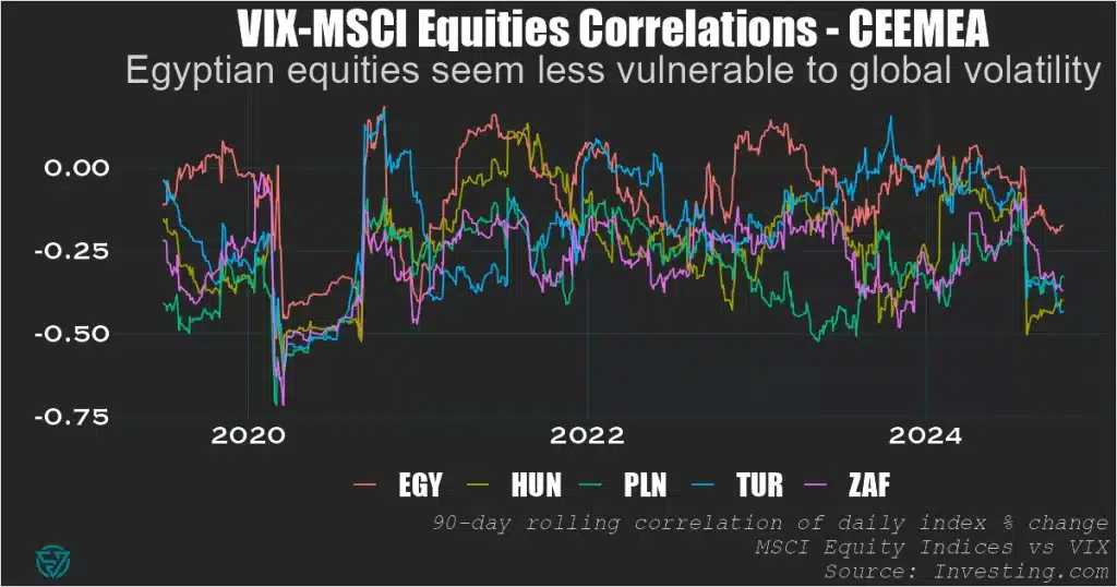
CEEMEA
Looking across the three EM regions, in CEEMEA Egypt currently appears less negatively-correlated – and therefore less vulnerable – to VIX.
In all five countries, the negative VIX correlations dropped to nearly -0.75 during the first wave of the pandemic in H1 2020, underscoring the risk to EMs from global vol.
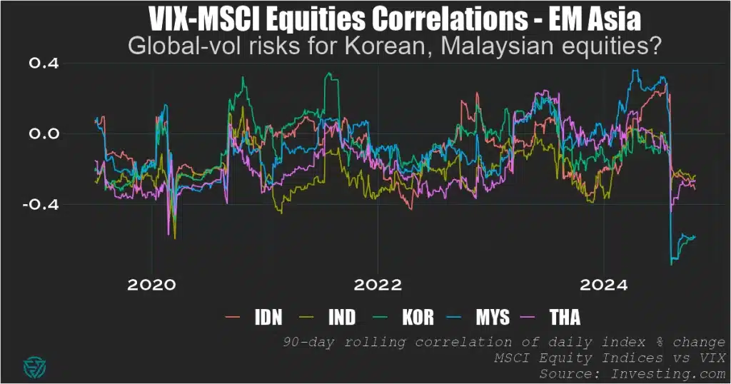
EM Asia
In EM Asia, Korean and Malaysian equity markets appear most at risk from changes in VIX.
We can’t really ascribe it solely to them being small, open economies, as their VIX correlations aren’t systematically more negative than their larger regional peers.
But certainly something about the current environment – whether global or local – is causing these correlations to be at -0.6, which points to significant VIX vulnerability.
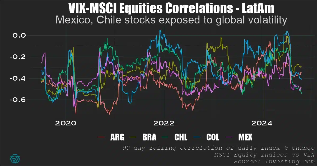
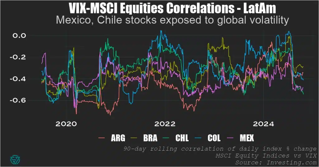
LatAm
As for LatAm, Mexico and Chile stocks are most exposed to global vol.
Their equity market correlations with volatility are around -0.5, meaning they seem to face less VIX risk than Malaysia or Korea but more than any of the CEEMEA countries.
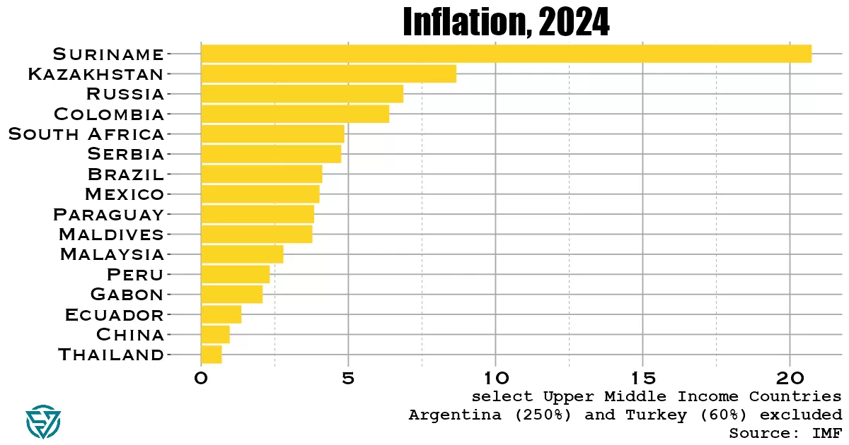
Rampant inflation is most prevalent in lower-middle income countries, except for Argentina and Turkey.
A recent piece by the ex-head of EM economics at Citi, David Lubin, ponders inflation risk in emerging markets, citing fiscal indiscipline as a major threat to price stability.
So I wanted to visualize cross-country IMF forecasts for EM inflation in 2024 and juxtapose that to see how it tracks with what Lubin is saying.
He mentions South Africa (~4.5%) and Hungary (3.7%) as success stories in reining inflation in to target. In contrast, Lubin notes that Brazil (~4%) and Turkey (~60%) have fiscal policies that are too loose.
Though I would add that South Africa didn’t exactly implement an austerity program in the run-up to its general election in June.
The Fed’s easing cycle and increasing Chinese market share in global exports are both disinflationary forces for EMs, whose battles against inflation could benefit from these benign external forces.
Upper-middle income EMs
In the upper-middle income group of EMs, South Africa and Brazil hardly stand out as particularly successful or unsuccessful in tackling inflation, respectively. Not least because the former has higher inflation numbers than the latter.
Lubin is of course right about Turkey being too expansionary in its fiscal policy, with a potential crisis brewing. According to Lubin, on the monetary front, one issue is that the central bank is under too much pressure to maintain exchange rate stability.
While inflation remains reasonably low in Mexico, Lubin is right to point out the fiscal discipline risks in Mexico, given early indications of new president Claudia Sheinbaum’s policies.
Argentina is in the reverse situation compared to Mexico, with already-rampant inflation (250%!) but leadership that has balanced the budget.
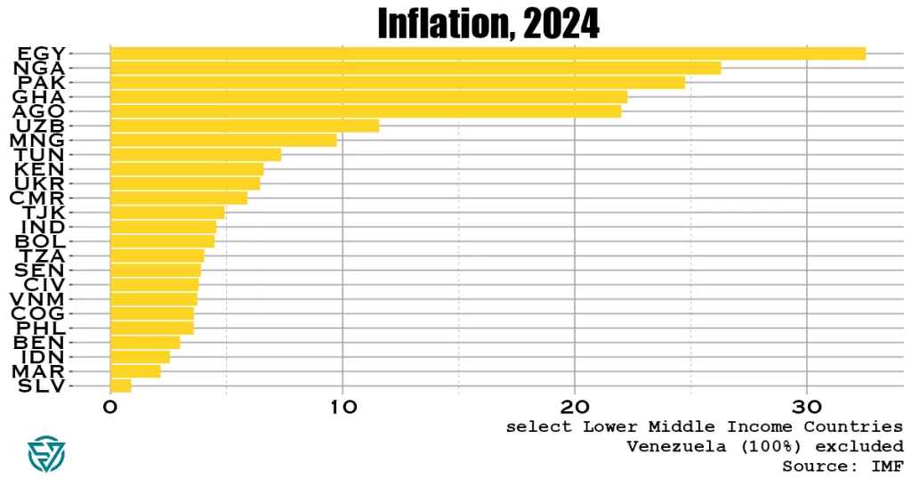
Lower-middle income EMs
Unsurprisingly, inflation is much higher in this poorer sample of countries. Only a handful have inflation rates below 5%.
Lubin notes that fiscal discipline is a risk in Indonesia, though it does have one of the lowest inflation levels in this category.
Though I am surprised to see that Indonesia – and India – are lower-middle income. I’d had them pegged as upper-middle income, given their prominence in the EM universe.
Let’s chalk that up to how confusing the EM asset class is. I get that both countries have large populations, but I thought they would have “emerged” more by now. Thankfully, growth is strong in these two Asian nations.
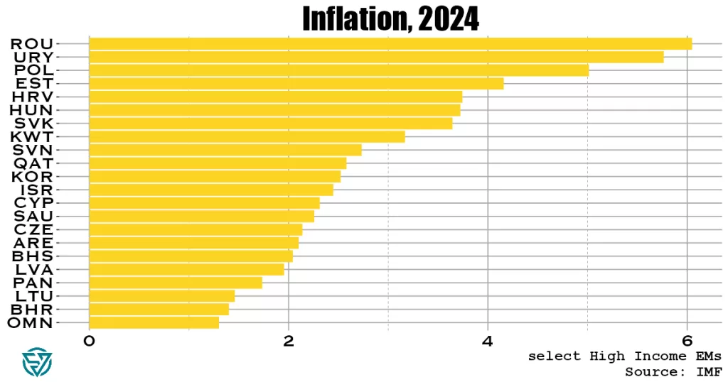
High income EMs
Overall inflation rates are much lower in this group. Romania comes in highest, at a mere 6%.
These are truly developed-country CPI readings, providing yet more reason to abandon the EM designation altogether. Many of these countries have little in common with each other.
Lubin points to potential fiscal indiscipline risks in Poland, which indeed has higher inflation than a more “successful-according-to-Lubin” Hungary.
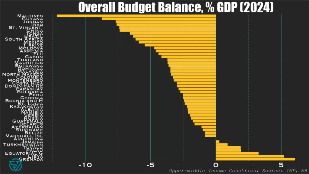
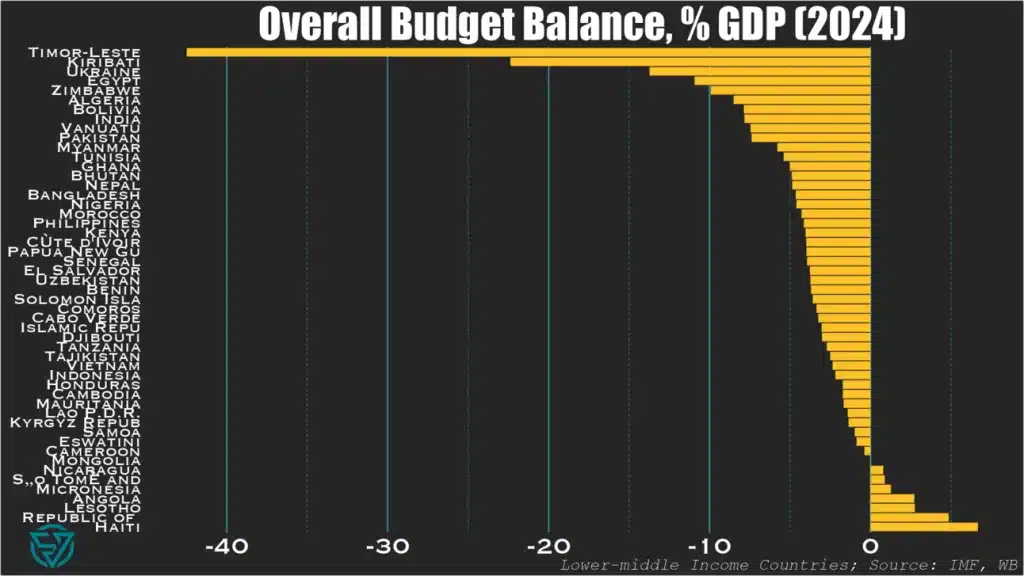
Small island states and large emerging markets have the biggest budget deficits in 2024.
So this week I wanted to take a quick look at how our beloved emerging and frontier markets compare fiscally .
In today’s newsletter I’m only showing you overall budget balances as a starting point. This is part of a larger deep-dive cross-country fiscal comparison that I’m working on.
As I’ve done previously, I segment the countries by income level, into upper-middle and lower-income groups. Here I rely on the IMF’s World Economic Outlook April 2024 database, using the forecasts for the current year.
Small Island States & “Big EM”
The first thing that stands out when comparing the upper-middle (first chart) and lower-income (second chart) country groups is that “only” one UMIC – the Maldives – has a budget deficit at or below -10%/GDP.
In contrast, five LMICs – Timor-Leste, Kiribati, Ukraine, Egypt, Zimbabwe – are at or below this threshold.
No wonder the Maldives is currently on the hunt for a bailout to avoid the first-ever sovereign default on an Islamic bond.
And taken together, these charts both underscore the frailties of small-island states. In addition to the ones mentioned above: St. Vincent, Tonga, Fiji, and Vanuatu also have yawning budget deficits.
The Washington Consensus
These lists are also noteworthy for the presence of large deficits in large emerging markets keen to use their borrowing power. Chief among them is China at -7.4%/GDP, followed by Brazil, South Africa, Mexico, and Turkey.
Though by now it’s fair to say that the Washington Consensus principle of fiscal discipline is effectively dead, with the US on track to run a -7%/GDP fiscal shortfall this year.
Among large emerging markets, only China is more profligate. Unlike the US, however, it is trying to spend its way out of an economic slump.
So for any countries out there in need of an IMF program, the message is “do as I say, not as I do” when told to rein in their government spending.
A Positive Note?
Not really, unless Jamaica or a chainsaw counts. The countries that run fiscal surpluses have one or more of the following characteristics:
Mineral wealth: Equatorial Guinea, Libya, Turkmenistan, Republic of Congo, Angola, Turkmenistan, Mongolia
Small islands with no borrowing power: Haiti, Lesotho, Tuvalu, Palau, Grenada, Micronesia, São Tomé and Príncipe
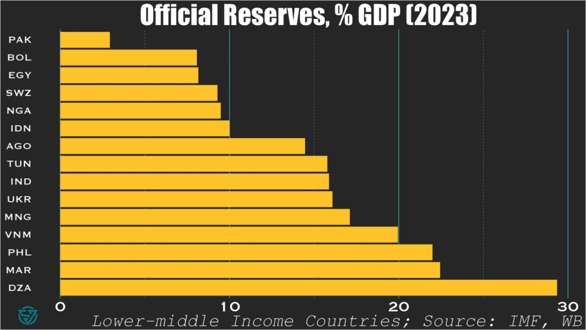
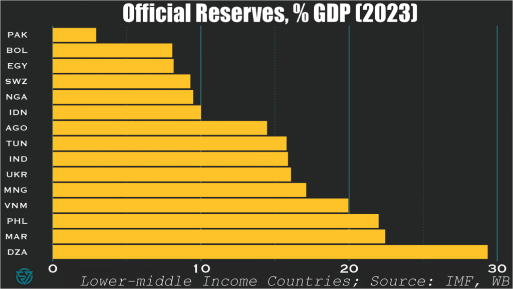
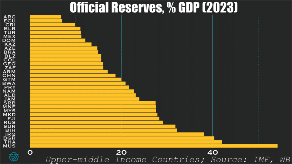
It’s not just the usual suspects: some oil exporters also have low official reserves levels.
When writing last week’s piece on the IMF’s shoddy deal with Pakistan, I was blown away at the country’s astonishingly-low level of international reserves.
$9.5 billion for a $350 billion economy. That’s only around 3% of GDP and 1-2 months of import cover. Such a low amount of cash on hand isn’t exactly best practice, whether it’s sovereign, corporate, or personal finance.
So it got me thinking: is Pakistan really such an outlier? Or am I just crazy or ill-informed?
Lower-middle income countries
Turns out I was right: among countries in its income bracket, Pakistan has the lowest reserves-to-GDP ratio of all.
Bolivia, Egypt, Swaziland, Nigeria, and Indonesia are not far behind, at 10% or less.
Yet international reserves are far from the only macro indicator that matters of course. So I suppose we should be forgiving of Indonesia, which generally has much of its (macro) house in order.
Upper-middle income countries
Looking at upper-middle income countries, only three in-sample are sub-10%: Argentina, Ecuador, and Costa Rica. I suppose Latin America really does have a savings problem.
As expected, these slightly richer countries generally exhibit higher reserve-to-GDP ratios than their poorer counterparts. No surprise there.
What is surprising, however, is to see oil-exporters like Azerbaijan, and Kazakhstan sub-15 percent.
Mexico, Brazil, and Colombia also produce oil and also have low ratios. But, then again, they are also Latin American…
“What’s the big deal?”, I hear you asking.
Well, Ukraine is a lower-middle income country fighting a war and undergoing debt restructuring. Yet Kyiv still manages to have more in the bank than wealthier countries with much lower-levels of security threats.
To me, that speaks volumes about economic management.
Pakistan and the IMF recently agreed on a program worth $7 billion, which appears woefully insufficient to resolve the country’s macroeconomic imbalances. The Fund claims that the Extended Fund Facility over the next 37 months intends to “cement macroeconomic stability and create conditions for a stronger, more inclusive, and resilient growth.” But this nothingburger of a deal – painfully, obviously so ($2.3 billion per year?) – will more likely achieve the opposite.
Some quick stats from 2023 pulled from my sovereign stress tracker, where Pakistan flashes red on reserve cover and debt-to-revenue:
Average annual interest payments over the next five years = ~6.5% / GDP (~$20 billion)
Average annual principal payments over the next five years = $19 billion
Imports typically range from $60-85 billion
Export revenues range from $30-40 billion
Tax revenues = ~10% / GDP (~$35 billion)
In 2023, the current account deficit narrowed to -0.7% of GDP (-$2.4 billion), but in the past these have been much larger (e.g. ~-$17.5 billion in 2022). But even financing small external deficits could prove difficult. With annual FDI generally under $2 billion and in the absence of other private capital inflows, the government will likely have to borrow more. This is a problem given already-high public debt levels at 77% / GDP, of which Pakistan owes 28% / GDP to external creditors.
So it is crucial that Pakistan runs small current account deficits or, dare I say it, surpluses. If the global trading system worked as it should (i.e. fantasy-land), non-commodity-exporting emerging and frontier economies should be expected to run current account deficits. The idea is that the current account surpluses of wealthy countries would fund the development and climate transition of poorer nations.
But since so few advanced economies run surpluses, I guess this nuclear power and world’s fifth-most populous country will just have to tighten its belt. Fantastic.
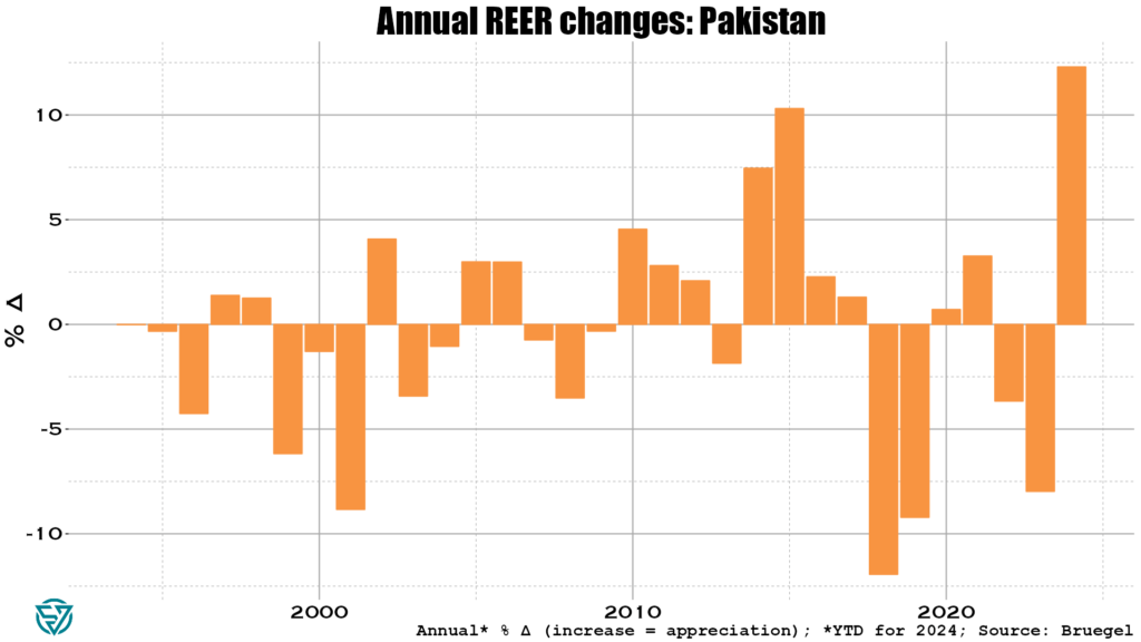
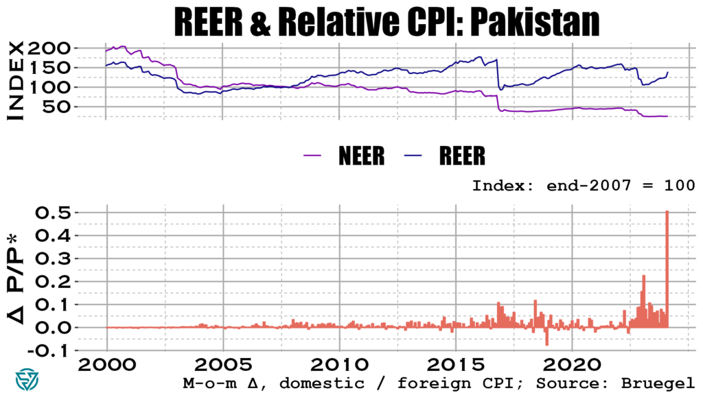
To avoid large external deficits, Pakistan’s real exchange rate needs to depreciate. Yet the exact opposite is happening, so don’t hold out too much hope for a small CAB deficit this year:
Olivier Blanchard once said that inflation is the canary in the coal mine. In the chart below you can see that Pakistan’s weighted inflation differential with its trading partners skyrocketed in May 2024.
Consider the alarm sounded. Even on the off-chance Pakistan manages to run a small CAB deficit in 2024 (say, like the -$2.4 billion in 2023), annual IMF support ($2.3 billion) will barely help bridge that gap. Islamabad still has to cough up about $39 billion in combined principal and interest payments every year going forward. This sum is roughly equivalent to export receipts and slightly larger than tax revenues.
This looks to be a solvency issue. And with inflation through the roof, it’s hard to see how this doesn’t get worse before it gets better. Watch this space.
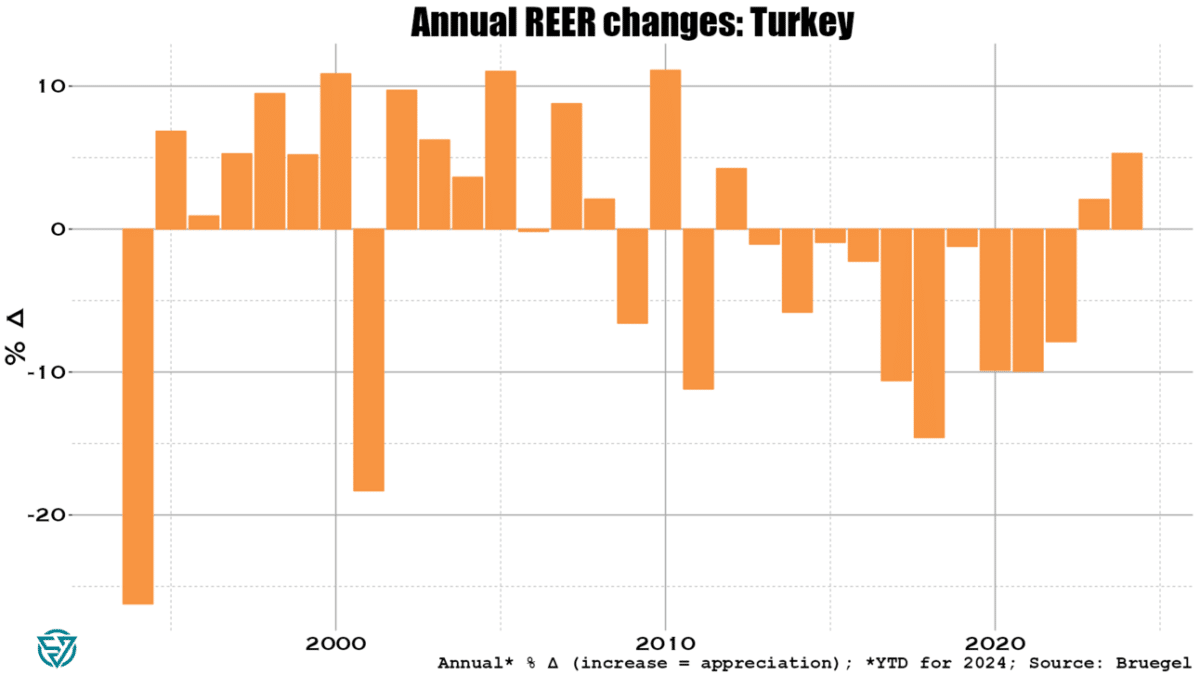
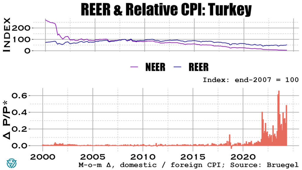
Looking across the emerging markets complex, Turkey stands out as one of the larger, systemic EMs that is rapidly headed in the wrong direction. Inflation has of course been the main symptom of imbalances in the economy, gyrating between 40-80% since 2022. It currently stands at around 70%, despite the central bank hiking the policy rate from 45% to 50% in March.
Part of the reason behind rampant inflation is an ongoing credit boom in the country. Private firms and households account for much of the borrowing, with worryingly strong growth in credit card debt. Lenders are issuing more debt in foreign currency, which increases currency risks. Non-performing loans remain low, but the central bank has tightened macroprudential regulations in response to this recent credit growth.
At above 33 to the dollar, the lira is at record lows. Even so, Turkish export competitiveness is eroding as the real exchange rate with trading partners has surged by more than 5% YTD through end-May.
With the lira tanking, inflation is of course driving real exchange rate appreciation. Prices have been rising much faster in Turkey than has been the case with its trading partners in 2023 and 2024.
It seems that so far Turkey has had somewhat of a reprieve from these brewing imbalances. Not only does loan performance remain decent, but the current account deficit was “unusually” small in May. The carry trade is driving surging portfolio and bank flows to Turkey, which has driven official reserves to increase to $148 billion in June.
Still, Turkish foreign exchange reserves are low compared to EM peers. They currently stand at 13.3% of (2023) GDP. While an improvement since last year, that’s still only 4.9 months of imports.
So it’s certainly worth keeping an eye on increases in the country’s external financing needs. An increase in the current account deficit and/or an abrupt halt to the carry trade flows linked to further worries over lira weakening could see the central bank dip into its reserves to cover gaps. Watch this space.
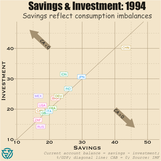
In last week’s post, I discussed savings and investment across large emerging markets and the G7 countries. As has been well-documented, imbalances in the G7 have profound consequences not only on domestic economies and the rise of populism. High consumption and the low savings that result across the G7, especially ex-Japan / Germany, means that there is less capital to flow from these rich countries to emerging and developing economies.
In the US, both savings and investment are low as a share of output. Yet investment is endemically higher than savings in the US, partly as a result of strong global demand for US assets. What that robust foreign appetite means is that in most years more investment flows into the US than flows out of the country. The stock of these accumulated flows is the Net International Investment Position.
In cases where net investment flows into rather than out of a country in a given period, its NIIP declines. As such, the US has by far the world’s most negative NIIP, which stood at -$19.8 trillion in 2023. The UK has the next-largest negative NIIP, which at -$1 trillion is a far cry from the US.
Capital flows to the US, UK, and several other external deficit countries thanks to strong investor protections, rule of law, and diversified economies. With open capital accounts, it is easy for international capital to acquire assets domestically and affect prices in financial markets, real estate, and other investment categories. There is naturally a price effect, which I have begun to measure.
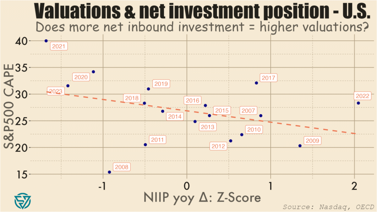
As a starting point, I’ve compared normalized annual changes in the US’s overall NIIP to the S&P 500’s cyclically-adjusted price-to-earnings ratio. CAPE is a valuation metric that compares current prices with the 10-year average of earnings per share.
As expected, I do find a negative association between changes in NIIP and CAPE levels. So more net investment into the US in a given year (i.e. a NIIP decrease) is loosely correlated with stock prices that are higher compared to long-term earnings.
In plain English, what this means is, for example: there were large net investment inflows into the US in 2020, 2021, and 2023, and S&P500 valuations were also high during those years. Conversely, large net outflows in 2022, 2009, and 2007 coincided with lower P/E ratios. There are of course factors other than net international investment flows at work, including monetary and fiscal policy.
So I won’t make any grand claims based on the chart above. Moreover, it has only a limited number of data points, and which are weakly correlated. I might run portfolio investment flows against price-to-earnings metrics to see if there is a tighter link. I also might look at other asset valuations, potentially in real estate, to see what the relationship is with capital inflows.
Essentially, I’m working my way towards testing whether foreign capital inflows contribute to asset bubbles in the US. As usual, I’ll also be expanding my analysis to other countries, in this case other G7 / advanced economies.
The point is to get a sense of the extent to which open capital accounts are driving asset prices in wealthy economies beyond the reach of local workers, thus contributing to the rise of populist political forces. Meanwhile, many emerging markets and developing economies have the potential to deliver better returns on investment than capital-saturated wealthy countries. But investment gaps in the EMs will likely persist as long as rich countries continue to run such large, negative NIIPs.
The past few weeks of political headlines have provided yet more confirmation of a long-term trend: the distinction between emerging and developed markets is less clear than it once was. Emerging and frontier markets are less politically stable, or so the old consensus goes.
Yet Emmanuel Macron has flown in the face of all that by dissolving France’s parliament and calling snap legislative elections. The prospects of extremist parties coming to power or of a hung parliament in France has sent European markets reeling.
Sadly, Macron’s folly is just the latest episode in a recent litany of rich-world self-sabotage. Cue January 6th, just about everything that Donald Trump does, Brexit, and the tenures of Boris Johnson and Liz Truss. To complement the Anglosphere’s masochism, add in the rise of the Italian far right, multi-faceted German despondence, and demographic reversals in Japan, Italy, and Germany. The result is something other than a pretty picture. At the recent G7 meeting in Italy, every leader save Prime Ministers Meloni and Kishida was speaking from a position of political weakness.
The upside-down global trading system
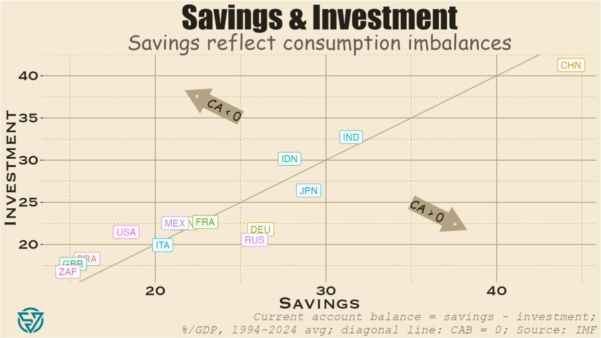
One of the driving forces behind this wealthy-country malaise is the absence of a well-functioning global trading system. Consider that savings is the difference between income and consumption. One would think then that advanced economies would have more savings than emerging economies, as they have greater income. Not so.
As a share of GDP, China, India, Indonesia, and sometimes Russia all have higher savings rates than G7 countries. In fact, only Germany and Japan have roughly equivalent savings rates, followed by Canada, France, and Italy. The US and the UK trail distantly.
The Chinese anomaly
The advantage of a high domestic savings rate is of course that a country can use these fund investments. China is an extreme example of this. By suppressing domestic consumption, Beijing has been able to jack up investment levels to dizzying heights without even running a current account deficit.
This is of course a significant problem because that abundance of savings ends up penalizing savers. The result is a vicious circle where the authorities discourage consumption in order to keep interest rates low for investment, which hurts people with money saved up in the bank. It’s a classic case of financial repression. Remember that the Chinese government directs a lot of investment from state-owned banks to inefficient state-owned enterprises. This is a recipe for slower growth, which China is currently experiencing.
Unfinished construction in a Chinese “ghost city.” Civic Data Design Lab
These chronically high savings end up “exporting” China’s weak consumer demand to the rest of the world, to the dismay of its trading partners. Juicing up savings to such levels results in over-investment domestically, without which the world’s largest current account surplus in dollar terms would be even larger. Remember that investment most typically reflects fixed capital formation, e.g. the construction of infrastructure and real estate assets. Hence the ghost cities that pepper the real estate landscape. Echoing US residential real estate pre-2007, many Chinese families had bought several apartments as investments during the boom years and are now enduring the ongoing property crisis currently afflicting the country.
CAB deficit, low investment, high consumption
The US and the UK are the best counter-examples to the Chinese model. In these countries, consumption is subsidized, partly through easy access to a diverse array of credit products at relatively low rates. Higher consumption naturally results in lower savings rates, which in turn mean some combination of:
Investment would have to decrease significantly for the current account to be at zero and/or
If investment doesn’t decrease by a lot, then there must be a current account deficit.
In reality both countries experience both low investment and current account deficits. This combination isn’t only an obstacle for directing resources towards badly-needed infrastructure maintenance and upgrades. Current account deficits make it harder for capital to flow from rich countries to poor ones that need it.
A deadly Amtrak train crash in DuPont, Washington in December 2017. Stephen Brashear / Getty Images
What we have is a world where the US, the UK, and other wealthy countries over-consume. France, Canada, and Australia are mostly in this camp as well. Over-consumption, external deficits, and financialization don’t only come at the cost of infrastructure investment and funding for international development. They also result in the outsourcing of jobs and entire industries because subsidizing consumption comes at the expense of production.
Exorbitant privilege, exorbitant cost
This status quo also reinforces the US dollar’s status as the reserve currency because US current account deficits mean that the US can flood the world with dollars. The US can do this because of well-entrenched, large global demand of US assets, whether financial, real estate, or other. This is what gives the US Treasury its “exorbitant privilege” to borrow significantly, at low cost.
Savers around the world are always keen to invest in highly-diversified economies with strong property rights. Open capital accounts across most of the developed world make it possible for capital to move around nearly seamlessly for buying and selling assets. This is one reason why asset valuations across much of the Anglosphere seem so stretched, whether stock market valuations or residential real estate prices. Local workers, even in wealthy cities like New York, Vancouver, and Sydney, are being priced out by global capital.
Moreover, a global economy awash in dollars is one where the dollar can be weaponized via sanctions. Dollar dominance also reinforces the power of US banks, which are already strengthened by domestic financialization.
This is also a system that benefits US dollar strength. While a strong dollar hurts US exporters, no one in the US government or Congress really seems to care about export competitiveness beyond lip service. Worse still is the fact that an appreciating dollar is associated with lower trade volumes and more expensive debt servicing costs on dollar-denominated debt for emerging market issuers.
CAB surplus, high investment, low consumption
On the flip side are the economies running current account surpluses. First and foremost China, but also Germany, Japan, Russia, and – sometimes – Italy. One thing that these countries all have in common is rapidly-aging populations. People in prime working years tend to consume more due to higher income levels and spending needs, including children.
China, Germany, and Japan also under-consume because they subsidize production at the expense of consumption. If you’ve ever wondered why Japanese unemployment rates are so low, consider that a relatively small working-age population has a lot of domestic exporting industries to choose from. Or why wages and real estate prices are lower in Frankfurt and Berlin than in London and Paris. Germany has kept wages and consumption low to boost manufactured exports.
Unsustainable consumption imbalances
The global trading status quo doesn’t only damage the developing countries that need access to rich-world capital. These imbalances are also causing rot at the heart of G7 economies. For the US and other deficit countries, consumption is too high. Jobs and industries have been outsourced, while asset prices have skyrocketed out of reach for workers.
In Germany, Japan, and Italy, consumption is too low in these aging societies with external surpluses. Domestic industry has survived, in part thanks to the typically-abundant savings of the elderly.
Balanced consumer demand is needed across advanced economies, in China, and beyond. Only then will more stable electoral politics return to the G7.
With the African National Congress party having endured a crushing defeat in South Africa’s election on May 29th, the political horse-trading around forming a minority government is already well under way. The final tally shows the ANC receiving 40% of the votes and 159 of the parliament’s 400 seats, a sharp drop from the 230 held previously.
Coalition-forming
These are uncharted waters in the post-apartheid era, as the ANC has lost its parliamentary majority for the first time in three decades and now finds itself constrained to seek coalition partners. Although many observers expected a challenging vote for the party, the scale of this electoral setback and its ramifications are still sobering.
The market-oriented, center-right Democratic Alliance continues on as the assembly’s next-largest party with 87 seats and is amenable to coalition talks, as parties seek to strike a deal before a parliamentary session begins in two weeks. Ex-president Jacob Zuma’s uMkhonto weSizwe party is in third position with 58 seats, though the personal antagonism between Zuma and the ANC’s leader, President Cyril Ramaphosa, likely precludes any bargain between the two.
Macro mismanagement, demographic dividends
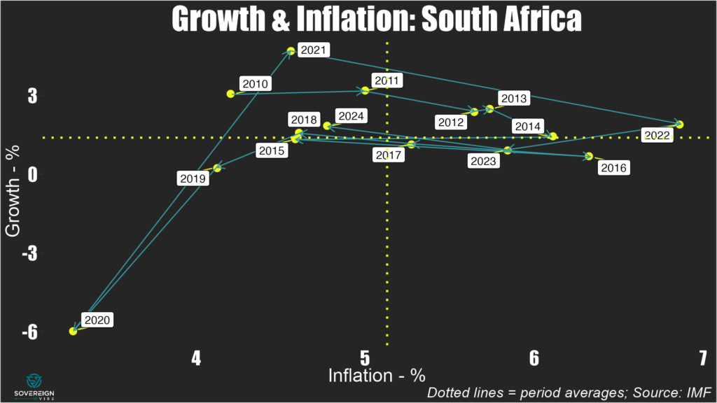
As the dust settles over this result, a quick look at some macro variables helps explain why the ANC got thrashed and where South Africa might be headed. Since 2010, average annual real GDP growth has been lackluster, at less than 1.5%, while inflation has been above 5% on average. Budget deficits have mostly been in the range of -4% to -5% of GDP for the entire period. The current fiscal approach is probably unsustainable over the long term, especially given that these spending overruns don’t seem to result from long-term investments in key areas. The woes of the national power grid operator Eskom serve as a prime example.
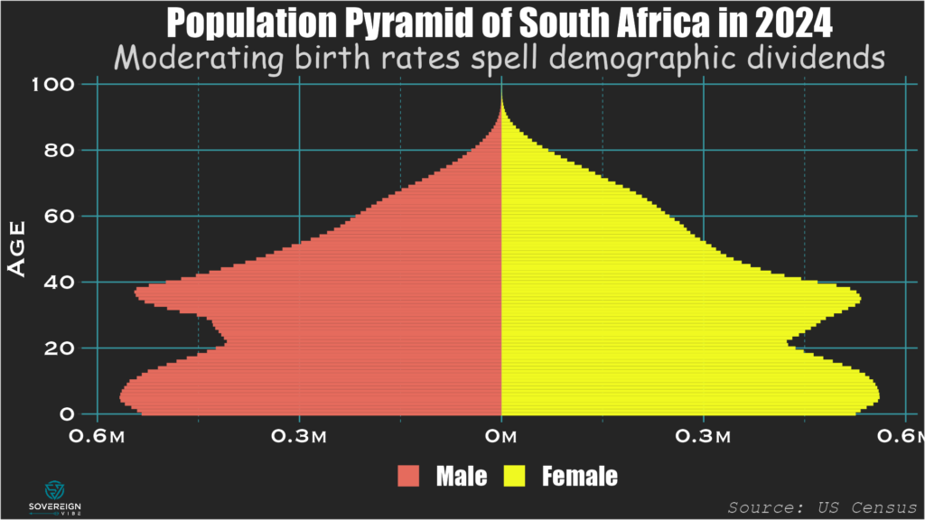
One outcome from the ANC’s economic policies is that GDP per capita has failed to rise significantly over the past two decades: the $6800 recorded in 2022 isn’t far above the $6100 registered in 2006. Indeed, real output growth has barely been able to annual outstrip population growth, which after dropping sharply in the 1990s, rose from the 2000s until peaking above 2% in 2015. Thankfully, annual population growth has moderated in recent years, and the fertility rate stands at a reasonable 2.37 births per woman, slightly above the replacement rate of 2.1.
As such, South Africa has a demographic advantage with a relatively small and declining share of the population that is outside the working ages of 15-64. At 53%, this is on par with the US and much lower than elsewhere in Africa (e.g. 80% in Senegal). The numbers of young South Africans set to enter the workforce over the short- and medium-terms is large compared to the overall numbers of young and elderly residents, meaning that the country has a demographic tailwind to be harnessed – but only if the new government gets its policies right.
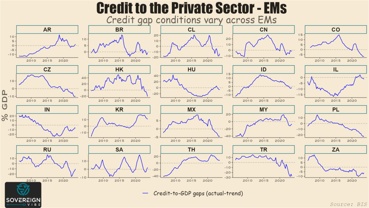
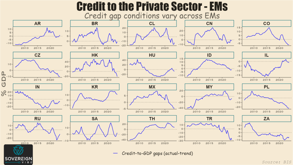
Today’s charts are snapshots of credit-to-GDP gaps in emerging and advanced economies. As a reminder, the credit gap measures the difference between actual credit to the private sector and trend credit to the private sector.
These estimates through Q3 2023 are provided by the Bank for International Settlements, which describes its credit-to-GDP ratio as capturing total borrowing from all domestic and foreign sources by the private non-financial sector.
Several factors have an impact in determining private sector borrowing. These include how developed the country’s financial system is, the ability of domestic firms to borrow internationally, and the extent to which public sector borrowing crowds out the private sector.
As such, the level of credit to the private sector as a percentage of GDP varies significantly from country to country. It is therefore more helpful to look at credit-to-GDP gaps when comparing across countries.
Besides, credit gaps are one measure that the IMF uses in measuring sovereign stress for market-access countries. A high, positive credit gap can point to the presence a credit bubble. Such bubbles are sometimes a symptom of macroeconomic imbalances and policies that can lead to sovereign debt strains.
There is little evidence of excessive credit gaps in emerging markets. The absence of credit bubbles is at least partly attributable to EM central banks hiking rates rapidly in response to inflation when it first began appearing in the latter stages of the pandemic. This early tightening has enable EM central banks to start easing before many of their developed market peers, e.g. Brazil and Mexico in Q1-2024.
Of course the chief objective of monetary policy is price stability. But, by definition, rate changes also affect credit conditions and lending.
South Korea is one of only two EMs in this sample with a sizable, positive credit gap. That excess credit is, however, declining, as the country’s central bank maintains its policy rate at a 15-year high with no signs of imminent loosening.
The other is Thailand, where the central bank is holding its policy rate steady despite political pressure to ease. In the meantime, its credit gap is also narrowing.
This relatively benign outlook across major EM is a sign of improving policy credibility compared to the volatility that led to various EM financial crises in the past. On the other hand, a negative credit gap doesn’t necessarily indicate sound macroeconomic management, e.g. see Turkey, South Africa etc.
The BIS only provides data for 21 EMs, which is already a lot. But achieving broader country coverage is why I also use similar World Bank data in my sovereign stress analysis.
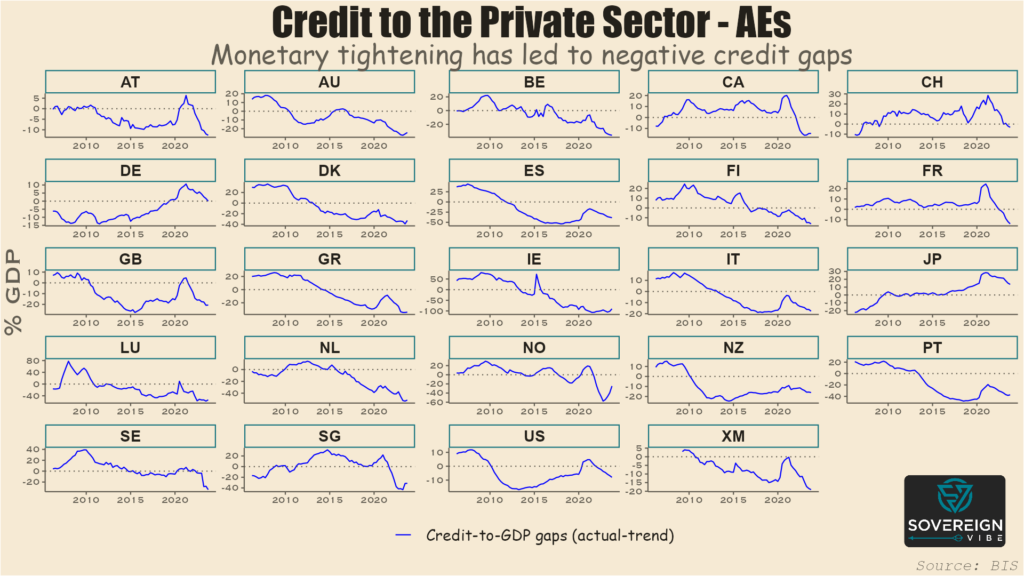
Looking at advanced economies, the gaps are virtually all negative, as in EM. But, unlike EM, almost all of the gaps appear to still be widening, representing the later start to post-pandemic monetary policy tightening by AE central banks.
Note the sizable negative gap in the Euro Area (i.e. “XM”), which is a cyclical indicator suggesting that a turning point for the ECB might not be too far off. Indeed, Switzerland has recently led the way with a first DM rate cut this cycle. Japan is the outlier with its large, positive credit surplus, but tighter monetary policy has been eroding that gap in recent quarters.