One of the holy grails in the economics profession is to accurately measure an economy’s output gap, which is the difference between its actual GDP and potential GDP. Having an accurate representation of an output gap is useful for all sorts of economic modeling purposes, given statistical relationships with inflation, exchange rates, and a host of other variables of interest to economists, investors, and policymakers. Simply put, a positive (negative) output gap means that actual GDP is above (below) potential GDP.
Yet the IMF in its flagship World Economic Outlook database provides output gaps for fewer than 30 advanced economies, to say nothing of emerging and developing economies. The Fund does of course in many cases provide such estimates elsewhere, such as in country and program monitoring reports, but, unfortunately, leaves these out of the WEO.
Measuring output gaps is notoriously riddled with uncertainty because, unlike actual GDP, potential GDP isn’t directly observed through spending or income. Rather, it needs to be estimated in some other way, which I have done for the broadest possible group of advanced and emerging-developing economies.
The optimal approach for calculating potential GDP likely focuses on supply side inputs including total factor productivity, labor, and capital à la Y = ALαK1−α, an example of which is the Production Function Methodology. Yet such methodologies can be data-intensive, especially when looking at emerging and developing economies, for which data is often scarcer.
An alternative is to use a moving averages approach – one of which is known as Hodrick-Prescott filtering – that separates actual GDP readings into trend and cyclical components, representing potential output and the output gap, respectively. One of the downsides of this approach is that it may misestimate potential output by ignoring the individual supply-side constituents used in bottom-up methodologies. An advantage of HP filtering is that potential GDP and output gaps can be quickly estimated for a broad group of countries from real GDP data.
The problem is of course whether the HP-estimated output gaps that I have prepared are actually any good. To assess this, I compare the HP results with the countries – all of which are advanced economies – for which the IMF provides output gap estimates in its World Economic Outlook database. Using the October 2023 WEO, I derive the HP output gaps for many countries with annual real GDP readings and λ = 100. I rely on data in national currency, which has the benefit of minimizing exchange rate effects that are present in USD data. I then plot the HP-derived output gaps against the IMF’s own output gap estimates, hoping to see something resembling a positive, one-to-one relationship, which the data bear out fairly well:
Behind the scenes I’ve looked at slopes by individual countries (remember m = Δy/Δx), and these all seem to be m < 1, indicating that there is more variance in the HP-derived output gaps. In any case, these data seem to track pretty closely, meaning that the HP gaps probably have some analytical value.
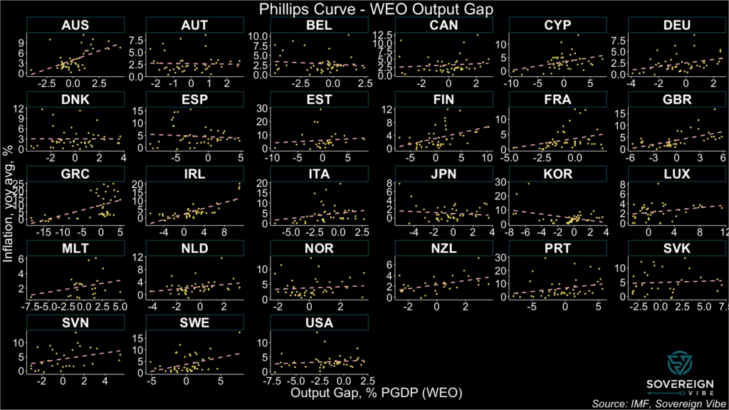
Next, I put the WEO and HP output gaps to the test separately against inflation readings, expecting the relationship to be positive. The theoretical underpinning is that when an economy is running hot – i.e. its output gap is positive – prices tend to rise more. Known as the Phillips Curve, this relationship is also often shown as the negative link between inflation and unemployment.
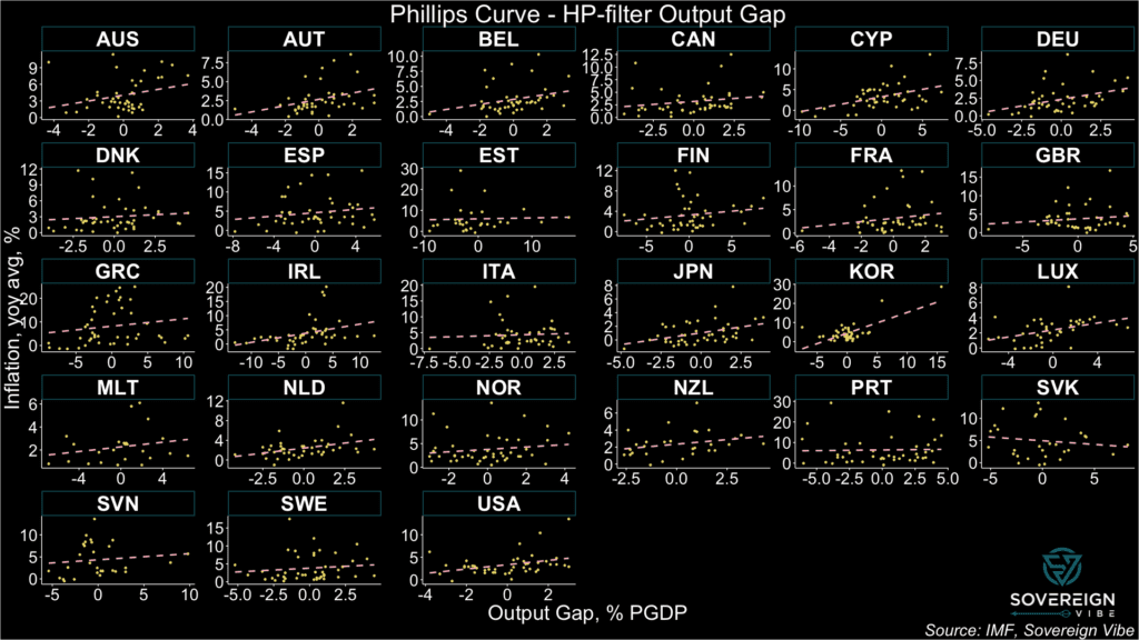
The two faceted charts below show Phillips Curves for the selected countries where IMF output gap estimates are available in the WEO. The first one uses the IMF’s output gap estimates in the x-axis, while the second one uses the HP-derived ones. Consistently positive relationships likely point to better output gap measurement.
In the first chart, the WEO’s output gap estimates point to a positive relationship with inflation in most countries, as per the fitted linear regression lines. There are, however, some exceptions. Austria, Belgium, Spain, Japan, Korea, and possibly Denmark all exhibit negative relationships. Others such as Slovakia, Estonia, and Norway appear quite flat. This calls into question the IMF’s output gap estimates in these countries, according to the Fund’s own data.
On the other hand, the second chart exhibits more consistently-positive relationships with inflation in this sample of countries, suggesting that the HP-derived output gaps may actually be more accurate than those provided by the IMF. Slovakia appears to be the only country with a negatively-sloped line, although admittedly Estonia, Italy, and Portugal are nearly flat.
Following the release of sovereign debt stress heatmaps for 82 market-access countries, the underlying data for nine indicators for near-term risks is now available in the dashboard below. This first iteration facilitates visualization of each variable since 2010, with the possibility of viewing multiple countries simultaneously for comparative purposes. This tool is based directly on the IMF’s model for detecting the probability of sovereign debt strains 1-2 years ahead, as described in its 2021 Debt Sustainability Framework for Market-Access Countries. In addition to the IMF’s own documentation, past posts on this site describe the model and its indicators in more detail:
Institutional quality
Stress history
Current account / GDP
Real effective exchange rate: 3-year change
Credit gap to the non-financial private sector / GDP (t – 1)
General government debt / GDP: 1-year change
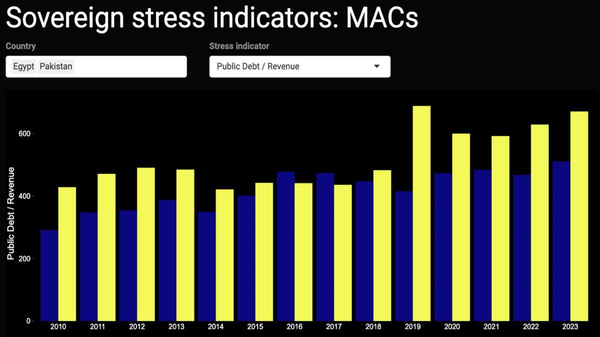
Public debt / Revenue
External public and publicly-guaranteed debt / GDP
International reserves / GDP
Future iterations
For the time being, this dashboard allows for users to view only one indicator at a time, and excludes one of the IMF’s ten independent variables – the one-year change in the VIX index.
A further improvement for future versions concerns the change-based variables, as it would be helpful for readers to also – or only – view the level of REERs and general government debt (and of the VIX, if included).
Moreover, an augmented dashboard for broad monitoring of sovereign debt strains would have to include interest payments, amortization schedules, gross financing needs, central bank interest rates, and more information on exchange rate dynamics, inter alia.
Missing data
Lastly, working with this data from a range of official, reputable sources highlights severe deficiencies in coverage. In some cases, the data is missing outright:
For instance, World Bank data would have us believe that Israel has no external PPG debt or that Jordan has no international reserves, which is untrue in both cases.
Similarly, BIS data on credit gaps is only available for around 40 countries, though these are easily estimated for a much larger set of countries using World Bank data.
Despite these oversights from multilateral data sources, it is still useful to have broad overviews of the sovereign debt landscape for those needing to view which parts of the system are coming under strain. Of course, paid data sources can help plug these data holes.
But, given efforts at the IMF, World Bank, and elsewhere to advocate for sovereign debt transparency, surely some of the lowest-hanging fruit must be for the multilateral institutions themselves to improve their own data collection and dissemination practices to make relevant data more widely-available.
Angola, Pakistan, Egypt, Jordan, Argentina, El Salvador, Ecuador, and Belize are among the market-access countries most at risk of sovereign stress, according to the model presented below.Unsurprisingly, several advanced economies appear least at risk, including Norway, Ireland, Denmark, Singapore, the Netherlands, Luxembourg, Hong Kong, and Switzerland.
Earlier this year I published the high-level initial results of a sovereign debt stress tracker, based on a model developed by the International Monetary Fund for countries that it classifies as having access to international markets. The IMF presented this model as part of its update to its Debt Sustainability Framework for Market-Access Countries in 2021, claiming at the time that it had performed significant robustness checks to ensure forecast salience. Time will tell how useful this tool is in predicting sovereign debt strains, and, in any case, it should only be used in conjunction with other analytical approaches.
Heatmaps
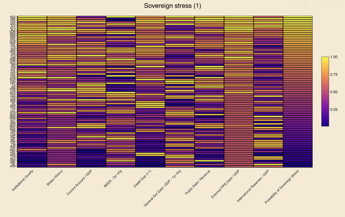
Using the latest available data for 2023, the heatmaps below rank order countries by the probability of experiencing sovereign stress, as represented by the column farthest to the right. Neither the probabilities for the dependent variable nor any of the raw data readings for any of the independent variables is shown below. Instead, readers can see the percentile rank compared to the maximum value in each variable column, which is beneficial for visually detecting relative heat for each indicator.
Lighter colors represent more risk, while darker colors represent less risk. Independent variables with negative coefficients, i.e. are negative predictors of sovereign stress, have been reversed in order to ensure color scheme coherence. These include institutional quality, the current account, and international reserves.
The first heatmap below suggests that Angola, Pakistan, Egypt, Jordan, Argentina, El Salvador, Ecuador, and Belize are most at risk of experiencing sovereign debt strains. Looking across the independent variables for this group of countries:
They generally suffer from high external public debt burdens and from relatively poor institutional quality, though Argentina and Jordan fare better on those measures, respectively.
El Salvador is penalized relatively less on stress history, though this assumes spread widening in recent years remained under the IMF’s stress definition threshold (see “Model” section below).
One-year changes in general government debt in Angola, Egypt, and Argentina point to potential risks.
El Salvador, Jordan, and, to a lesser extent, Pakistan, appear to need some replenishing of their international reserve buffers.
Angola and – to a lesser extent – Argentina are marked down for surging REERs.
Pakistan and Egypt display relatively concerning public debt/revenue ratios.
Jordan stands out for poor current account performance.
Egypt, Jordan, and Ecuador exhibit high credit-to-GDP gaps, though several other countries fare worse on this measure.
Each value is divided by the maximal value in that column, resulting in its own empirical percentile. Each value shown is the percent of observations with that value or below it. Sources: IMF, WGI, WB, Bruegel, BIS, author’s calculations.
The second heatmap uses foreign currency general government debt to replace the external PPG debt indicator featured in the first heatmap (see explanation in “Data” section below). Neither of these indicators is ideal, as in both cases coverage for many countries is either lacking or data points are equal to zero. This is obvious in both heatmaps from the absence of dark-colored cells in the relevant column, meaning that many countries are zero. Overall country coverage on this variable is better in the first heatmap, but the second one provides value for countries where data is missing in the first one (e.g. Israel, Korea, Sweden).
The eight countries most at risk of sovereign stress in this second heatmap are the same as in the first one, albeit in a slightly different order and except for Mexico replacing Belize. On this latter point, FX general government debt data – sourced from the BIS (see “Data” section below) – is missing for Belize, conferring on it an unfair advantage over Mexico and other countries where data are present for this indicator. In the first heatmap, external debt data is present for both Mexico and Belize, with the latter appearing more at risk than the former.
Each value is divided by the maximal value in that column, resulting in its own empirical percentile. Each value shown is the percent of observations with that value or below it. Sources: IMF, WGI, WB, Bruegel, BIS, author’s calculations.
Interpretation
Focusing on a country case helps illustrate ways to interpret the data in this model. Take Angola, as it appears most at-risk. Using heatmap (1), the brightest and thus most concerning data points are in the institutional quality, REER 3-year change, general government debt 1-year change, and external public and publicly-guaranteed debt columns. This suggests that the government and public sector more broadly are borrowing heavily, while prices and the exchange rate have also combined to rise quickly. Moreover, the institutions to set a good policy framework appear to be lacking. This is already a dangerous mix.
On the other hand, Angola scores well on its current account balance and international reserves variables. This is easily explained by the fact that the country is an oil exporter, thereby keeping its current account balance high and accumulating foreign reserves from the proceeds of these oil sales to buyers abroad.
While these oil exports provide Luanda with ample benefits, heavy reliance on a commodity-based export sector is also a double-edged sword. The result is often an appreciation of the exchange rate, making the economy less competitive for developing other industries: a classic case of Dutch Disease.
More concerning still is the presence of high inflation. The country’s surging REER variable already suggests that prices are probably rising, as the overall increase is unlikely to be due to nominal exchange rate dynamics alone. Increases in government debt suggest potential fiscal profligacy, which can lead to undesirably-high inflation, the presence of which is confirmed by a glance at recent Angolan statistics. The credit-to-GDP gap, which measures the deviation from trend of credit to the non-financial private sector as a share of GDP, is not particularly alarming in Angola, but may be high enough to also be contributing to the rising price level.
Angola also exhibits a high public debt-to-revenue ratio, which is worrying, given all the oil revenues that the country is seemingly raking in, suggesting that less borrowing and more fiscal discipline are likely needed. Recent sovereign stress is also a concern, indicating that, for all its natural resources, the government is unable or unwilling to pursue policies required to maintain macroeconomic stability.
Model
To recap, the model’s dependent variable is the probability of sovereign stress, which the IMF has detailed criteria for defining – running the gamut from outright default to a mere spread widening beyond a certain threshold. Regarding the independent variables:
The first two represent how recently a country has experienced sovereign stress, and its government effectiveness and regulatory quality.
Other explanatory variables are macroeconomic in nature, including current account balances, real effective exchange rates – which also capture price changes, credit gaps to the private sector, and international reserves.
More specifically fiscal indicators include those on general government debt, foreign currency public debt, and public debt-to-revenue ratios.
With the exception of REERs and debt-to-revenue, these macro-fiscal indicators are all expressed as a share of GDP.
A global variable also features in the model, the VIX Index, which measures stock market volatility in the US, but is not presented in the heatmaps above, given its constance across countries.
Data
In the first iteration of the tracker, 2023 data was captured for 43 market-access countries, including both emerging markets-developing economies and advanced economies. Thanks to more available data for this year and refinements in data capture, coverage has been expanded to 82 MACs in these heatmaps.
Two similar heatmaps are presented in this article, with a difference in one of the independent variables and, as a result, slight changes to the overall results in the dependent variable. One of the IMF’s indicators is foreign currency public debt. In the first instance, the World Bank indicator for external public and publicly-guaranteed debt is used as the best available proxy for the IMF’s variable. While using this data from the World Bank remains the best possible option at this stage, there are some glaring omissions in coverage. For instance, the World Bank source suggests that Israel’s external PPG debt is equal to zero, which is clearly incorrect.
As a remedy to the World Bank’s data deficiencies, a second heatmap applies data from the Bank of International Settlements on foreign currency general government debt, as a proxy for this indicator in the same overall model. The BIS data does fill in some of the World Bank gaps – e.g. Israel – but in fact covers fewer countries than the first source. As such, the first heatmap is still preferable.
It is also worth noting that both the World Bank and BIS indicators differ from the IMF variable of foreign currency public debt. In the former case, external public debt differs somewhat from foreign currency public debt, even if virtually all external debt is in foreign currency. In the latter case, foreign currency general government debt excludes some types of debt that is covered under foreign currency public debt.
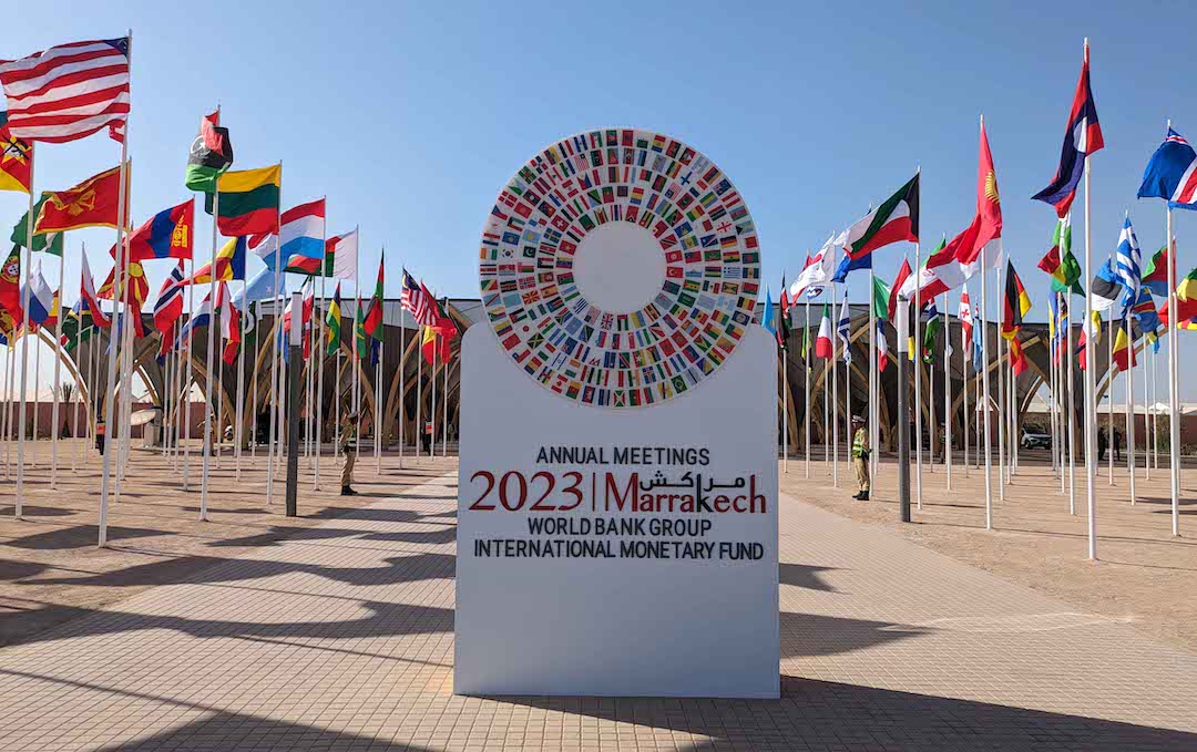
The World Bank Group-International Monetary Fund Annual Meetings drew to a close in Marrakech this past weekend, the first time these events have been held in Africa since the 1973 edition in Nairobi. While the Bank-Fund leadership expressed their usual endorsement of international cooperation and optimism for the future, this year’s agenda also explicitly aimed to address geopolitical fragmentation and fully acknowledged heightened threats to the goals of eradicating poverty; bolstering sustainable, inclusive growth; and preserving macroeconomic stability.
The main problem at this year’s annuals wasn’t a new one and goes by many names: geopolitical competition, fragmentation, deglobalization, trade frictions, or decoupling. A whole host of challenges to multilateral financing efforts stem from the political obstacles to international cooperation that have emerged over the past decade, with the 2007-2009 Global Financial Crisis marking the end of America’s “unipolar moment” and ushering in a new, more competitive era. The prospects for a new capital increase for multilateral development banks, innovative hybrid financing solutions to boost World Bank lending, and sovereign debt restructuring processes are all suffering from the fractured backdrop.
IMF Global Policy Agenda
The IMF’s policy priorities are a response to the main macroeconomic challenges in today’s global economy:
tame inflation
ensure financial stability
restore fiscal room
boost medium-term growth
Indeed, inflation has not yet reverted to central bank targets in many countries, while the rapid rise in interest rates in the past few years have strained parts of the US banking system. At the same time, expansionary fiscal policies have pushed up yields on government debt in various countries, with the return of bond vigilantes evident in the US in 2023. The prospect of higher fiscal deficits can also sometimes undermine financial stability, as exemplified by the UK mini-budget straining pension schemes in September 2022. Tighter fiscal policy will be necessary in many countries to guard against future shocks, while appropriate reforms are also widely-needed to revive the dimmed outlook of medium-term growth.
In parallel with the macroeconomic policy priorities, the Fund is pursuing complementary objectives. The IMF launched, with the government of Morocco, the Marrakech Principles for Global Cooperation, which include reinvigorating inclusive and sustainable growth; building resilience; supporting transformational reforms; and strengthening and modernizing global cooperation. These principles are a welcome attempt to stem the tide of global divergences, even if they are unlikely to meet with much success in the short term. In a similar vein, the IMF has attracted more funding for the interest-free Poverty Reduction and Growth Trust and for the climate change-focused Resilience and Sustainability Trust.
Of note, the IMFC Chair committed to concluding the 16th General Review of quotas by December 2023, in light of agreement on a significant increase of quotas this year. Crucially, there seems to be support for quota realignment by June 2025 to reflect current economic realities, including through an updated quota formula. The IMFC has also called for the creation of a third chair on the IMF Executive Board for Sub-Saharan Africa, in order to improve the continent’s representation.
Yet the IMF has not been able to deliver more in the way of impactful policy successes. One potentially high-impact policy area would be finding a solution for re-allocating SDR usage from the wealthy countries that don’t need them to the poorer countries that do. A further work-stream with outsized effects would be to do more to strengthen the Global Financial Safety Net, which includes the IMF’s toolkit, bilateral swap arrangements, regional financial arrangements, and international reserves – a tall order in the current environment.
Global Sovereign Debt Roundtable
The official sector has achieved a modicum of progress on improving the sovereign debt restructuring architecture in recent months. Probably of most importance to private creditors is improved information-sharing during restructurings, with new possibilities for private lenders to access debt sustainability analyses and related elements at the same time as official creditors, under certain conditions. The Fund has highlighted the increasing speed from staff-level approval to Board approval, from 11 months in Chad in 2022, to 9 in Zambia, 6 in Sri Lanka, and 5 in Ghana most recently, while recognizing that this is still above the 2-3 month average in the past.
The IMF maintains that external public debt strains are not currently as high as they were in the 1990s, even considering the existence of larger local debt markets, which has led to some observers wondering if there is a sense of complacency about pending risks in low-income countries. The IMFC welcomed progress in Zambia, Sri Lanka, and Suriname but called for more results in Ghana, Ethiopia, and Malawi, while also calling for stronger creditor coordination for sovereign debt restructurings occurring outside the Common Framework.
One of the main pieces of news to come out of the meetings was that Zambia’s finance ministry and its official creditor committee signed a memorandum of understanding, thus formalizing the agreement reached in June, and paving the way for Zambia to seek comparable treatment from its commercial creditors. It was also revealed that Kenya may be seeking exceptional access to IMF support ahead of a $2 billion bond maturing in June 2024.
There are some other minor new features in the sovereign restructuring framework, regarding cutoff dates (no later than staff-level agreement), state-contingent debt instruments (which shouldn’t be the norm), and the appropriate approaches to domestic debt (case-by-case) and SOE debt. Other areas remain contentious among the various creditor categories, such as appropriate discount rates to be used for NPV calculations for comparability of treatment. There is also no consensus on the treatment of arrears and on debt service suspensions during negotiations.
Show me the money: capital increases for MDBs?
Despite the ongoing efforts of senior staff to convince donor countries to provide more resources for development, the World Bank Group’s ambitions will continue to lack requisite firepower. The cause is an absence of political will in most of the G7 countries to make sufficient financial commitments to development, as evidenced by a succession of broken Western promises. To be sure, some efforts are under way, such as Japan’s pledge to significantly raise its contribution to the IMF’s zero-interest loan tool, the Poverty Reduction and Growth Trust. For its part, the US may transfer $2 billion in additional funding to the World Bank Group this year, though this is a far cry from the scale that is needed.
Additional annual financing required to meet the United Nations’ Sustainable Development Goals stands at around $3 trillion. The G20’s Capital Adequacy Review framework suggests that a general capital increase for the multilateral bank system, including the IBRD, could unlock $200 billion in annual lending, with a further $80 billion annually from balance sheet optimization (e.g. callable and hybrid capital). The Center of Global Development suggests that the international development finance system should boost its annual financing by $500 billion by 2030, with multilateral development banks providing $260 billion and national development finance institutions delivering the remainder. Private capital ought to match that half-trillion increase, for a combined public-private total of $1 trillion.
Yet these figures still fall well short of the additional $3 trillion needed annually. By the CGD’s calculations, each dollar of new equity in MDBs can be leveraged for $15 of external sustainable investment financing, of which $7 in direct MDB lending and $8 in private capital. Assuming that private finance can be crowded in to such a degree is likely overly optimistic, as the CGD’s own figures indicate that MDBs currently mobilize only 60 cents for each dollar lent. Even so, public and private stakeholders will have to come up with financing solutions to achieve the SDGs, and this should be possible with enough political will: just look at the over $100 billion raised for Ukraine.
The World Bank’s Evolution Roadmap
The World Bank Group’s recently-appointed president, Ajay Banga, has laid out a roadmap to enhance the organization’s effectiveness. More efficient balance sheet management should unleash $157 billion in additional lending over 10 years, while preserving the Bank’s AAA rating. These measures include increasing the loan to equity ratio, launching a hybrid capital instrument, and creating a portfolio guarantee mechanism. Similarly, management is also exploring solutions using callable capital and SDRs. An elegant approach to channeling some of 2021’s SDR 650 billion windfall could be to have the Bank issue SDR bonds, to be purchased by national central banks.
A number of other changes are in the works under Banga. These include setting up a Global Public Goods Fund to grow concessional resources by attracting funding from governments and philanthropies, exploring maturities of up to 40 years for social and human capital investments, and exploring energy transition solutions. More importantly, efficiency gains are at the heart of the new strategy. There is an objective to slash project review and approval times by a third by simplifying procedures, while partnerships with other MDBs are already being pursued more actively so as to amplify impact. Similarly, Banga’s team plans on scaling knowledge-sharing in order to more easily share impactful solutions, and a private sector investment lab has already been set up to galvanize private financing.
Banga’s plans to streamline processes seem like a requisite pre-condition for convincing donor countries to increase the Bank’s share capital, though even if his team can deliver, any new equity is far from guaranteed. Early signs of the new president’s first few months in the role have demonstrated his dynamism and communication skills, and future success in reforming the institution’s bureaucracy, while likely challenging to achieve, could yield significant development benefits. However, his team is reportedly difficult to approach internally, which could potentially delay progress.
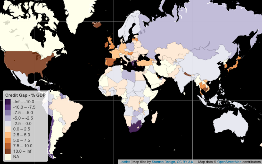
This post follows on from previous credit gap analysis on this blog and how this indicator helps estimate the probability of sovereign debt strains, for which Bank of International Settlements data is of great use. However, the BIS data covers “only” 43 countries and the Euro Area, which roughly corresponds to the G20 – including the 27 European Union members. As a result of this limitation, I use World Bank data, which has much broader country coverage, to derive credit gaps for a larger number of countries. As the Bank’s dataset is released on an annual frequency, I use annualized BIS data for comparative purposes, though the latter has the advantage of being published on a quarterly basis and is thus already available for a part of 2023.1As a reminder, in the IMF’s MAC DSA model published in 2021, the coefficient for credit gaps as an independent variable is positive with respect to the dependent variable, which is the probability of a sovereign stress event.
The first map below presents the BIS data on credit gaps in 2022, revealing how most of these 43 countries,2Argentina, Australia, Brazil, Canada, China, Chile, Colombia, Denmark, Ireland, Austria, Czechia, Finland, France, Germany, Greece, Hungary, India, Israel, Italy, Japan, South Korea, Mexico, Malaysia, Belgium, Hong Kong SAR, China, Luxembourg, Netherlands, Norway, New Zealand, Poland, Portugal, Russia, Saudi Arabia, South Africa, Singapore, Spain, Sweden, Switzerland, Thailand, Turkey, United Kingdom, United States, Indonesia are in negative territory, meaning that credit extended to the private sector is below trend. This makes sense given the wave of central bank tightening from circa 2021 in many countries, leading to tighter financial conditions globally. Notable exceptions remained in 2022, including Japan, Switzerland, Germany, and France in the DM space and Korea, Thailand, Indonesia, Brazil, and Hungary among EMs.
The second map shows BIS credit gap data for 2021, when there was clearly more heat in the system. Several countries exhibited positive gaps that ended up turning negative in 2022: Canada, the US, Mexico, Colombia, Argentina, Saudi Arabia, Norway, Sweden, and Austria among them. Virtually all countries cooled down from 2021 to 2022, according to this data.
The credit gaps derived from World Bank data feature in the two maps below, the first of which is for 2022. Sadly, this first World Bank map appears underwhelming given missing 2022 data for a number of large countries, including the US, Canada, Russia, and India. However, the data here covers 101 countries3Antigua & Barbuda, Algeria, Azerbaijan, Albania, Armenia, Angola, Australia, Barbados, Bangladesh, Belize, Bosnia & Herzegovina, Benin, Solomon Islands, Brazil, Brunei, Cambodia, Burundi, China, Chile, Colombia, Costa Rica, Cape Verde, Djibouti, Dominica, Dominican Republic, Ecuador, Egypt, El Salvador, Fiji, Georgia, Ghana, Grenada, Germany, Guatemala, Haiti, Honduras, Iceland, Israel, Côte d’Ivoire, Japan, Jamaica, Jordan, Kyrgyzstan, South Korea, Kuwait, Kazakhstan, Libya, Madagascar, North Macedonia, Mali, Morocco, Mauritius, Oman, Maldives, Mexico, Mozambique, Malawi, Niger, Hong Kong SAR, China Macao SAR, China, Palestinian Territories, Montenegro, Vanuatu, Norway, Nepal, Suriname, Nicaragua, New Zealand, Paraguay, Pakistan, Papua New Guinea, Guinea-Bissau, Qatar, Romania, Moldova, Philippines, Rwanda, St. Kitts & Nevis, Lesotho, Senegal, Sierra Leone, St. Lucia, Sudan, Trinidad & Tobago, Thailand, Tajikistan, Tonga, Togo, Turkey, United Kingdom, Burkina Faso, Uruguay, Uzbekistan, St. Vincent & Grenadines, Vietnam, Namibia, Samoa, Eswatini, Zimbabwe, Indonesia, Serbia – more than twice the number of BIS coverage. The last map is World Bank 2021 data with readings for 154 countries, which is closer to reasonable levels of coverage for those seeking a global view.
One of the glaring divergences between the World Bank and BIS datasets is China’s trajectory. The World Bank data suggests that China has gone from a negative gap in 2021 to a positive one in 2022, which is consistent with the PBOC easing while the rest of the world’s central banks were tightening. In contrast, the BIS data suggest that China’s gap became more negative in 2022 compared to 2021. As described previously, the World Bank data appears to include only domestic sources of credit, whereas the BIS includes domestic and foreign credit. Thus the data is essentially saying that, in 2022, domestic credit in China rose while foreign credit evaporated.
1
As a reminder, in the IMF’s MAC DSA model published in 2021, the coefficient for credit gaps as an independent variable is positive with respect to the dependent variable, which is the probability of a sovereign stress event.
2
Argentina, Australia, Brazil, Canada, China, Chile, Colombia, Denmark, Ireland, Austria, Czechia, Finland, France, Germany, Greece, Hungary, India, Israel, Italy, Japan, South Korea, Mexico, Malaysia, Belgium, Hong Kong SAR, China, Luxembourg, Netherlands, Norway, New Zealand, Poland, Portugal, Russia, Saudi Arabia, South Africa, Singapore, Spain, Sweden, Switzerland, Thailand, Turkey, United Kingdom, United States, Indonesia
3
Antigua & Barbuda, Algeria, Azerbaijan, Albania, Armenia, Angola, Australia, Barbados, Bangladesh, Belize, Bosnia & Herzegovina, Benin, Solomon Islands, Brazil, Brunei, Cambodia, Burundi, China, Chile, Colombia, Costa Rica, Cape Verde, Djibouti, Dominica, Dominican Republic, Ecuador, Egypt, El Salvador, Fiji, Georgia, Ghana, Grenada, Germany, Guatemala, Haiti, Honduras, Iceland, Israel, Côte d’Ivoire, Japan, Jamaica, Jordan, Kyrgyzstan, South Korea, Kuwait, Kazakhstan, Libya, Madagascar, North Macedonia, Mali, Morocco, Mauritius, Oman, Maldives, Mexico, Mozambique, Malawi, Niger, Hong Kong SAR, China Macao SAR, China, Palestinian Territories, Montenegro, Vanuatu, Norway, Nepal, Suriname, Nicaragua, New Zealand, Paraguay, Pakistan, Papua New Guinea, Guinea-Bissau, Qatar, Romania, Moldova, Philippines, Rwanda, St. Kitts & Nevis, Lesotho, Senegal, Sierra Leone, St. Lucia, Sudan, Trinidad & Tobago, Thailand, Tajikistan, Tonga, Togo, Turkey, United Kingdom, Burkina Faso, Uruguay, Uzbekistan, St. Vincent & Grenadines, Vietnam, Namibia, Samoa, Eswatini, Zimbabwe, Indonesia, Serbia
As part of tracking the probability of credit stress among 112 sovereign issuers, one of the variables of interest in the IMF’s model is the credit-to-GDP gap. This indicator matters not only because of its predictive power for sovereign credit events but for many other reasons as well, including monetary policy transmission and government borrowing. When analyzed in conjunction with other data, credit gaps are useful barometers for detecting the presence of credit bubbles, economic over- or under-heating, and policy distortions such as financial repression and fiscal dominance.
Credit gaps are derived from observations of credit extended to the private sector as a percentage of GDP, and then a statistical technique, usually Hodrick-Prescott filtering, is used to smooth out the data points in the time series as a way to measure an underlying trend. While there are some shortcomings to this approach, including the arbitrary nature of the smoothing parameters used to identify the trend, it helps ascertain whether the cyclical component of lending is above or below long-term expected processes.
A credit-to-GDP gap is thus an actual observation at time t minus the trend in the same time period. As such, a positive credit gap is one in which lending is above trend, whereas a negative one is below. The credit gap coefficient in the IMF model is positive, as is the case in other models in the financial crisis academic literature, meaning that higher values are associated with an increased likelihood of sovereign debt strains. Looking at quarterly data through end-202212023 data will be presented in future posts on credit gaps. from the Bank of International Settlements on 43 countries plus the Euro Area, this first set of charts presents the actual credit-to-GDP ratios in blue, the smoothed trend in yellow, and the credit-to-GDP gaps in green.
SLIDE DOWN: actual data vs trend; SLIDE UP: the cyclical gap between the two; XM = Euro Area
In the chart above, credit gaps in this mix of developed (DMs) and major emerging market economies (EMs) are currently mostly negative. This makes sense given the tighter monetary policy stances around the world to combat inflation, with EM central banks having begun their rate-raising cycles2Some EM central banks are so far ahead of DM that they have already begun cutting rates in 2023. before their DM peers. A spike in credit gaps can also be observed in 2020 as policymakers worldwide lowered interest rates and facilitated the extension of credit as part of emergency measures to mitigate economic scarring at the height of the pandemic.
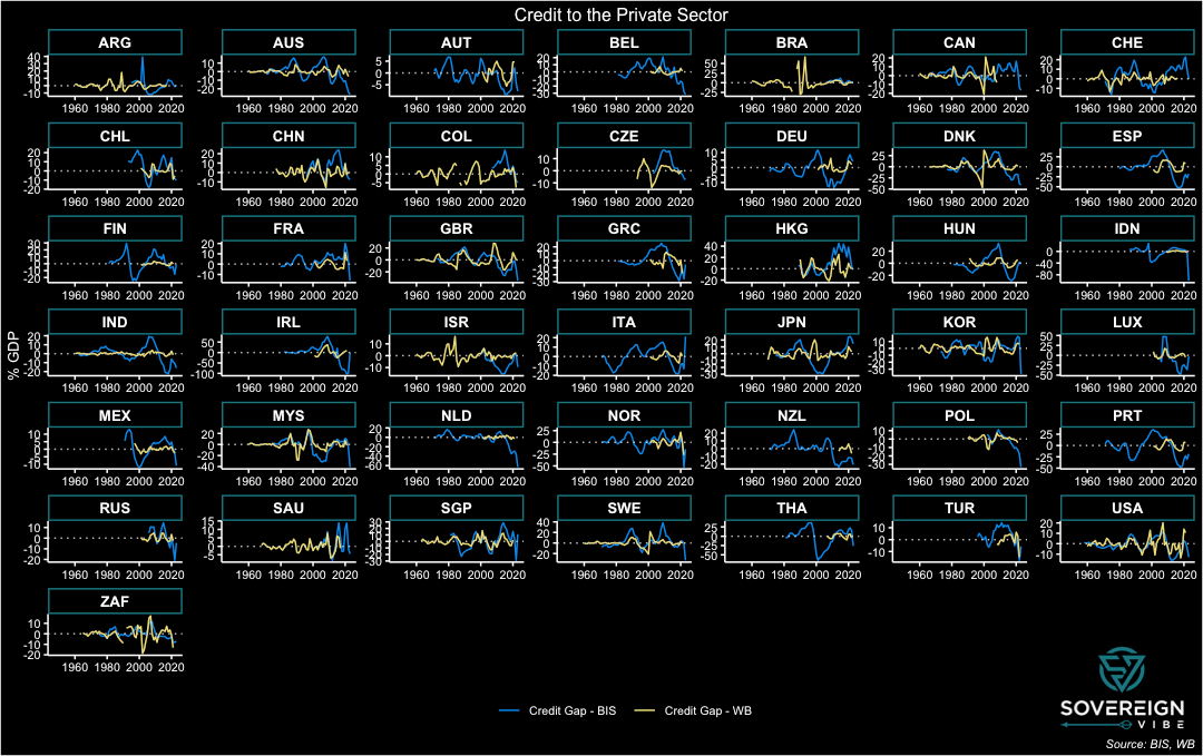
The BIS credit gap data is extremely useful for this set of countries, which, after all, comprise the world’s largest economies, and all the more so because it is available on a quarterly basis. The BIS describes its credit-to-GDP ratio as capturing total borrowing from all domestic and foreign sources by the private non-financial sector.3https://www.bis.org/statistics/about_credit_stats.htm However, other sources are needed for measuring credit to the private sector in other countries, and, thankfully, the World Bank has a similar indicator: domestic credit to the private sector by banks.4 https://databank.worldbank.org/metadataglossary/jobs/series/FS.AST.PRVT.GD.ZS The World Bank data series has far broader country coverage than the BIS data, thus opening vast additional swathes of the world to analytical coverage.
In contrast to the BIS data with its inclusion of both domestic and foreign credit to the non-financial private sector, the World Bank indicator appears to only include domestic sources of financing. Moreover, the BIS data appears to include sources of non-bank financing, unlike the World Bank data. Taken together, these two differences likely explain much of the discrepancy between these two datasets. Further, the World Bank data appears to only be available at a yearly frequency, thus requiring the BIS quarterly data to be transformed to yearly averages for the purposes of comparison.
The charts below present BIS data in blue and World Bank data in yellow, in yearly form through end-2022 in both cases. As seen above, the BIS provides credit gap and trend data alongside its credit ratios and uses a one-sided Hodrick-Prescott filter with the smoothing parameter λ set to 400,000 for this quarterly data. The World Bank only provides its credit ratios on a standalone basis, meaning that the trend and credit gap need to be estimated independently. This is simple enough for one country, and thankfully panel statistical techniques enable scalability for quick estimation across a large number of countries and years. As such, trends and credit gaps are derived from the World Bank’s credit ratios using a two-sided HP filter with λ = 100, the recommended setting for annual data.
SLIDE DOWN: actual data; SLIDE UP: trend data, smoothed with HP filters
Consistent with the inclusion of foreign sources of credit, the BIS credit ratios are usually higher than those from the World Bank, especially in many European countries, e.g. Luxembourg and Belgium. Elsewhere, the figures track more closely, as is the case with Japan, Malaysia, and the UK. The US and China also fell into this category, but the datasets have diverged in recent decades for those countries. Surprisingly, there are also a few countries where the World Bank ratio exceeds the BIS reading, despite the former excluding foreign credit sources, with South Africa and the US standing out most prominently from this perspective.
The point of comparing the two datasets is to use the BIS as a benchmark to get a sense if the World Bank data is at least somewhat aligned with the former and it is any good for predictive purposes. Certainly, the similar characteristics of the actual and trend data above are a positive sign. As for the credit gaps themselves, the BIS and World Bank figures are presented below. While there are large differences in most countries, there are also similar processes at work in many countries, e.g. the United Kingdom, Malaysia. The BIS credit gaps appear to be more volatile than those of the World Bank, which could be explained by the former’s inclusion of foreign lending: capital flows of the portfolio variety, which includes debt, are prone to sudden stops and starts.
To simplify further, the difference in the BIS and World Bank credit gaps, where the former is subtracted from the latter (difference = WB – BIS), features in the chart above. Ideally, the data readings would all be horizontal lines at zero or at least resemble a stationary process hovering above and below zero. While some countries do have these features – Sweden, the UK, the US, and Switzerland, among others, a large cohort exhibits some sort of bias. A statistical test of this difference in credit gaps across this panel of countries over these years would likely reject the notion that the difference is equal to zero. Nevertheless, the World Bank domestic credit to private sector by banks indicator seems fit for purpose, particularly given the large role that domestic banks play in credit provision in most economies.
Future posts will expand further on the importance of credit gaps and present broad country coverage of World Bank credit gap data.
1
2023 data will be presented in future posts on credit gaps.
2
Some EM central banks are so far ahead of DM that they have already begun cutting rates in 2023.
The recent wave of coups in Africa has increased scrutiny of France’s role on the continent. Looking at France’s net stocks of foreign direct investment in its former colonies reveals some surprises for those not closely monitoring these trends, and helps provide some sense of where Paris’s relations are with this group of countries. A snapshot of Franco-African economic relations helps debunk the oft-exaggerated importance of French influence in Africa, despite it being too early for a Françafrique post-mortem. Using foreign direct investment as a proxy delivers useful context for observers wondering where the next coup might strike, not as a causal factor, but as an illustration of heterogeneity.
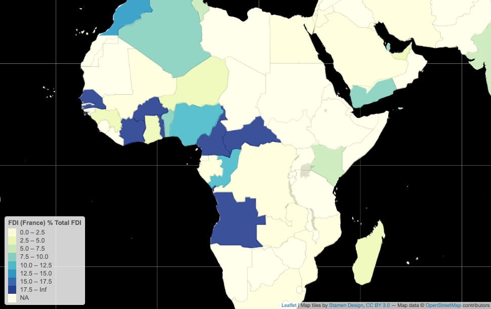
As a percentage of all FDI in Sub-Saharan Africa by country, France is best represented in Senegal, Côte d’Ivoire, Burkina Faso, Togo, the Republic of Congo, Cameroon, and Angola. Of these countries, only Burkina Faso has experienced a coup d’Etat in recent years. French FDI as a percentage of GDP is highest in Senegal, the Congo, the Central African Republic, and Angola, and was also significant in Niger in the mid-2010s. The point is that the French factor, especially in the economic sphere, fails to shed much light on why any of the coups in Gabon, Niger, Chad, Burkina Faso, Mali, and Guinea occurred, each of which has its own idiosyncratic explanations.
Coup’s next?
As for the prospects of further military takeovers in Africa’s Sub-Saharan francosphere, Senegal and Congo appear the least likely candidates. In Senegal, President Macky Sall is not seeking an unconstitutional third term in the 2024 election, in keeping with the country’s history of political stability. In Congo, President Denis Sassou-Nguesso’s apparently ironclad grip on the country has shown no signs of wavering. In Cameroon, President Paul Biya’s late August military reshuffle could offer him some temporary protection, though the ongoing conflict with separatist rebels in its anglophone region is a source of risk.
None of the countries in the Sahel are completely immune from another putsch. In Chad, Mahamat Idriss Déby Itno’s future will depend on his ability to exercise control to the same degree as his father, the previous president. In Burkina Faso, 34-year-old Captain Ibrahim Traoré has already done well to last a full 12 months, while in Mali the Touaregs are a perennial thorn in Bamako’s side. Facing no credible threat of foreign intervention, Niger appears to be under tight control – for now.
Côte d’Ivoire’s 2025 presidential election is an upcoming flashpoint in an ethnic powder-keg, with President Alassane Ouattara already having changed the constitution to enable a third term from 2020. Since the International Criminal Court in the Hague acquitted former president Laurent Gbagbo of all charges in 2019, it’s a politically-explosive resurrection given the context of ongoing ethnic favoritism in Ivorian politics. To complicate matters further, the largest of the country’s three main ethnicities – Ouattara and Gbagbo hailing from the other two – hasn’t held the presidency since 1999, setting the stage for further grievances.
France FDI timelines
The charts below present a snapshot of how France’s FDI presence has evolved in select Central and West African countries, where Paris is regarded as having the most influence in Sub-Saharan Africa. As can be seen from the map above, its FDI presence is weaker in East and Southern Africa, even where it once had a colonial presence (e.g. Madagascar, Comoros, Djibouti). The high-level overviews presented below focus only on broad aspects of France’s investment footprint in these countries and often overlook the activities of French groups with a pan-African presence, including Total, Bolloré Africa Logistics, Air Liquide, CMA CGM, and Castel, among many others.
Central Africa
With all eyes on Libreville following Gabon’s August coup, facile narratives of France’s relevance are overblown, historical, linguistic, and security ties notwithstanding. France’s FDI involvement in GDP terms was higher in Gabon than in any other Central African country at one point in the mid-2000s, though Congo has had more French investment stock as a share of its economy for most of this century. In dollars, however, Angola has attracted the largest quantity of French investment.
Use vertical slider to compare USD vs % GDP figures.
Gabon’s main economic drivers are the oil, manganese, and wood sectors, with a French presence in each of these and well beyond. The French oil major Total has ongoing but diminished activities, following its sale of some of its Gabonese assets to the Anglo-French oil company Perenco in 2021. The Euronext-listed metallurgical and mining company Eramet continues to operate the country’s chief manganese concessions, while the Rougier group is a significant wood processor and exporter.
Yet Gabon’s economic partnerships have been tilting away from France for over a decade. Singapore has been a major player in the country since the agri-business company Olam entered into a joint venture with the government in 2010 to create a Special Economic Zone. The Paris-listed oil junior Maurel & Prom continues to operate in Gabon but has been majority-controlled by the Indonesian state oil company Pertamina since 2017. In 2022, Gabon joined the Commonwealth, alongside Togo, another former French colony, even as Libreville’s trading relationships shifted away from France and towards Asian partners.
France is a leading foreign investor in Angola, accounting for 60 subsidiaries and 45 local companies that employ around 10,000 people – trailing only Portugal and China on this metric. France has benefited from President João Lourenço’s efforts to rebalance economic ties away from Chinese, Russian, and Turkish interests in favor of Western partners. The French presence is concentrated in the oil and oil services sectors, with Total, Maurel & Prom, and Technip among the major players. Total alone accounts for 40% of Angola’s national oil production and is one of the country’s largest employers, alongside the French brewer Castel.
Total’s presence accounts for a large share of France’s FDI footprint in the Republic of Congo, where most French companies operate in the oil services and construction sectors. French firms currently employ around 15,000 people, though this is down from over 25,000 in 2015. Italy, the US, and China are the other main foreign investors in the country.
West Africa
Côte d’Ivoire accounts for France’s highest stock of FDI in francophone West Africa, followed closely by Senegal. The latter being the smaller economy of the two, France’s presence in Senegal is heavier in GDP terms. There was also a strong French economic presence in Niger in the mid-2010s, according to the data from the Banque de France below, though this has fallen off sharply in recent years.
Use vertical slider to compare USD vs % GDP figures.
France is the largest foreign investor in Côte d’Ivoire, with around 240 subsidiaries and some 1,000 companies owned by French citizens. These investments are spread across numerous economic sectors, reflecting the highly-diversified nature of the Ivorian economy.
France also has the highest proportion of foreign investment in Senegal, though its share has declined markedly since the mid-2010s. This involvement is also spread broadly across economic sectors, including banking, retail, telecoms, and industrials.
In Niger, China, France, and Nigeria comprise the main foreign investors, with a focus on extractive and manufacturing industries. French FDI peaked in the mid-2010s amid rail infrastructure investments by the Bolloré logistics group, road investments by the uranium miner Orano, and uranium transport investments by the Necotrans/R Logistic group.
I spent most of 2012 working in Gabon, a gem of a country well-endowed with some of the lushest rainforest on the planet, abundant natural resources – oil, manganese, wood – and a small population. Like many observers, I was aware of the concerns leading up to the August 2023 presidential elections as President Ali Bongo sought a third consecutive term, especially given the post-electoral violence in 2016.
Yet the military coup of August 30th still comes as a surprise because, in recent years, the military takeovers in Africa had largely been confined to the Sahel region: Niger, Mali, Burkina Faso, Chad, and Sudan. There were two other recent putsches, one in Guinea, on the Sahel’s doorstep, and another one in Zimbabwe.
These countries have much lower income/capita and larger populations. Unlike Gabon, most of them are landlocked and have arid climates.1Guinea is neither landlocked, nor does it have an arid climate. Zimbabwe is also not as arid as the Sahel. So what do these countries have in common with Gabon? Plenty, whether their colonial pasts under France2With the exceptions of Sudan and Zimbabwe. or the nitroglycerin-like combination of weak institutions and ethnic divisions.
Country
Coup d’Etat(s) date
GNI per capita – USD
Population – mn
🇬🇦 Gabon
August 2023
7,540
2.6
🇳🇪 Niger
July 2023
610
25.3
🇹🇩 Chad
October 2022 & April 2021
690
17.2
🇧🇫 Burkina Faso
September & January 2022
840
22.1
🇸🇩 Sudan
October 2021 & April 2019
760
45.7
🇬🇳 Guinea
September 2021
1,180
13.5
🇲🇱 Mali
August 2020
850
21.9
🇿🇼 Zimbabwe
November 2017
1,500
16.0
Sources: World Bank, author’s research
My analytical fallacy was to think about the coups in the Sahel as some sort of wave with common drivers, which would have a bearing in other parts of Africa and beyond. Not so, or at least not beyond the Sahel where several weak, poor states having trouble coping with terrorist insurgents is a commonality. Rather than a wave of African coups with a shared set of narrowly-defined underlying causes, a version of the Anna Karenina principle applies: “Each unhappy country is unhappy in its own way.”
Moreover, it is good discipline to keep ethnicity front of mind when analyzing African politics, as this helps reveal some of the political forces at play that make each country unique. Even though ethnic factors are often of secondary importance, as in the case of Gabon, considering ethno-linguistic and cultural differences also provides contextual granularity that is often absent from English-language coverage of francophone Africa.
Below, I also provide charts on France’s net FDI to each of the francophone countries as a simple gauge of its ongoing involvement in each economy. This simple measure does not explain the coups in each country, nor does it encompass the complexity of the bilateral economic, political, and security relationships, but it provides relevant context as observers ponder Paris’s links to the continent.
🇬🇦 Gabon
August 2023: The military overthrows Ali Bongo, who hails from the small Téké ethnicity (~<10% of the population) in the remote Haut-Ogooué region, minutes after his electoral win is announced. The takeover appears to have elements of both popular dissatisfaction and of a palace coup. The leader of the junta, Brice Clotaire Oligui Nguema, was head of the Republican Guard’s special services unit. Also a Haut-Ogooué native, Nguema had long served under the previous president, Omar Bongo, before being sidelined for several years after Ali came into office.
Omar Bongo had long relied on French support, while his son Ali had made some concessions to the larger Fang ethnicity (33% of the population) and others at various points during his terms.
In Africa, only the Seychelles and Mauritius have higher GNI/capita than Gabon, where 1/3 of the population lives below the poverty line.
Clearly, any wealth redistribution from the rapacious Bongo clan was insufficient for the population to allow him to continue pilfering the country indefinitely amid suspicions of electoral fraud in the current and previous elections.
Enfeebled by a stroke in October 2018, Ali Bongo – and his reportedly dissolute family members – provided a complacent atmosphere at the presidential palace, thus combining with popular discontent to set the ideal conditions for Nguema and his co-conspirators.
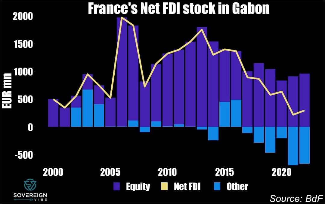
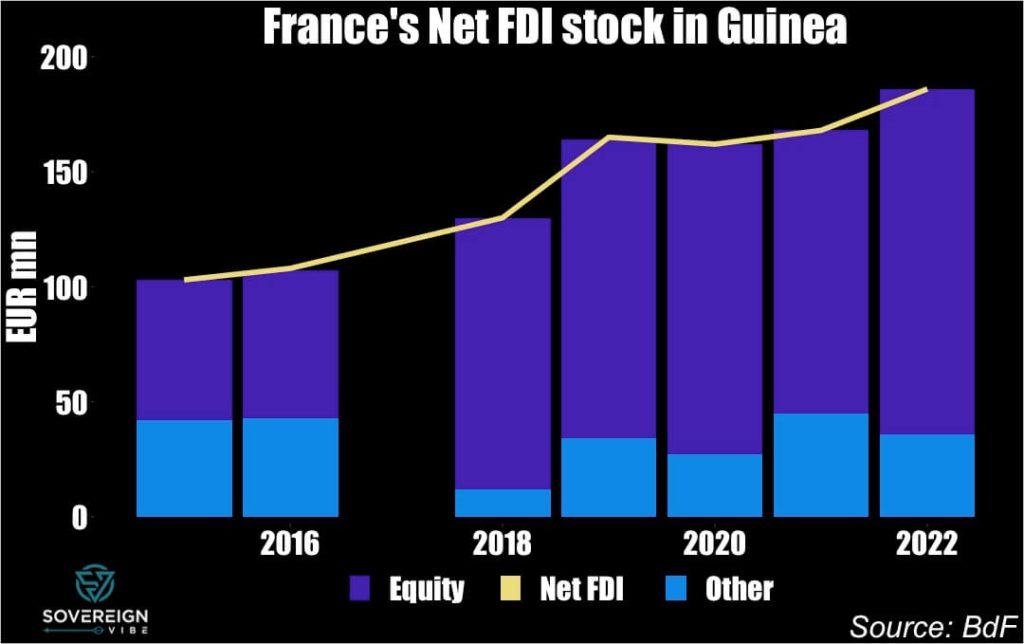
Of note, France’s net foreign direct investment stock in Gabon has been on a downward trend since the mid-2010s (see charts below), declining from around €1.8bn in 2013 to under €500mn in 2022. This is despite the global net FDI stock in Gabon rising over the same period, pointing to France’s diminished stature in the Gabonese economy. More detailed information on this topic will be available in future posts.
🇳🇪 Niger
July 2023: Junta leaders oust President Mohamed Bazoum, who is of Arab ethnicity ( < 0.5% of the population), purportedly for leniency towards islamist insurgents. This underscores the political importance of the security situation, as in several other countries throughout the Sahel.
Bazoum succeeded Mahamadou Issoufou (Hausa, 55% of the population), who completed two terms as president without trying to run for a third term, instead nominating Bazoum as his preferred successor.
Issoufou had himself come to power through elections a few years after a military coup ousted a previous president – Mamadou Tandja – who had attempted to stay on as president for longer than two terms, much like Ali Bongo in Gabon today.
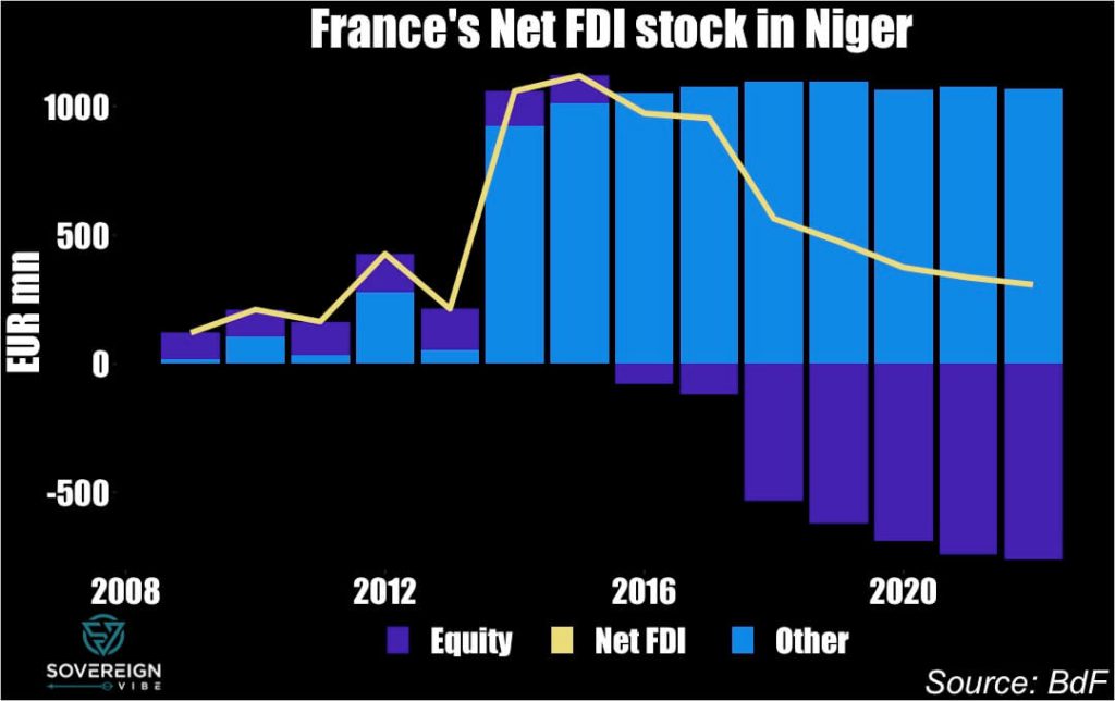
As in Gabon, France’s net FDI stock in Niger has been on the wane since the mid-2010s, declining from over €1bn to under €500mn as of last year. The entirety of French exposure to the country appears to in the form of debt and other instruments, including in all likelihood intra-company debt.
🇹🇩 Chad
April 2021 – October 2022: Long-serving President Idriss Déby (Zaghawa, ~1%) had taken power via a French-supported coup in 1990 against then-president Hissène Habré (Gorane, aka Daza or Toubou, ~4-5%) and was fatally wounded in April 2021 during hostilities with insurgents, mainly of Gorane extraction.
Déby’s son Mahamat Idriss Déby (half Zaghawa, half Gorane, married to a Gorane, father of nine children) seized control of the country at the head of a military junta immediately after his father’s death with a commitment to an 18-month transition period to culminate in elections, which he postponed by two years in October 2022.
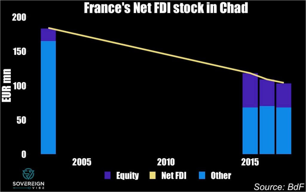
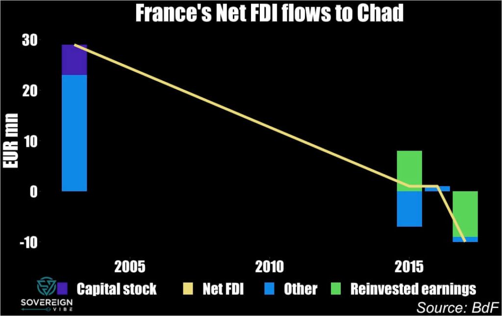
Despite limited French net FDI exposure to Chad, even here France’s presence is declining, from nearly €200mn in the early 2000s to around €100mn today.
🇧🇫 Burkina Faso
September 2022: Captain Ibrahim Traoré (b. 1988) overthrew Lieutenant-colonel Paul-Henri Sandaogo Damiba for not having followed through on the promises of the January 2022 coup and following several deadly terrorist attacks, notably in Gaskindé, where jihadists ambushed a provisioning convoy, resulting in at least 11 deaths.
Mutineering soldiers ousted President Roch Marc Christian Kaboré (Mossi, ~56%) in January 2022 following a crushing defeat of burkinabè armed forces by jihadists in November 2021, amid widespread disappointment at the government’s management of the conflict and failure to provide rations to troops. Lieutenant-colonel Paul-Henri Sandaogo Damiba succeeded Kaboré as transitional president.
In October 2014, a popular uprising ousted then-president Blaise Compaoré’s (Mossi, ~56%) upon his attempt to change the constitution and thereby allow himself to stand for a fifth term after 27 years in power. After a year of transition, Kaboré was elected president in November 2015.
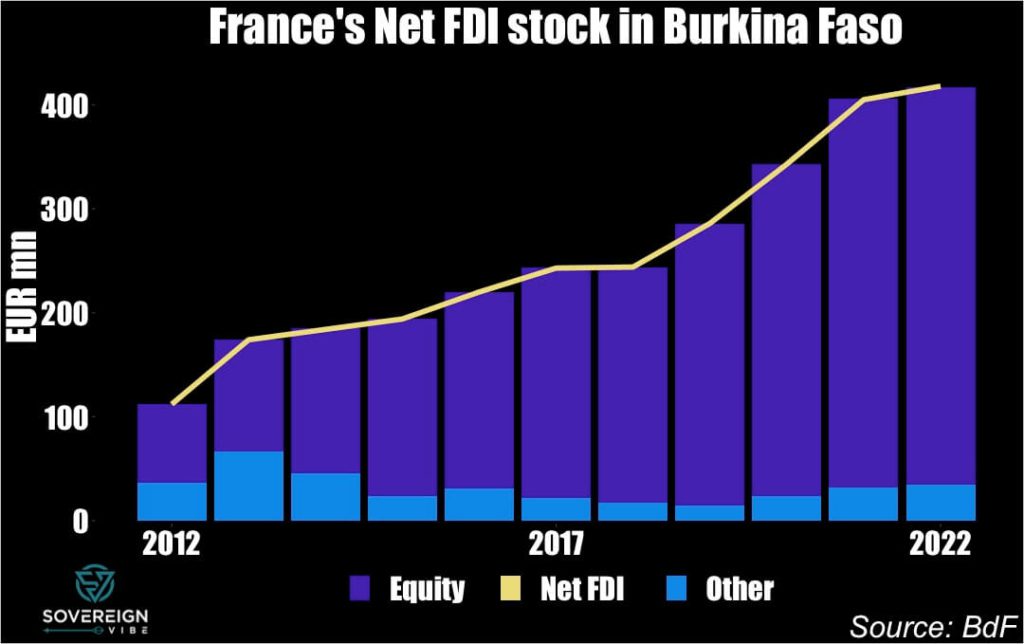
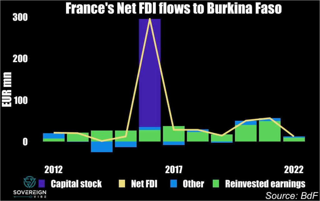
In constrast to Gabon, Niger, and Chad, France’s net FDI stock in Burkina Faso has been rising steadily for the past decade, driven mainly by reinvested earnings into increasing shareholder equity. Overall exposure has jumped from ~€100mn in 2012 to ~€400mn in 2022.
🇸🇩 Sudan
April 2019 & October 2021: General Abdel Fattah al-Burhan seized power in 2021, placing Prime Minister Abdalla Hamdok under house arrest. The Sudanese Armed Forces ousted the long-reigning Omar al-Bashir in 2019 under the leadership of Ahmad Awad Ibn Auf.
🇬🇳 Guinea
September 2021: Amid widespread popular dissatisfaction with the government, military putschists arrested President Alpha Condé (Mandingo aka Malinké, 23%, second-largest group) as special forces commander Mamady Doumbouya dissolved the government and seized power as interim president. Of these recent coups, the Guinean case most closely resembles the current situation in Gabon.
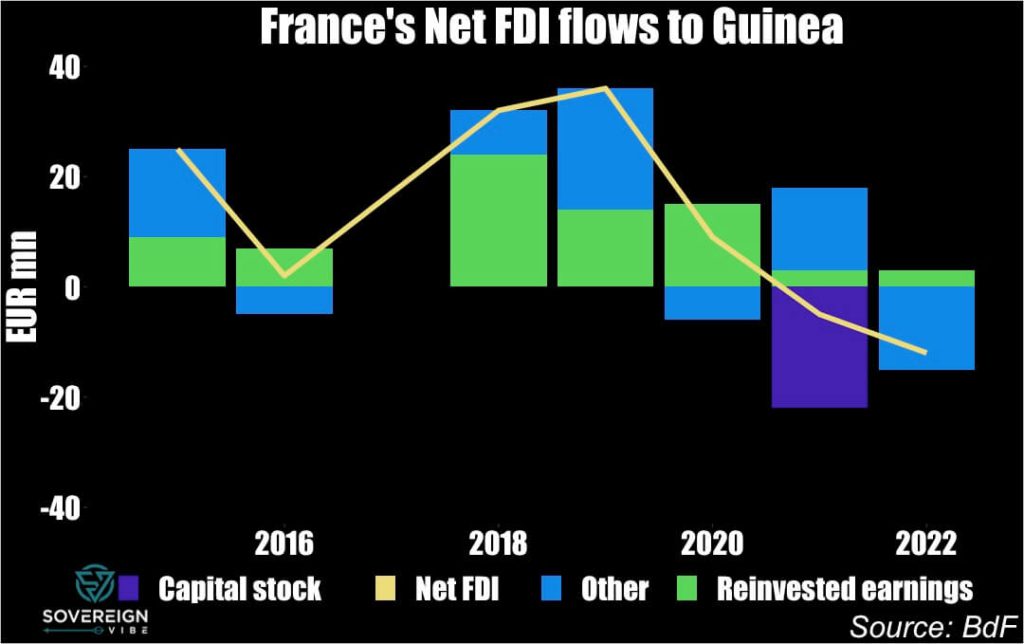
France’s net FDI exposure to Guinea has been rising steadily since the mid-2010s, albeit from a low base, partly reflecting Conakry’s historically relatively cool relations with Paris. Up from €100mn in 2015, French FDI stock stood at ~€175mn in 2022.
🇲🇱 Mali
August 2020: A colonel in Mali’s special forces, Assimi Goïta (Minianka, ~7%, b. 1983) has been the country’s de facto leader since a successful coup ousting IBK in August 2020.
Ibrahim Boubacar Keïta (Mandingo, aka Malinké or Maninka, ~8%, d. 2022) is elected president in 2013 after the elections were delayed by a year, following the military putsch of 2012 and the ongoing war against islamist insurgents. He rejected the coup but agreed to negotiate with the junta, which adopted a neutral position towards him. In 2020, after months of political crisis stemming from economic pressures, the Peul/Fula-Dogon ethnic conflict, and the pandemic, a coup removed IBK from power.
Amadou Toumani Touré (Bambara, ~25%, largest group, d. 2020) was president from 2002-2012 after having been elected democratically and later ousted via military coup two months before the 2012 elections, in which he was not running. The coup was to denounce the management of the conflict in northern Mali between the army and the Touareg rebellion at the time. He had himself participated in a coup d’Etat in 1991 against the then-long-standing president Moussa Traoré (Malinké, ~8%, d. 2020).
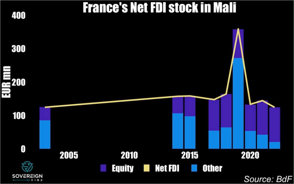
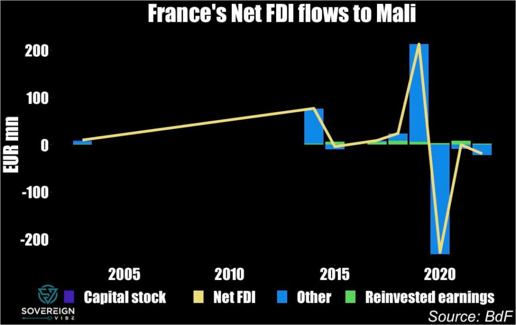
France’s FDI exposure to Mali has essentially moved sideways over the past 20 years, standing at around only €100mn.
1
Guinea is neither landlocked, nor does it have an arid climate. Zimbabwe is also not as arid as the Sahel.
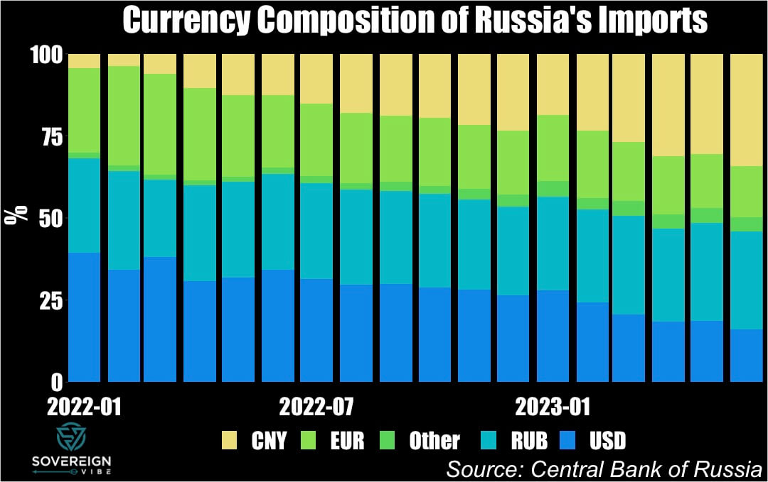
Building on a previous post on the de-dollarization debate, a snapshot of Russian trade invoicing data gives a sense of a potentially maximum speed of the dollar’s declining use in some quarters of the global economy, while also revealing how Moscow’s trading partners are willing to part with rubles but unwilling to receive them.
As has been widely reported, trade with Russia since the start of the war in Ukraine in February 2022 is being invoiced increasingly in Chinese yuan, at the expense of the dollar and euro. Russian imports in CNY have increased over 8x from January 2022 to June 2023, rising from $1.1bn to $9.1bn over that period. Meanwhile, USD and EUR fell from a combined $17bn to $8.5bn, with the USD experiencing a drop of around 60%.
And while these comparisons exclude seasonal adjustments, the trend is clear, and comparing year-on-year growth readings for June 2023 versus June 2022 tells the same story: CNY: +148%, USD: -57%, EUR: -35%.
In percentage terms, USD has declined in Russia’s import invoicing from 39% in January 2022 to a mere 16%, while EUR shrank from 26% to 16% as well. That is a combined 33 percentage-point drop for both currencies.
In the same period, CNY’s share rose 30 ppts, from 4% to 34%, almost entirely replacing USD and EUR. Moderate increases in the shares of other currencies and the RUB explain the remainder, though the fact that the RUB has only risen 1 ppt suggests that exporters to Russia are reluctant to accept Moscow’s currency.
Looking at the export side reveals a similar picture. Only $170mn Russian exports were invoiced in CNY back in January 2022, whereas in June 2023 these exceeded $8.1bn. While the USD and EUR each accounted for $25bn and $17bn at the time, these have fallen off to around $7bn and $2bn currently, respectively.
In contrast to Russian imports, where the USD’s decline was more precipitous, it is EUR that had the faster drop in the case of exports, likely due in significant part to the sharp reduction in Russian energy exports to Europe. Another difference is that, unlike Russia’s imports, which have remained somewhat stable over this period, the country’s exports appear to be on a declining trend, pointing to downward pressures on the trade balance.
Staggeringly, CNY now accounts for a quarter of payments that Russia receives for its exports, up from less than half a percent 18 months prior. The USD share is down from over half of all export receipts to some 23%, while the EUR has decreased from 35% to 7%.
Surprisingly, RUB has increased markedly, from 12% to 42%, though this makes good sense if one considers that foreign buyers are likely keen to reduce any long exposures they may have to the ruble. Such positioning currently appears to prescient, given the RUB’s significant weakening to ~100/USD at the time of writing.
Future posts will explore the implications for the dollar’s role and the bigger question of using frozen Russian assets for the reconstruction of Ukraine.
De-dollarization has become an increasingly popular topic in recent years, and for good reason. Indeed, the global economy has been gradually entering a period of deglobalization for the past decade or so, and, in parallel, the U.S.-led nature of the international economic order is facing challenges from geopolitical competitors and a disenchanted Global South.
Yet much of the ideologically-driven discourse on the greenback’s supposedly-imminent demise fails to account for the USD’s security and demographic underpinnings and the absence of viable alternatives. The U.S. dollar’s role is both a reflection of and a driving force behind the moral values governing the global financial architecture, with significant implications for global economic growth, international security, and the fate of Ukraine.
This article will be the first of many to explore de-dollarization and related phenomena, including sanctions, trade, and geopolitics. As a starting point, tracking the use of the U.S. dollar in international sovereign reserves and in international trade provides a solid foundation for further analysis.
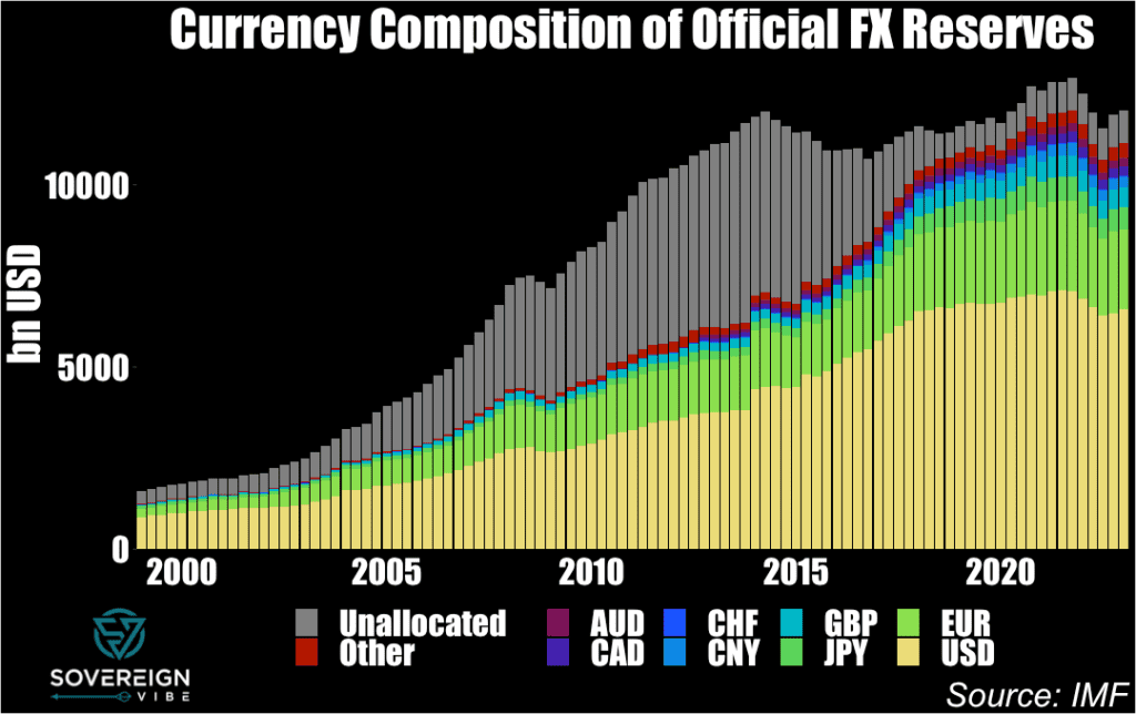
Official Foreign Exchange Reserves
The chart above illustrates the prominence of the USD in governments’ international reserves, accounting for over $6.5 trillion as of Q1 2023 – nearly 60% of the global total.1The “unallocated” reserves in grey are merely the USD value of official FX reserve assets for which the IMF has no currency decomposition. The IMF collects this currency composition of reserves data from its member countries, many of which report it on an anonymized basis for public disclosure.
Unfortunately, a currency breakdown of reserves by country appears to be unavailable to the public via the IMF, which is partly understandable given geopolitical sensitivities that some countries may have in revealing this information. Still, this opacity is yet another of a plethora of examples of sovereign financial data transparency practices found wanting, even if currency composition may be available from some national sources.
While the first chart at the top of the piece shows absolute totals and is useful in seeing changes in global reserve quantities – such as the quarterly declines in 2022 – a proportional view is more helpful from a de-dollarization perspective. The interactive chart below shows that from a peak in this sample of over 72% in the early 2000s, for the proportion of reserves disclosed2The IMF designates these as “allocated” official FX reserves. by currency to the IMF, the USD slumped to a trough of just under 59% in Q4 2021, a 13-percentage points decline.
So which currencies did the USD lose ground to? China is indeed part of the story, with CNY having risen from nil to…a peak of merely 2.8%. That leaves 10 of the 13 ppts to account for. The euro also contributes to the USD decline but only modestly because, despite its share having risen in the middle years of the sample, in 2023 it only stands at ~1-2 ppts above where it started 24 years ago. The yen is certainly not the culprit, as it has actually lost some ground as well, albeit only 0.5-1 ppt depending on chosen measurement times.
It is in fact other currencies that explain most of the USD’s loss of share in official reserves, especially sterling and the Australian and Canadian dollars. GBP accounts for a nearly 2 ppts rise from 1999 to 2023. AUD and CAD are slightly harder to measure over the full sample period because the IMF clearly recategorized them both in 2012, moving them from the “Other” currency category into their own standalone categories, presumably because of their growing shares. In 1999, the “Other” category stood at some 1.6%, while summing “Other” with CAD and AUD in 2023 yields a figure of 7.7%, pointing to a 6 ppts difference, of which only 1.7 ppts came from currencies other than CAD and AUD. To simplify, CAD and AUD combined for a 4.3 ppts bite into the USD share.
The reality of other advanced economy currencies displacing the USD as a reserve currency stands in marked contrast to prevailing ideological narratives that the USD decline is related mostly or solely to the rise of emerging market currencies such as CNY. While there is ample evidence for central banks repatriating gold in the wake of U.S. sanctions against Russia and freezing of its reserve USD assets following Moscow’s invasion of Ukraine in February 2022,3https://www.reuters.com/business/finance/countries-repatriating-gold-wake-sanctions-against-russia-study-2023-07-10/ there has been no associated decline of the USD’s reserves standing. In fact, since the war began last year, the USD slice has risen from just under 59% to over 60% this year, while the yuan’s has fallen by 0.2 ppts.
Trade Invoicing
In 2020, then-IMF Chief Economist Gita Gopinath and colleagues published an IMF working paper4https://www.imf.org/en/Publications/WP/Issues/2020/07/17/Patterns-in-Invoicing-Currency-in-Global-Trade-49574 on the invoicing of international trade by currency, building on Gopinath’s prior extensive academic work in this area.
Here too there is broad-based evidence of a declining role of the USD. The greenback’s decline is most evident when comparing the early 2000s to the present day, though Gopinath, Boz, et al.’s dataset has less country coverage that far back. For this reason, the most recent year of available data – 2019 – is compared to 2010, to provide a snapshot of currency invoicing of exports and imports trends over the decade.
The two charts below show overall lower use of the USD in export and import invoicing in 2019 versus 2010 in most countries, although there are outliers on either side of the diagonal change demarcation line, e.g. Russia and Cyprus. As with official reserves, it appears that another advanced economy currency – the euro in this case – could be responsible for taking away USD market share, as many of the country declines are either in the Euro area or in Europe.
The situation is different for EUR, which saw its trade invoicing presence grow in most of the sample countries in the 2010s. This confirms the suspicions above that EUR was displacing the USD in the euro area and Europe but goes further by demonstrating EUR’s growing role outside Europe as well, e.g. Israel, Chile, Indonesia, Thailand.
These last two charts present the change in invoicing in currencies that are neither the USD nor the EUR and appears to include a country’s home currency, at least for imports.5The metadata in the dataset leaves room for ambiguity on this nuance. Here the picture is mixed, with a relatively even balance between increases and decreases across countries over the period. Yet some of the outliers provide compelling avenues for further research. For instance, Tunisia’s apparent switch from invoicing imports in its home currency in 2010 – prior to the Arab Spring, which had its tragically self-immolating spark in Tunis in 2011 – to USD by 2019 raises questions in need of answers, as do the cases of Russia, Ukraine, Cyprus, and Mongolia.
1
The “unallocated” reserves in grey are merely the USD value of official FX reserve assets for which the IMF has no currency decomposition.
2
The IMF designates these as “allocated” official FX reserves.