It’s not just the usual suspects: some oil exporters also have low official reserves levels.
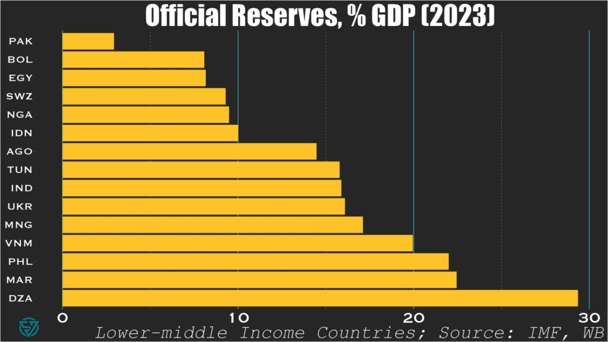
When writing last week’s piece on the IMF’s shoddy deal with Pakistan, I was blown away at the country’s astonishingly-low level of international reserves.
$9.5 billion for a $350 billion economy. That’s only around 3% of GDP and 1-2 months of import cover. Such a low amount of cash on hand isn’t exactly best practice, whether it’s sovereign, corporate, or personal finance.
So it got me thinking: is Pakistan really such an outlier? Or am I just crazy or ill-informed?
Lower-middle income countries
Turns out I was right: among countries in its income bracket, Pakistan has the lowest reserves-to-GDP ratio of all.
Bolivia, Egypt, Swaziland, Nigeria, and Indonesia are not far behind, at 10% or less.
Yet international reserves are far from the only macro indicator that matters of course. So I suppose we should be forgiving of Indonesia, which generally has much of its (macro) house in order.
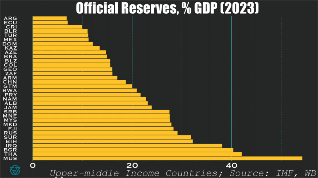
Upper-middle income countries
Looking at upper-middle income countries, only three in-sample are sub-10%: Argentina, Ecuador, and Costa Rica. I suppose Latin America really does have a savings problem.
As expected, these slightly richer countries generally exhibit higher reserve-to-GDP ratios than their poorer counterparts. No surprise there.
What is surprising, however, is to see oil-exporters like Azerbaijan, and Kazakhstan sub-15 percent.
Mexico, Brazil, and Colombia also produce oil and also have low ratios. But, then again, they are also Latin American…
“What’s the big deal?”, I hear you asking.
Well, Ukraine is a lower-middle income country fighting a war and undergoing debt restructuring. Yet Kyiv still manages to have more in the bank than wealthier countries with much lower-levels of security threats.
To me, that speaks volumes about economic management.
Pakistan and the IMF recently agreed on a program worth $7 billion, which appears woefully insufficient to resolve the country’s macroeconomic imbalances. The Fund claims that the Extended Fund Facility over the next 37 months intends to “cement macroeconomic stability and create conditions for a stronger, more inclusive, and resilient growth.” But this nothingburger of a deal – painfully, obviously so ($2.3 billion per year?) – will more likely achieve the opposite.
Some quick stats from 2023 pulled from my sovereign stress tracker, where Pakistan flashes red on reserve cover and debt-to-revenue:
Average annual interest payments over the next five years = ~6.5% / GDP (~$20 billion)
Average annual principal payments over the next five years = $19 billion
Imports typically range from $60-85 billion
Export revenues range from $30-40 billion
Tax revenues = ~10% / GDP (~$35 billion)
In 2023, the current account deficit narrowed to -0.7% of GDP (-$2.4 billion), but in the past these have been much larger (e.g. ~-$17.5 billion in 2022). But even financing small external deficits could prove difficult. With annual FDI generally under $2 billion and in the absence of other private capital inflows, the government will likely have to borrow more. This is a problem given already-high public debt levels at 77% / GDP, of which Pakistan owes 28% / GDP to external creditors.
So it is crucial that Pakistan runs small current account deficits or, dare I say it, surpluses. If the global trading system worked as it should (i.e. fantasy-land), non-commodity-exporting emerging and frontier economies should be expected to run current account deficits. The idea is that the current account surpluses of wealthy countries would fund the development and climate transition of poorer nations.
But since so few advanced economies run surpluses, I guess this nuclear power and world’s fifth-most populous country will just have to tighten its belt. Fantastic.
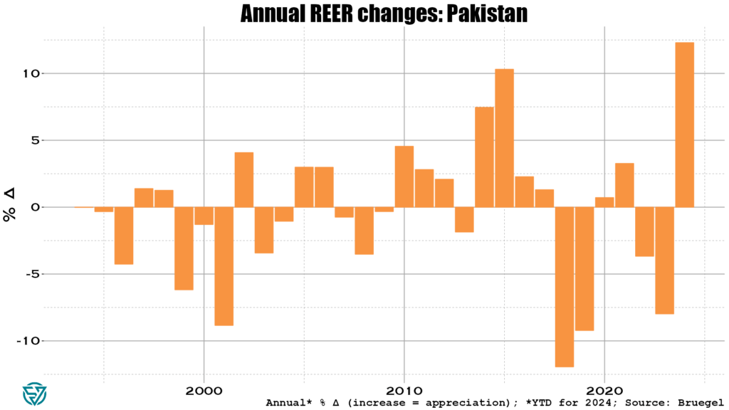
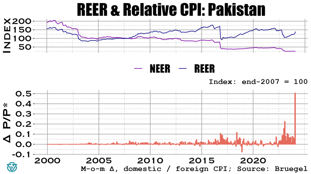
To avoid large external deficits, Pakistan’s real exchange rate needs to depreciate. Yet the exact opposite is happening, so don’t hold out too much hope for a small CAB deficit this year:
Olivier Blanchard once said that inflation is the canary in the coal mine. In the chart below you can see that Pakistan’s weighted inflation differential with its trading partners skyrocketed in May 2024.
Consider the alarm sounded. Even on the off-chance Pakistan manages to run a small CAB deficit in 2024 (say, like the -$2.4 billion in 2023), annual IMF support ($2.3 billion) will barely help bridge that gap. Islamabad still has to cough up about $39 billion in combined principal and interest payments every year going forward. This sum is roughly equivalent to export receipts and slightly larger than tax revenues.
This looks to be a solvency issue. And with inflation through the roof, it’s hard to see how this doesn’t get worse before it gets better. Watch this space.
Looking across the emerging markets complex, Turkey stands out as one of the larger, systemic EMs that is rapidly headed in the wrong direction. Inflation has of course been the main symptom of imbalances in the economy, gyrating between 40-80% since 2022. It currently stands at around 70%, despite the central bank hiking the policy rate from 45% to 50% in March.
Part of the reason behind rampant inflation is an ongoing credit boom in the country. Private firms and households account for much of the borrowing, with worryingly strong growth in credit card debt. Lenders are issuing more debt in foreign currency, which increases currency risks. Non-performing loans remain low, but the central bank has tightened macroprudential regulations in response to this recent credit growth.
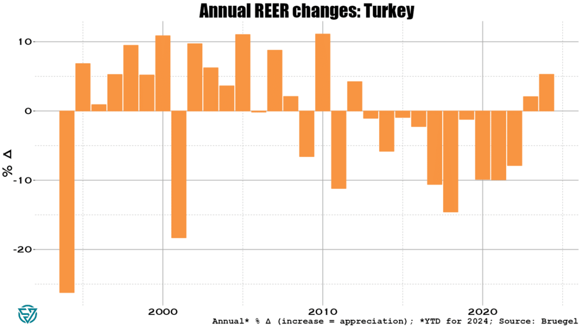
At above 33 to the dollar, the lira is at record lows. Even so, Turkish export competitiveness is eroding as the real exchange rate with trading partners has surged by more than 5% YTD through end-May.
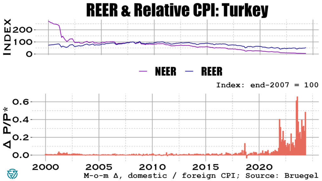
With the lira tanking, inflation is of course driving real exchange rate appreciation. Prices have been rising much faster in Turkey than has been the case with its trading partners in 2023 and 2024.
It seems that so far Turkey has had somewhat of a reprieve from these brewing imbalances. Not only does loan performance remain decent, but the current account deficit was “unusually” small in May. The carry trade is driving surging portfolio and bank flows to Turkey, which has driven official reserves to increase to $148 billion in June.
Still, Turkish foreign exchange reserves are low compared to EM peers. They currently stand at 13.3% of (2023) GDP. While an improvement since last year, that’s still only 4.9 months of imports.
So it’s certainly worth keeping an eye on increases in the country’s external financing needs. An increase in the current account deficit and/or an abrupt halt to the carry trade flows linked to further worries over lira weakening could see the central bank dip into its reserves to cover gaps. Watch this space.
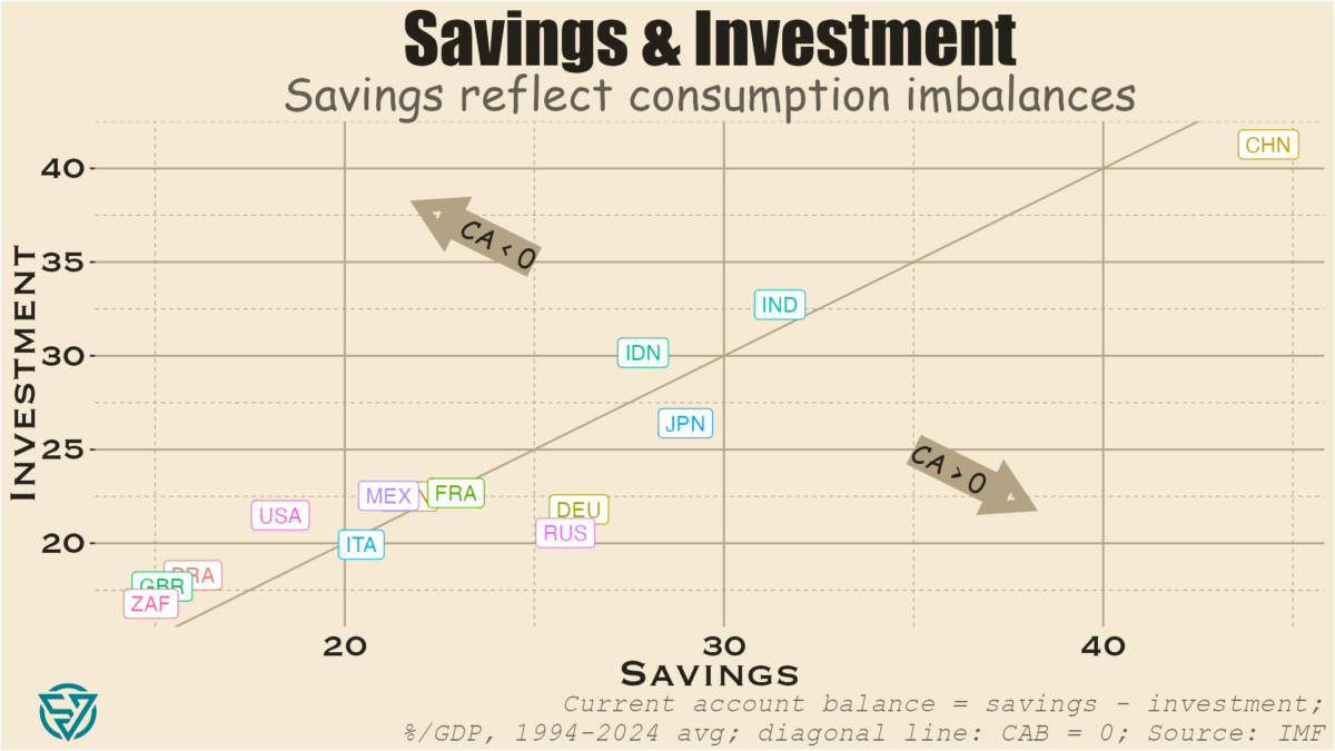
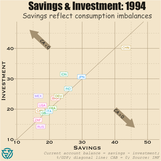
In last week’s post, I discussed savings and investment across large emerging markets and the G7 countries. As has been well-documented, imbalances in the G7 have profound consequences not only on domestic economies and the rise of populism. High consumption and the low savings that result across the G7, especially ex-Japan / Germany, means that there is less capital to flow from these rich countries to emerging and developing economies.
In the US, both savings and investment are low as a share of output. Yet investment is endemically higher than savings in the US, partly as a result of strong global demand for US assets. What that robust foreign appetite means is that in most years more investment flows into the US than flows out of the country. The stock of these accumulated flows is the Net International Investment Position.
In cases where net investment flows into rather than out of a country in a given period, its NIIP declines. As such, the US has by far the world’s most negative NIIP, which stood at -$19.8 trillion in 2023. The UK has the next-largest negative NIIP, which at -$1 trillion is a far cry from the US.
Capital flows to the US, UK, and several other external deficit countries thanks to strong investor protections, rule of law, and diversified economies. With open capital accounts, it is easy for international capital to acquire assets domestically and affect prices in financial markets, real estate, and other investment categories. There is naturally a price effect, which I have begun to measure.
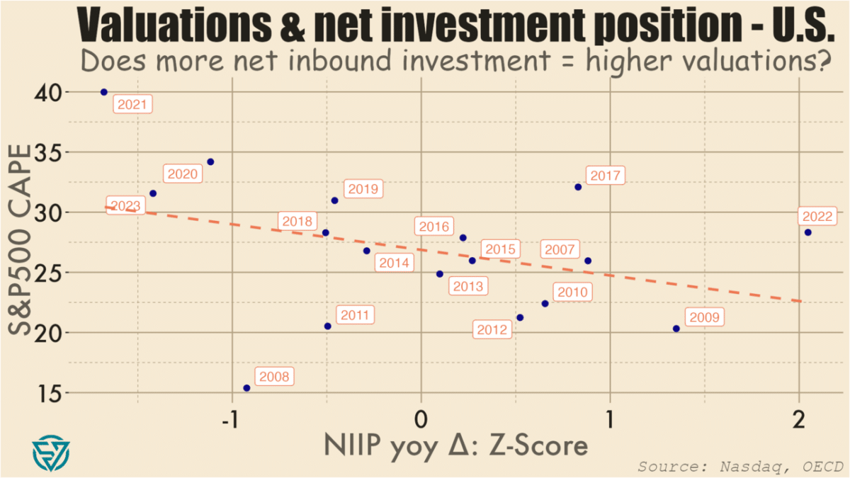
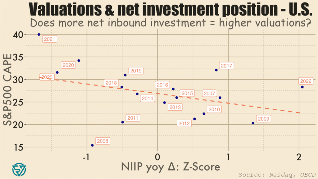
As a starting point, I’ve compared normalized annual changes in the US’s overall NIIP to the S&P 500’s cyclically-adjusted price-to-earnings ratio. CAPE is a valuation metric that compares current prices with the 10-year average of earnings per share.
As expected, I do find a negative association between changes in NIIP and CAPE levels. So more net investment into the US in a given year (i.e. a NIIP decrease) is loosely correlated with stock prices that are higher compared to long-term earnings.
In plain English, what this means is, for example: there were large net investment inflows into the US in 2020, 2021, and 2023, and S&P500 valuations were also high during those years. Conversely, large net outflows in 2022, 2009, and 2007 coincided with lower P/E ratios. There are of course factors other than net international investment flows at work, including monetary and fiscal policy.
So I won’t make any grand claims based on the chart above. Moreover, it has only a limited number of data points, and which are weakly correlated. I might run portfolio investment flows against price-to-earnings metrics to see if there is a tighter link. I also might look at other asset valuations, potentially in real estate, to see what the relationship is with capital inflows.
Essentially, I’m working my way towards testing whether foreign capital inflows contribute to asset bubbles in the US. As usual, I’ll also be expanding my analysis to other countries, in this case other G7 / advanced economies.
The point is to get a sense of the extent to which open capital accounts are driving asset prices in wealthy economies beyond the reach of local workers, thus contributing to the rise of populist political forces. Meanwhile, many emerging markets and developing economies have the potential to deliver better returns on investment than capital-saturated wealthy countries. But investment gaps in the EMs will likely persist as long as rich countries continue to run such large, negative NIIPs.
The past few weeks of political headlines have provided yet more confirmation of a long-term trend: the distinction between emerging and developed markets is less clear than it once was. Emerging and frontier markets are less politically stable, or so the old consensus goes.
Yet Emmanuel Macron has flown in the face of all that by dissolving France’s parliament and calling snap legislative elections. The prospects of extremist parties coming to power or of a hung parliament in France has sent European markets reeling.
Sadly, Macron’s folly is just the latest episode in a recent litany of rich-world self-sabotage. Cue January 6th, just about everything that Donald Trump does, Brexit, and the tenures of Boris Johnson and Liz Truss. To complement the Anglosphere’s masochism, add in the rise of the Italian far right, multi-faceted German despondence, and demographic reversals in Japan, Italy, and Germany. The result is something other than a pretty picture. At the recent G7 meeting in Italy, every leader save Prime Ministers Meloni and Kishida was speaking from a position of political weakness.
The upside-down global trading system
One of the driving forces behind this wealthy-country malaise is the absence of a well-functioning global trading system. Consider that savings is the difference between income and consumption. One would think then that advanced economies would have more savings than emerging economies, as they have greater income. Not so.
As a share of GDP, China, India, Indonesia, and sometimes Russia all have higher savings rates than G7 countries. In fact, only Germany and Japan have roughly equivalent savings rates, followed by Canada, France, and Italy. The US and the UK trail distantly.
The Chinese anomaly
The advantage of a high domestic savings rate is of course that a country can use these fund investments. China is an extreme example of this. By suppressing domestic consumption, Beijing has been able to jack up investment levels to dizzying heights without even running a current account deficit.
This is of course a significant problem because that abundance of savings ends up penalizing savers. The result is a vicious circle where the authorities discourage consumption in order to keep interest rates low for investment, which hurts people with money saved up in the bank. It’s a classic case of financial repression. Remember that the Chinese government directs a lot of investment from state-owned banks to inefficient state-owned enterprises. This is a recipe for slower growth, which China is currently experiencing.
Unfinished construction in a Chinese “ghost city.” Civic Data Design Lab
These chronically high savings end up “exporting” China’s weak consumer demand to the rest of the world, to the dismay of its trading partners. Juicing up savings to such levels results in over-investment domestically, without which the world’s largest current account surplus in dollar terms would be even larger. Remember that investment most typically reflects fixed capital formation, e.g. the construction of infrastructure and real estate assets. Hence the ghost cities that pepper the real estate landscape. Echoing US residential real estate pre-2007, many Chinese families had bought several apartments as investments during the boom years and are now enduring the ongoing property crisis currently afflicting the country.
CAB deficit, low investment, high consumption
The US and the UK are the best counter-examples to the Chinese model. In these countries, consumption is subsidized, partly through easy access to a diverse array of credit products at relatively low rates. Higher consumption naturally results in lower savings rates, which in turn mean some combination of:
Investment would have to decrease significantly for the current account to be at zero and/or
If investment doesn’t decrease by a lot, then there must be a current account deficit.
In reality both countries experience both low investment and current account deficits. This combination isn’t only an obstacle for directing resources towards badly-needed infrastructure maintenance and upgrades. Current account deficits make it harder for capital to flow from rich countries to poor ones that need it.
A deadly Amtrak train crash in DuPont, Washington in December 2017. Stephen Brashear / Getty Images
What we have is a world where the US, the UK, and other wealthy countries over-consume. France, Canada, and Australia are mostly in this camp as well. Over-consumption, external deficits, and financialization don’t only come at the cost of infrastructure investment and funding for international development. They also result in the outsourcing of jobs and entire industries because subsidizing consumption comes at the expense of production.
Exorbitant privilege, exorbitant cost
This status quo also reinforces the US dollar’s status as the reserve currency because US current account deficits mean that the US can flood the world with dollars. The US can do this because of well-entrenched, large global demand of US assets, whether financial, real estate, or other. This is what gives the US Treasury its “exorbitant privilege” to borrow significantly, at low cost.
Savers around the world are always keen to invest in highly-diversified economies with strong property rights. Open capital accounts across most of the developed world make it possible for capital to move around nearly seamlessly for buying and selling assets. This is one reason why asset valuations across much of the Anglosphere seem so stretched, whether stock market valuations or residential real estate prices. Local workers, even in wealthy cities like New York, Vancouver, and Sydney, are being priced out by global capital.
Moreover, a global economy awash in dollars is one where the dollar can be weaponized via sanctions. Dollar dominance also reinforces the power of US banks, which are already strengthened by domestic financialization.
This is also a system that benefits US dollar strength. While a strong dollar hurts US exporters, no one in the US government or Congress really seems to care about export competitiveness beyond lip service. Worse still is the fact that an appreciating dollar is associated with lower trade volumes and more expensive debt servicing costs on dollar-denominated debt for emerging market issuers.
CAB surplus, high investment, low consumption
On the flip side are the economies running current account surpluses. First and foremost China, but also Germany, Japan, Russia, and – sometimes – Italy. One thing that these countries all have in common is rapidly-aging populations. People in prime working years tend to consume more due to higher income levels and spending needs, including children.
China, Germany, and Japan also under-consume because they subsidize production at the expense of consumption. If you’ve ever wondered why Japanese unemployment rates are so low, consider that a relatively small working-age population has a lot of domestic exporting industries to choose from. Or why wages and real estate prices are lower in Frankfurt and Berlin than in London and Paris. Germany has kept wages and consumption low to boost manufactured exports.
Unsustainable consumption imbalances
The global trading status quo doesn’t only damage the developing countries that need access to rich-world capital. These imbalances are also causing rot at the heart of G7 economies. For the US and other deficit countries, consumption is too high. Jobs and industries have been outsourced, while asset prices have skyrocketed out of reach for workers.
In Germany, Japan, and Italy, consumption is too low in these aging societies with external surpluses. Domestic industry has survived, in part thanks to the typically-abundant savings of the elderly.
Balanced consumer demand is needed across advanced economies, in China, and beyond. Only then will more stable electoral politics return to the G7.
Behold the dashboard for low- and middle-income country external sovereign debt!
After peaking at $188 billion in 2021, for the first time in two decades the stock of low- and middle-income country sovereign debt that China holds declined in 2022. At just under $181 billion, this is still more than the US, France, the UK, Germany, Italy, and Canada combined. Nevertheless, this reversal confirms China’s pullback from its Belt and Road Initiative-driven lending that began in the early 2010s. It is also part of a broader global trend that saw LMICs’ external debt stock dip by $43 billion, from $3.490 trillion in 2021 to $3.447 trillion in 2022. Higher global interest rates are certainly part of the story.
China’s exposure to LMICs is $181 billion.
G7 ex-Japan exposure to LMICs is $161 billion.
There has been no shortage of coverage in recent years on Chinese lenders holding off on new loans to emerging and developing economies. Indeed, Beijing has been reconsidering its Belt and Road Initiative even as its sovereign lenders grapple with the consequences of having such large exposures to EMDEs for the first time. Chief among these of course have been the debt restructurings of recent years, which have underscored how the preferences of Chinese creditors diverge from those of other lenders.
The sharpest drops in percentage terms came in other private lending, which includes trade finance, and in the bilateral concessional category. While we shouldn’t read too deeply into this, I can’t help but muse that decreasing export credits is consistent with worsening frictions between China and its trading partners. Similarly, the drop in concessional overseas lending shouldn’t come as too much of a surprise in the context of domestic financial strains, as China’s property crisis roils onward.
bn USD
2022
2021
% Δ
$ Δ
Bilateral: Concessional
6.6
7.1
-7.8
-0.6
Bilateral: Non-Concessional
142.3
147.7
-3.6
-5.4
Private: Commercial Banks
29.1
30.1
-3.2
-1.0
Private: Other (incl. ECAs)
2.8
3.1
-10.3
-0.3
Total
180.8
188.0
-3.8
-7.2
Chinese lending to lower and middle income sovereign borrowers
Among LMICs, low-income countries are already feeling quite the pinch at China’s relative withdrawal. Chinese exposure to LICs has dropped by a full percentage point of GDP in just the space of a couple years. This is equivalent to a roughly 25% decline relative to output, as Chinese-held LIC debt has decreased from ~4% to ~3% of GDP since 2020.
Geographically, the outgoing Chinese tide is also affecting Africa. In 2022, China held less than $80 billion of African external debt, the lowest reading since 2018. While Sub-Saharan external debt actually increased in 2022, the pace has slowed compared to previous years. This reflects the lower exposure and significant weight of Chinese creditors, as they account for 1/6th of the $480 billion in global holdings of African external debt.
The World Bank’s International Debt Statistics are one of the top resources in the sovereign debt space. The data is released with about a year’s lag, meaning that full year data is currently only available through the end of 2022. But, as you can see, it’s such fertile analytical ground. So feel free to use this dashboard for your own purposes. Also available here.
EMDE sovereign borrowers walk a tightrope in the fragmented creditor landscape.
One of the main themes permeating the 7th edition of the Sovereign Debt Research and Management Conference – aka “DebtCon” – held in Paris on 29-31 May was the increasingly challenging environment that sovereign borrowers face in accessing international capital and managing their balance sheets. These challenges are numerous and complex, with some of the best-known ones being the more diverse creditor landscape, implementation problems of key policies such as the G20’s Common Framework of Debt Treatments beyond the DSSI, and geopolitical fragmentation.
The Chinese impact
DebtCon is a particularly useful forum for finding solutions to the day’s most pressing sovereign debt policy issues. Not only does it bring together stakeholders from across much of the sovereign space, including borrowers, creditors, academics, and practitioners, but the conference is also focused and small enough for participants to exchange ideas more efficiently than at larger, sprawling events.
One of the most impactful discussions was the closing panel, which addressed the geopolitics of sovereign debt and best encapsulated the myriad challenges in the space. Take, for instance, increased creditor diversity: one of the key newer features – alongside the emergence of bondholders – is that China has established itself as the world’s largest bilateral creditor to lower- and middle-income countries over the past decade plus. Resolving debt crises has become harder as a result, with more debt exposure to China making it less likely for a sovereign borrower to complete a Paris Club restructuring. Similarly, debt to China is associated with longer negotiating times for IMF programs.
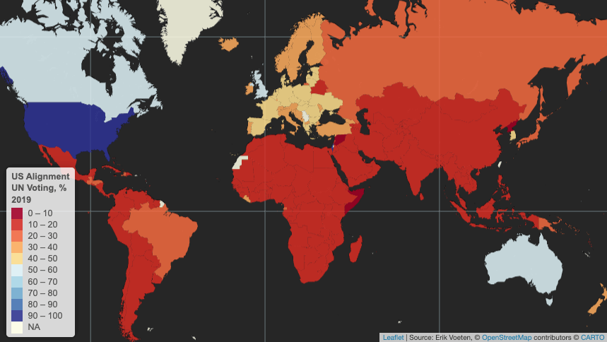
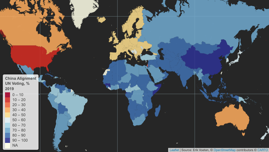
United Nations voting patterns
Yet emerging and developing economies as a whole are much more geopolitically-aligned with China than they are with the US. Using the latest available data on countries’ voting patterns in the United Nations’ General Assembly, in 2019 only a few EMDEs voted in alignment with the US more than 20% of the time. None did so in more than 50% of votes.
Only a handful of US allies tend to vote with the US in UN General Assembly votes more than half the time: Israel, Canada, the UK, Australia.
In contrast, EMDEs tend to vote in lockstep with China, which, after all is still considered somewhat of an emerging market itself. Virtually no EMDE votes outside of Europe were misaligned with China in the UN more than 50% of the time in 2019. Geopolitics is of course more complex than suggested by UN voting, and the world is not reverting to Cold War-era bipolarity, with multipolarity seemingly emerging on the horizon instead.
Sovereign borrowers in the “Global South” are aligned with China more often than not in UN voting.
Walking a tightrope
Nevertheless, the above data suggests that sovereign borrowers are navigating a complex environment in which they have to walk a tightrope between managing relationships with Chinese creditors and maintaining access to IMF support and lending from the Paris Club and private creditors. As such, some EMDE governments may not see that it is in their best interests to ask their largest creditors, which are often Chinese, to take steep haircuts during debt resolutions as has often been the case with past Paris Club restructurings and the Common Framework.
Instead, countries in debt distress may prefer to ask China for maturity extensions and for maintaining exposure while they implement structural reforms to set debt on a more sustainable path. This approach has the potential drawback of conflicting with or delaying IMF program negotiations, which typically require financing assurances from key creditors. Even so, some sovereign borrowers – especially those that are among Beijing’s strategic partners – may judge that their relationship with China is more important in terms of resources than IMF program sizes.
Still others may prefer to rely more on the G20’s Common Framework and the IMF and World Bank. This is especially true considering that Chinese lending to EMDEs has slowed to a trickle over the past five years as Beijing reconsiders its Belt and Road Initiative ambitions.
A poorly-functioning global trading system
Yet the drawback of relying on G7 countries and the Anglosphere for sovereign lending is that, ultimately, among these only Germany and Japan run meaningful current account surpluses. And while bilateral aid from the G7 is non-negligible, external deficits in the US, UK, Canada, and (historically) Australia mean that global capital flows towards these countries rather than from them to the world, as is the case with China.
One way to increase capital flows from rich to poor countries would be for more rich countries to begin running current account surpluses, which would effectively overhaul the global trading system. This is a highly unlikely outcome over the short- and medium-terms, for many reasons but partly because doing so would affect the US dollar’s reserve currency status, the ability to weaponize the dollar via sanctions, and undermine the power of US banks. In these murky waters, it is a small wonder then that many EMDE sovereign borrowers will continue to prefer to hedge their bets by viewing China as at least as important as the IMF and other creditors combined.
With the African National Congress party having endured a crushing defeat in South Africa’s election on May 29th, the political horse-trading around forming a minority government is already well under way. The final tally shows the ANC receiving 40% of the votes and 159 of the parliament’s 400 seats, a sharp drop from the 230 held previously.
Coalition-forming
These are uncharted waters in the post-apartheid era, as the ANC has lost its parliamentary majority for the first time in three decades and now finds itself constrained to seek coalition partners. Although many observers expected a challenging vote for the party, the scale of this electoral setback and its ramifications are still sobering.
The market-oriented, center-right Democratic Alliance continues on as the assembly’s next-largest party with 87 seats and is amenable to coalition talks, as parties seek to strike a deal before a parliamentary session begins in two weeks. Ex-president Jacob Zuma’s uMkhonto weSizwe party is in third position with 58 seats, though the personal antagonism between Zuma and the ANC’s leader, President Cyril Ramaphosa, likely precludes any bargain between the two.
Macro mismanagement, demographic dividends
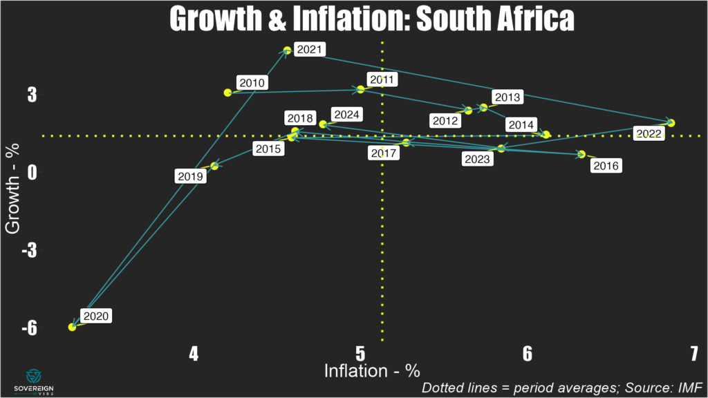
As the dust settles over this result, a quick look at some macro variables helps explain why the ANC got thrashed and where South Africa might be headed. Since 2010, average annual real GDP growth has been lackluster, at less than 1.5%, while inflation has been above 5% on average. Budget deficits have mostly been in the range of -4% to -5% of GDP for the entire period. The current fiscal approach is probably unsustainable over the long term, especially given that these spending overruns don’t seem to result from long-term investments in key areas. The woes of the national power grid operator Eskom serve as a prime example.
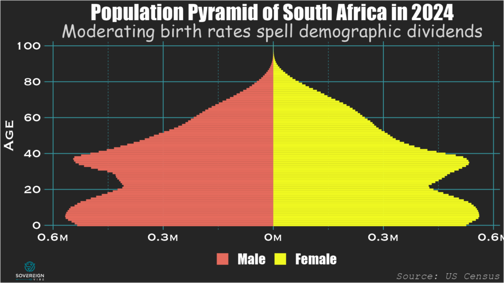
One outcome from the ANC’s economic policies is that GDP per capita has failed to rise significantly over the past two decades: the $6800 recorded in 2022 isn’t far above the $6100 registered in 2006. Indeed, real output growth has barely been able to annual outstrip population growth, which after dropping sharply in the 1990s, rose from the 2000s until peaking above 2% in 2015. Thankfully, annual population growth has moderated in recent years, and the fertility rate stands at a reasonable 2.37 births per woman, slightly above the replacement rate of 2.1.
As such, South Africa has a demographic advantage with a relatively small and declining share of the population that is outside the working ages of 15-64. At 53%, this is on par with the US and much lower than elsewhere in Africa (e.g. 80% in Senegal). The numbers of young South Africans set to enter the workforce over the short- and medium-terms is large compared to the overall numbers of young and elderly residents, meaning that the country has a demographic tailwind to be harnessed – but only if the new government gets its policies right.
Emmanuel Macron wasn’t the only person traveling from France to Berlin last week: I was as well, to attend the inaugural Berlin Energy Forum on May 21st. Here are the key takeaways:
First introduced in December 2022 and February 2023, energy sanctions are having mixed effects, but more can be done.
Introduced in December 2023, the threat of secondary US sanctions against non-Russian financial institutions engaging in certain types of transactions with Russia are proving effective, as banks cut ties with Russian counterparts.
The West missed a chance to devastate the Russian economy in 2022.
Russia is in a very strong macroeconomic position right now, but this is coming at the expense of long-term growth, with the military-industrial complex using labor and resources at the expense of national development projects.
Saudi Arabia and other Middle Eastern oil exporters are the big winners here.
Missed opportunity
The West had the opportunity to wreck the Russian economy in 2022, as its sanctions in response to the Russian military’s February invasion of Ukraine began to bite. But the sanctions had a limited effect because billions of Western money continued to flow into Russia as oil and gas payments. Putting money in an escrow account could have had a major impact.
Meanwhile, Russia’s central bank governor Elvira Nabiullina responded brilliantly in 2022 with large interest rate hikes, capital controls, and other FX restrictions. Moreover, Russia has been preparing since the 2014 sanctions by building up its shadow fleet of oil tankers ahead of time and by diversifying export routes, e.g. an oil pipeline to China.
Saudi Arabia and OPEC are playing an important role via keeping supply constrained and prices relatively high, benefiting Russia. Low-cost producers such as Saudi Arabia have more pricing power over the global oil market. So even if a higher-cost oil producer such as the United States could ramp up production immediately, the Saudis and other low-cost producers can still swing the market price by constraining supply.
Relevant sanctions actions
Western capitals only started applying energy sanctions against Russia nearly a year after the February 2022 invasion, with the crude oil price cap and embargo introduced in December 2022 and the oil products price cap and embargo in February 2023. The goal of these sanctions is to keep Russian oil volumes on the market, so that prices at the gas pump remain stable globally, while undermining Russia’s oil revenues via lower prices and fewer clients.
In December 2023, the US Treasury sanctioned 41 oil tankers comprising Russia’s shadow fleet, which has had an impact. However, enforcement has slowed in 2024, while Moscow has managed to add new vessels to the fleet.
Also in December 2023, President Biden issued an Executive Order to impose secondary sanctions on financial institutions engaging in transactions that violate the oil price cap or other sanctions against Russia. These have so far proven to be effective, as banks in China, the UAE, and Turkey limit payments to Russia and ask for increased compliance documentation from counterparties. These secondary sanctions were a top concern at the recent Putin-Xi summit in Beijing.
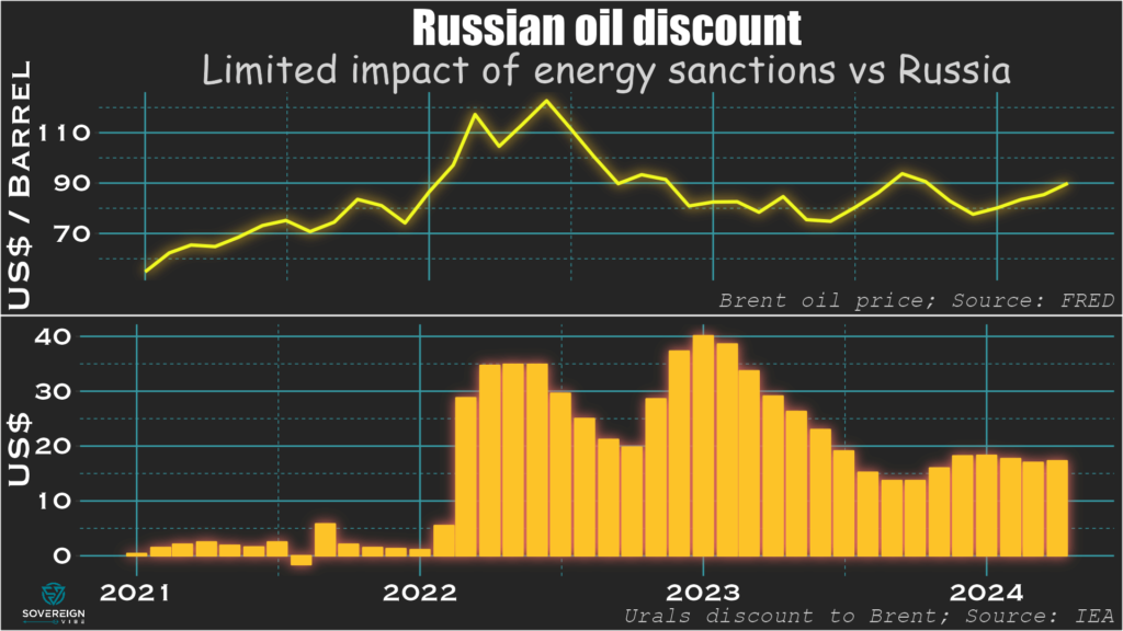
Discount on Russian oil
Everyone involved in Russian oil trade wants to be compensated for the risk of buying “tainted” product. The discount on Russian Urals oil rose in H1 2022 to $30-$35, as a geopolitical risk premium and had nothing to do with sanctions. This gradually declined as market players learned what they could get away with. This discount rose again from December 2022 as the crude price cap and embargo were first announced.
Each $10 of discount costs Russia $20 billion in export earnings if in place over the course of a year, so there is a tangible impact. But also consider the side-effects: the discount provides a subsidy to the buyer, e.g. China, India, Turkey, giving them an industrial advantage over Russia’s opponents.
The Western embargo worked because there is a discount on Urals, which Western countries used to buy, but none on Russian ESPO oil delivered from Siberia to China. It is clear that the $60 price cap on Russian oil hasn’t worked, as there are no two separate concentrations of transactions at $60 and the market price.
In the summer of 2023, Russia mobilizes its 41-strong shadow fleet, oil prices rise, and Russia’s discount drops. The US Treasury’s Office of Foreign Assets Control (OFAC) starts targeting the shadow fleet, so the discount starts rising again from end-2023. But OFAC stops enforcing these sanctions sometime in Q1 2024, so the discount hasn’t widened further. Part of the problem is that by the time governments sanction a vessel, it has been renamed and the company re-registered.
Three problems with energy sanctions on Russia
The first way to get around sanctions is violation. 29% of the Russian oil trade touches on G7 services, so 29% should be under the $60 cap. But only 2% is: the buyers are lying, which is attestation fraud. The buyers are no longer international oil traders but suspected subsidiaries of Russian companies recently registered in Dubai and in other jurisdictions.
The second is evasion. The shadow fleet now carries ~80% of Russian crude and ~50% of oil products, shares that have risen quickly in recent months.
The third hindrance is an unwillingness to disrupt access of Russian oil volumes to the global market. This is needed to wage economic warfare, but it is doubtful that G7 taxpayers would accept this. For instance, the US has given India unofficial clearance to accept Russian oil from ghost tankers as it doesn’t want the market to be too tight.
A strong macro position in the short- and medium-term
Although the discount on Urals oil has caused Russia to lose some oil revenues, relatively high oil prices have made up for those losses. Russia’s oil export earnings and budget oil revenues haven’t declined. The budget deficit widened in Dec 2022-Feb 2023. But the larger deficit in early 2023 was partly because Finance Minister Anton Siluanov was front-loading expenditures to avoid an end-of-year surprise.
By summer 2023 Russia had started getting revenues from from new oil export machine to India after the long oceanic voyages got put into place. The budget stayed on track for 2023. For 2024 year-to-date, budget revenues are up by 50%, while expenditures have risen by only 20%. Within that, oil and gas revenues have increased by 80%, while non-oil and gas revenues are up by a respectable 40%. This latter category is largely internal to Russia, and thus not sanctionable from the outside.
Russia has little in the way of external debt vulnerability: even without its frozen assets, Russia could just about pay off all of its $326 billion of external debt in cash anytime. There was a spike in Russia’s current account surplus in March 2024 to $13 billion, the second-highest reading in 15 years. Industrial production is growing, with Purchasing Managers’ Indices above 50. Unemployment is down to around 3%, and wages are rising faster than inflation.
However, this macro strength is also the symptom of a demographic problem and is coming at the expense of long-term growth. Chronically low birth rates and brain drain have now combined with resources directed to defense industries and the military to create tight labor supply conditions, if not shortages in some areas. This means that Russia is unable to pursue some of its non-defense national development projects, which is likely to weigh on long-term growth.
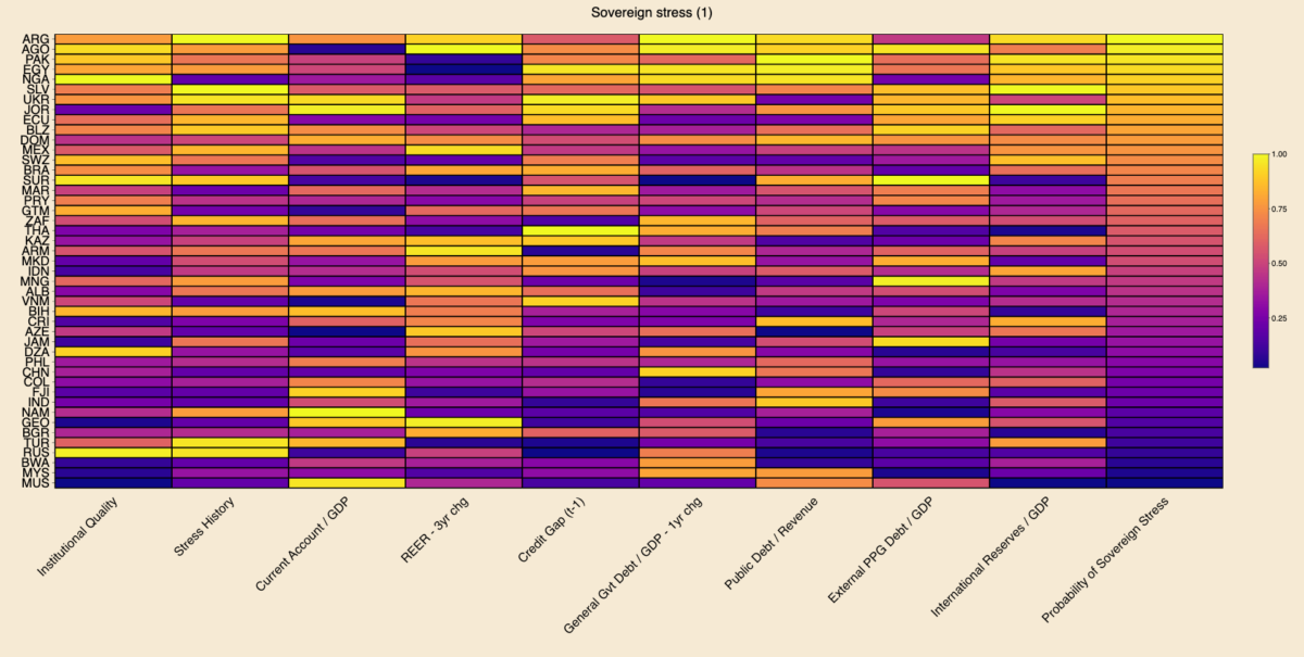
Today’s charts are an update of the Sovereign Vibe sovereign debt stress tracker initially released in 2023. This tool is based directly on the IMF’s Debt Sustainability Framework for Market-Access Countries, released in 2021, and is relevant only for countries that “principally receive financing through market-based instruments and on non-concessional terms.” Through extensive testing, the IMF developed a model that measures the probability of a borrowing country experiencing sovereign debt strains in the near-term based on changes in nine macroeconomic and governance variables.
Results
Among middle- and lower-income countries with market access with full data availability across all indicators, Argentina, Angola, and Pakistan are most at risk of sovereign debt stress. In the heatmap below, brighter colors indicate more risk, while darker colors indicate less risk. I use percentile scoring for each variable, including the probability of sovereign stress outcome.
Argentina defaulted on local currency debt in 2023, which penalized the country via the “stress history” indicator and propelled it into the “top” spot. The sovereign defaults that I tallied based on S&P for 2023 are El Salvador, Cameroon, and Ethiopia on foreign currency debt and Argentina, Ghana, El Salvador, Mozambique, and Sri Lanka on local currency. Let me know if I am missing any!
Caveats
Regarding the other 2023 sovereign defaults, El Salvador registered as sixth-most at risk of sovereign stress. I would expect Sri Lanka to rank fairly high on the sovereign stress heat-map above. But data for Sri Lanka has been patchy since its 2022 default, preventing me from making a full calculation on the same footing as other countries.
The IMF does not consider Cameroon, Ethiopia, Ghana, and Mozambique to currently be MACs. Other countries are borderline. For instance, Angola has been a market-access country for several years, but it seems like the IMF is in the process of declassifying it due to current vulnerabilities. So I may remove Angola from the next update. On the other hand, Nigeria still seems to be within the IMF’s MAC perimeter.
Also, this tracker shouldn’t be taken as gospel as to the likelihood of sovereign stress, as it only reflects macroeconomic-related indicators and which are mostly backward-looking. It fails to capture the qualitative aspects of a government’s commitment to reforms. Case in point: I wrote of Egypt’s brightening prospects last week.
Changes since October 2023
The table below outlines changes in the ten MACs most at-risk of experiencing sovereign debt strains. Argentina, Nigeria, and Ukraine have deteriorated by climbing up the ranking. Angola, Pakistan, Egypt, Jordan, Ecuador, Belize, and Mexico have seen their rankings improve. El Salvador continues to occupy the sixth spot.
Rank
May 2024
October 2023
🥇
🇦🇷 Argentina ⬆️
🇦🇴 Angola
🥈
🇦🇴 Angola ⬇️
🇵🇰 Pakistan
🥉
🇵🇰 Pakistan ⬇️
🇪🇬 Egypt
4
🇪🇬 Egypt ⬇️
🇯🇴 Jordan
5
🇳🇬 Nigeria ⬆️
🇦🇷 Argentina
6
🇸🇻 El Salvador
🇸🇻 El Salvador
7
🇺🇦 Ukraine ⬆️
🇪🇨 Ecuador
8
🇯🇴 Jordan ⬇️
🇧🇿 Belize
9
🇪🇨 Ecuador ⬇️
🇩🇴 Dominican Republic
10
🇧🇿 Belize ⬇️
🇲🇽 Mexico
I was surprised to see Mexico in October’s top ten, which points to some of this tool’s analytical limits. I and many others have generally perceived Mexico as a positive EM story in recent years, with an economy benefiting from supply chain reconfigurations and near-shoring, and an appreciating peso. Nevertheless, this IMF model can help challenge consensus narratives: in fact, Mexico is penalized precisely because of the strong appreciation of its real effective exchange rate over the past three years.