In last week’s post, I discussed savings and investment across large emerging markets and the G7 countries. As has been well-documented, imbalances in the G7 have profound consequences not only on domestic economies and the rise of populism. High consumption and the low savings that result across the G7, especially ex-Japan / Germany, means that there is less capital to flow from these rich countries to emerging and developing economies.
In the US, both savings and investment are low as a share of output. Yet investment is endemically higher than savings in the US, partly as a result of strong global demand for US assets. What that robust foreign appetite means is that in most years more investment flows into the US than flows out of the country. The stock of these accumulated flows is the Net International Investment Position.
In cases where net investment flows into rather than out of a country in a given period, its NIIP declines. As such, the US has by far the world’s most negative NIIP, which stood at -$19.8 trillion in 2023. The UK has the next-largest negative NIIP, which at -$1 trillion is a far cry from the US.
Capital flows to the US, UK, and several other external deficit countries thanks to strong investor protections, rule of law, and diversified economies. With open capital accounts, it is easy for international capital to acquire assets domestically and affect prices in financial markets, real estate, and other investment categories. There is naturally a price effect, which I have begun to measure.
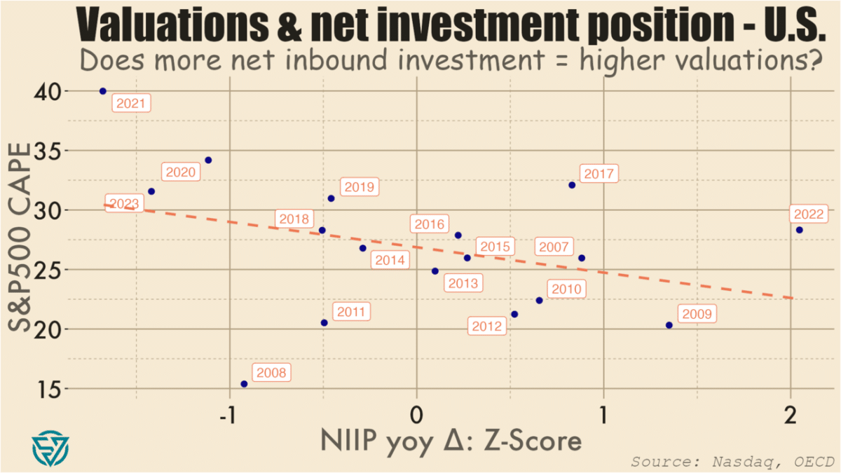
As a starting point, I’ve compared normalized annual changes in the US’s overall NIIP to the S&P 500’s cyclically-adjusted price-to-earnings ratio. CAPE is a valuation metric that compares current prices with the 10-year average of earnings per share.
As expected, I do find a negative association between changes in NIIP and CAPE levels. So more net investment into the US in a given year (i.e. a NIIP decrease) is loosely correlated with stock prices that are higher compared to long-term earnings.
In plain English, what this means is, for example: there were large net investment inflows into the US in 2020, 2021, and 2023, and S&P500 valuations were also high during those years. Conversely, large net outflows in 2022, 2009, and 2007 coincided with lower P/E ratios. There are of course factors other than net international investment flows at work, including monetary and fiscal policy.
So I won’t make any grand claims based on the chart above. Moreover, it has only a limited number of data points, and which are weakly correlated. I might run portfolio investment flows against price-to-earnings metrics to see if there is a tighter link. I also might look at other asset valuations, potentially in real estate, to see what the relationship is with capital inflows.
Essentially, I’m working my way towards testing whether foreign capital inflows contribute to asset bubbles in the US. As usual, I’ll also be expanding my analysis to other countries, in this case other G7 / advanced economies.
The point is to get a sense of the extent to which open capital accounts are driving asset prices in wealthy economies beyond the reach of local workers, thus contributing to the rise of populist political forces. Meanwhile, many emerging markets and developing economies have the potential to deliver better returns on investment than capital-saturated wealthy countries. But investment gaps in the EMs will likely persist as long as rich countries continue to run such large, negative NIIPs.